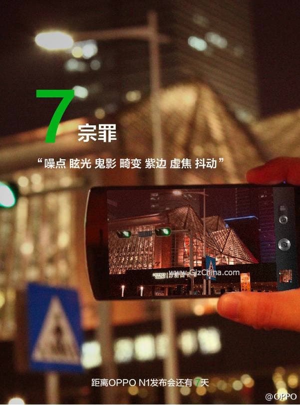
Oppo China have released this promotional image which includes the first real photo of the Oppo N1!
Oppo are making every effort to keep Ofans properly informed about the soon to be launched Oppo N1, today even releasing promotional material with an actual photo of the new phone!
We don’t get a full detailed look at the N1, but we can see that the top half of the phone, the camera UI and thin bezels. In fact those thin bezels actually make the 5.9-inch Oppo N1 appear less of a handful than thought! Even with the large display it looks easy enough to use one-handed.
Gizchina News of the week

The text on the image speaks about the rear camera of the phone, more accurately the N1’ability to capture light and reduce blur and noise.
Oppo will officially launch the N1 on 23rd September, but more official leaks and teaser videos are sure to hit the internet before then so keep tuned.


Dayuuuum, those are some extremely thin bezels. It looks like it matches the Pantech Vega Iron in size.
Drooling over it already, so totally gonna buy this.
Bezel small
ugly…mi3 design is better
I have two xiaomi mi 2, design its ok.
Mi 3 design its catastrophal !
That’s way i will buy oppo n1
(if oppo will have micro sd slot, i hope and 16 mp camera)
I am designer and artist, and my opinion the oppo n1
design is better, modern, different als brick design
from lumia, xiaomi and co.
Hey, I’ was a designer (now illustrator) and I find lumia and mi3 design are good design. Hate that arc on top of N1 too, slightly arc on find 5 is good but not this, even samsung can do it better.
(just to take out the designer part of the debate, it’s your opinion vs us)
Too bad that “good” design didn’t save them from the obscurity.
It wasnt good design that made them fail, it was windows phone. even samsung cannot profit off of windows phones.
One of the big things is those 5 hour updates you always have to plug your phone into a computer to download. My buddy said once it took all night. Of course the windows phone is unusable during the whole update process. That is a major flaw in the windows phone the way I see it.
Never said it’s entirely the design that make them fail but I’m sure it play some part in it.
Those brick? sure….
having first hand experience i must say square edged phones are not ergonomic to use. it forces you to hold the phone from the side or you will have the corners dig into your palm….so maybe i’m missing something here. Since when does aesthetic come before ergonomics?
What? You dont like sharp jagged metal on a device that you have to touch and carry around all day? Wheres the fun in that?
The bezels are still too thick. I was expecting something a lot thinner.
………Really?
from the render is was also expecting a thinner bezel, probably its too fragile if the bezel is that thin and the diplay or glass will break for sure if you let it fall once.. ;-(
but im also pretty hoocked on the N1 😉
You are mad,thinner than that?How?
Nice Exclusive.
Did they get Igorvo Vkovinskiy for a hand model? Certainly looks OK size wise, the #4 trailer also shows a large at least 3000mah battery probably more, can’t decide if the round thing they are adding at 0;04 is a 20.1 Sony Zeiss sensor/lens, not sure.
So now, needs to be a fair bit cheaper than a Z1, currently $950 but with free QX10/watch. Only thing it might be lacking is dual sim.
“Did they get Igorvo Vkovinskiy for a hand model?” lol
Obviously this is not 5.9 inch phablet (comparing with hands).
Oppo already announced that the N1 is 5.9 inches. Nice try.
oh really?! thanks, cap!
all i want to say is that the hand is added by the photoshop.
Actually the image on the phone screen looks photoshopped too (just add a noise filter and voila!).
I think this image is still photoshopped, the angle doesnt seem right and I do not see the blue-ish line on the building to the right. Also just looking at the picture in the top right corner on the camera makes me doubt it.
Of course it could have been taken with a shitty camera (and the quality of the pictuere overall is way too low…) but still.
Oh wow! Do you also not see the green from the traffic light? Cause I don’t.
If the image is not photoshopped, the N1’s camera does have a really wide angle.
This is a fake, see @evleaks tweet https://twitter.com/evleaks/status/379711000678637568
Nope it isn’t http://n1.oppo.com/media/timer/share7.jpg
Samsung style physical home button? Nooooooooooooo!
Say it aint so. Not sure if these clones are even legal to sell in the US or if LG is gonna sue the shit out of me as soon as I bring it to market.
Maybe i was looking at the wrong photo with the physical button. I just hate the way it looks. I doubt the N1 is gonna have it tho, i just got spooked when i saw the photo for this article before you click on it.
I see what i did, i was looking the pic below of that note 3 clone, it makes sense now. I hope we dont see that on any original designs tho. That button is a samsung feature and its not worthy of copying unless its a samsung clone phone obviously.