The Ulefone Future, one of the only bezel-less phones ever produced, is on show at MWC 2016 here’s a hands on video!
Yesterday I was lucky enough to have a hands on with the Ulefone Future, but only today was I able to upload the video and my first impressions.
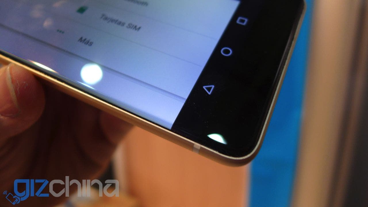
Ulefone have about 3 Ulefone Future phones at MWC, each of them are hand-made engineering samples, so they aren’t perfect but do give us a rough idea of how the final produce will actually look.
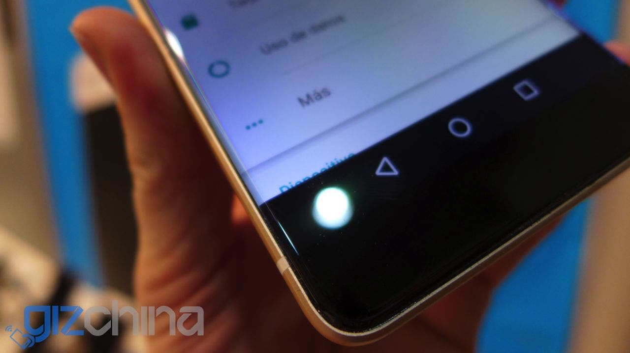
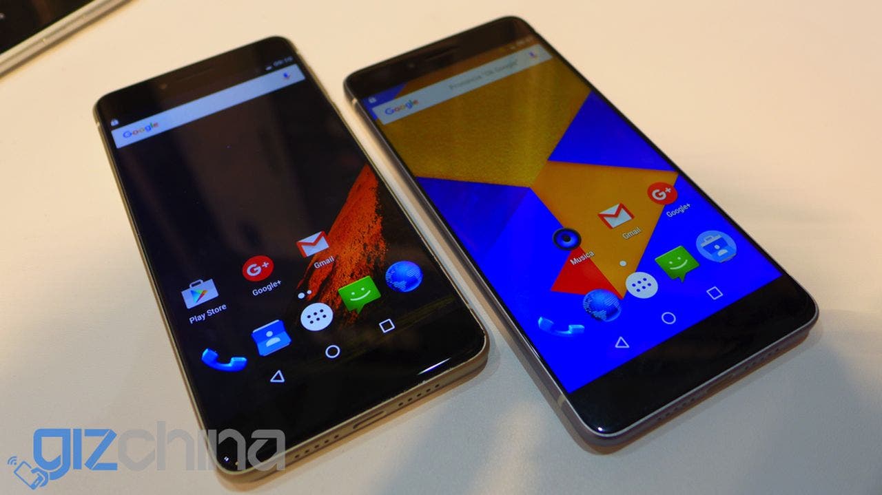
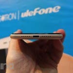
As promised the Future is a bezel-less design, or as bezel-less as Ulefone are able to make it. If you take a good close look you will notice a sliver of black bezel on each side of the 2.5D curved glass display.
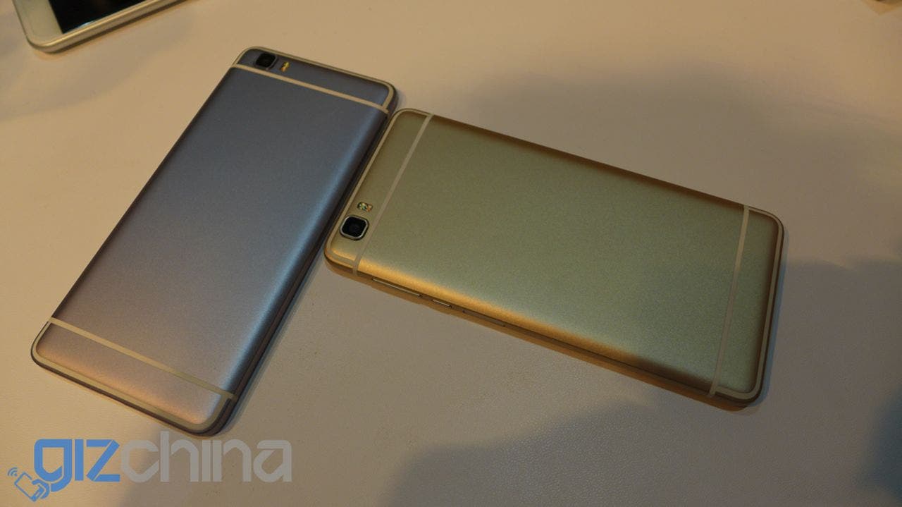
The build of the phone is a unibody alloy one with colour options including gold, silver and rose gold options. The rear has no Ulefone branding at this time but I assume we can expect a logo similar to that on the Ulefone Be Touch range.
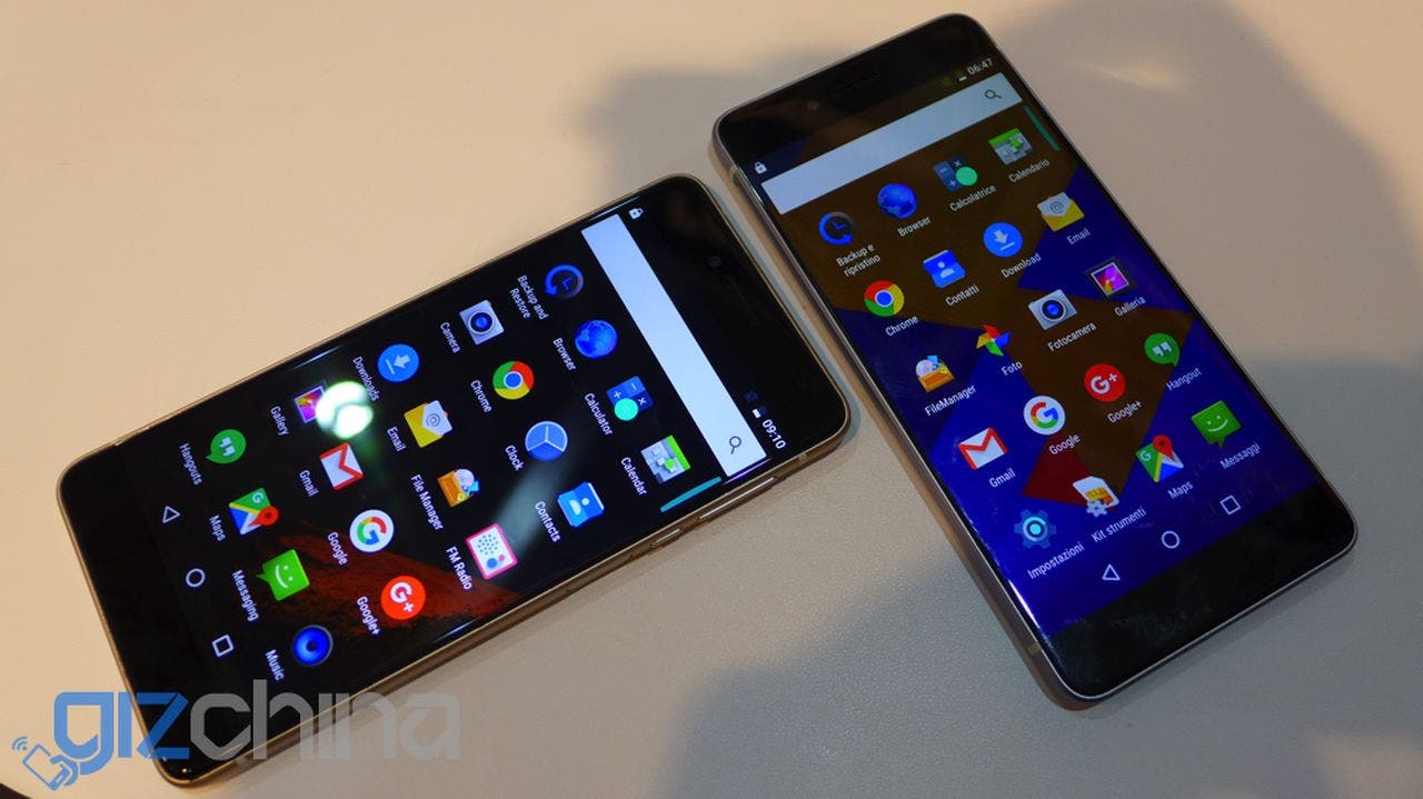
Specifications weren’t confirmed at the show although Ulefone reps did reiterate that the phone will run Android 6.0 on a Mediatek Helio P10 chipset with 4GB RAM. The final production version is also set to run a Sony IMX230 rear camera, USB Type C and large battery (possibly up to 4000mAh).
Ulefone Future Hands on Gallery
Ulefone did mention that the materials and R&D of the phone have been expensive, which doesn’t give me much hope of a bargain basement price for the Future, but only time will tell.






If the camera is good, this phone is my next.
pricy like.. 300$??
Andy did You find the stand from elephone?? Try to find the p9000 edge and make a quick review… Please, por favor
I’ll see if the bezelless from elephone is better than the ulephone
looks perfect, I’m waiting for price..
I detect a bit of negativity in Andi during this video… It’s as if he’s seen problems with it off Camera and he’s not up for sharing yet..?
It looks really impressive to me what Ulefone have managed to achieve with the screen and definitely a step in the right direction for them.
true … lets hope ulefone were mature this time.
i already saw a hell lot of potential when they launched Betouch 2 but made far too many childish mistakes… something only rookie engineers and design executives would do :/
lets hope they avoided all that and finally were able to get some positive yield !
good hands on from Andi …
but we really need to see the final product in flesh and works to gauge how hot of a phone this really is.
Why rose gold colour ? Why not emerald gold or other original combination ?
It seems that even after coming up with original idea, majority of Chinese manufacturers feel the need to copy at least one thing from Apple.
Talking about design, overall image is decent. Back needs additional design detail, as it looks rather empty.
Andi, why are you surprised the app drawer scrolls vertically. Stock app drawer has changed with the release of android 6.0. I didn’t like it either in the beginning, but its not a dealbreaker…
I decide …
My next phone gonna be Zopo speed 8
Great design. Official time of the sale, the camera needs to be better debugging.