The Xiaomi Mi3 launch is under a week away, so there is still plenty of time for speculation, rumours, renders and photos!
Normally when we get given a phone render or leaked photo we aren’t given much (if any) evidence to back up the authenticity of it, but this bright yellow Mi3 design has a few photos which make it all the more possible.

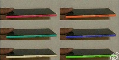
This render for the Mi3 looks very similar to the Lumia range of phones from Nokia, it also happens to have a angular, rectangle screen as we have seen in the leaks, but most interestingly there are a number of photos showing a similar design.

Interesting choice of colours.

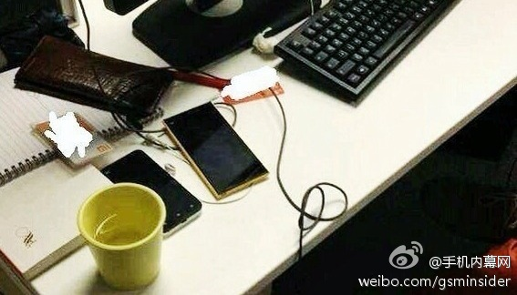
Then there is the photo which shows an alleged Mi3 used in a subway in Beijing.

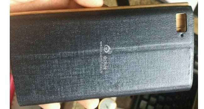
Even the purported flip covers match the design of this Xiaomi Mi3 concept!

I would be quite happy if Xiaomi launched an Mi3 with a design similar to this. I have never owned a Nokia Lumia but I have always been attracted by the design. The Xiaomi could be the perfect balance of stylish design, MIUI and powerful hardware!
How about you guy’s? do you like this style for the new Xiaomi phone?
[ Thanks to MIUI Italia for the hat-tip ]


Looks great! ^_^
Looks like Nokia Lumia [insert model]… Let’s hope it won’t have the same fate, sales-wise 🙂
The Lumia series is pretty popular here in India!
Looks Nice
No, please, not the stupid Nokia design. I have been waiting for that Mi3 for so long and finally such a disappointment. I really hope the yellow angular thing on the picture above is some kind of old prototype. Xiaomi, stick to the Mi2 design but thinner, please!!!
Agree!!
Me too! 😉
Lumia has one of the worst smartphone design, why are they even copying a relatively unpopular phone design I don’t even
The phone design is amazing, the only reason it’s umpopular is because it’s windows phone.
If you’ve ever held a lumia you’d know that it’s quite bulky/hard and premium-feeling.
Oh I’ve held it plenty of time, it’s ugly.
and “the only reason it’s unpopular is because it’s windows phone.”
No, you don’t know that for sure. It may be the design, the OS or combination of both.
The lumia lineup Is not ugly. it looks ugly on the internet until you’ve held it. I’d love a lumia-esque phone with android, provided the build is the same.
And i can safely say that because everything that has shipped with the WP8 OS has failed miserably. Nobody wants to be near that trainwreck.
I already said I’ve held it plenty of time, you may say that it’s not ugly but that’s simply your opinion and not universal facts. At the very least I’m not alone who think that it’s ugly.
So other devices with WP8 fails, so what? Does it proves that all people in the world think that Lumia is not ugly?
i like it! it looks stylish, solid premium body design! unlike that cheap plastic from another ‘galaxy’….one more week to go!
Will It be like the Nokia Lumia?
dual sim + good battery and water dust proof this phone gooo far =)
it’s look like 5.5″ , not 5″ !
5.5″ is too big,4.7″ to 5″ is perfect!
I hope this be durable like lumia
i think this one is real
I dont think so, at least the picture with several colours because the finger position is exactly the same in all of them, is the same photo with the colours changed.
A “brick-like” smartphone like lumia 920.I hope this is NOT real!
Looking at Oppo N1 and Meizu MX3 design I think Xioami is starting to lose terrain against them with this brick design…
omg fugly!
I don’t like the look at all….LOOKS TERRIBLE.
Agree, it’s really ugly! If this is real I think I’ll go with Meizu this time.
If that is the final design I have clear that Meizu Mx3 will be my next phone.
I really hope that this isnt d real design. I dont like the Lumia look
Too big to make sense. Mi2s remains the top dog (good thing that it will shortly be sold for less too…)
Hola!
Me ha gustado el articulo. Otros articulos no me gustaron tanto, pero la gran mayor