This miui V6 concept brings a much needed makeover the the popular Xiaomi Android ROM.
If you are after a functional ROM which just works then Xiaomi’s miui V5 (available for a number of devices) is one of the best. It offers some great features, it’s fast and get’s updated on a regular basis but it lacks one very important thing.. Style!
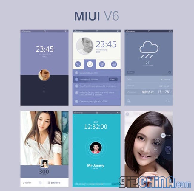
Visually MIUI hasn’t changed all that much and is now starting to look a little dated when compared to more modern roms such as Meizu’s Flyme and Funtouch from Vivo, so isn’t it about time Xiaomi updated the look of their ROM?
This MIUI V6 concept, produced by Chinese Xiaomi fans, brings a more up to date, fresh feel to Xiaomi’s custom ROM. The concept shows all new 2D icons and a much more stylish and simple UI which is the current trend in UI.
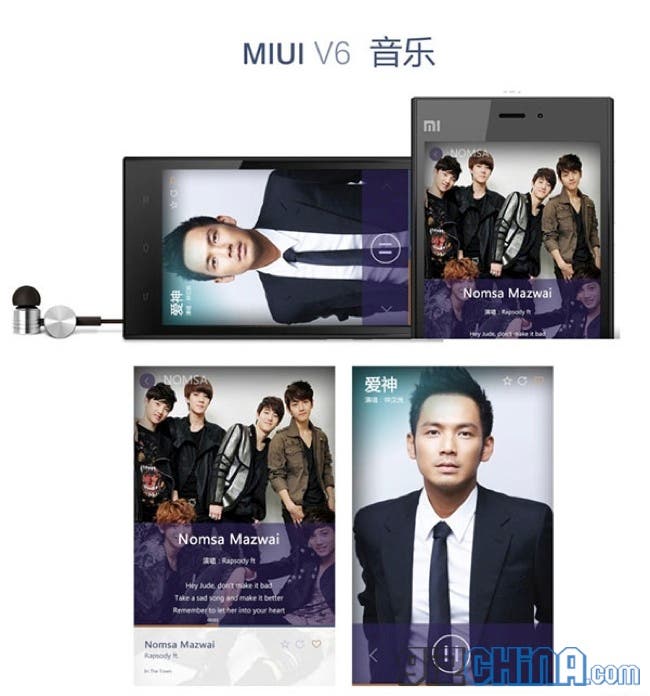
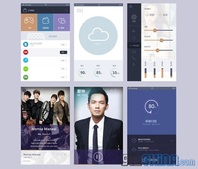
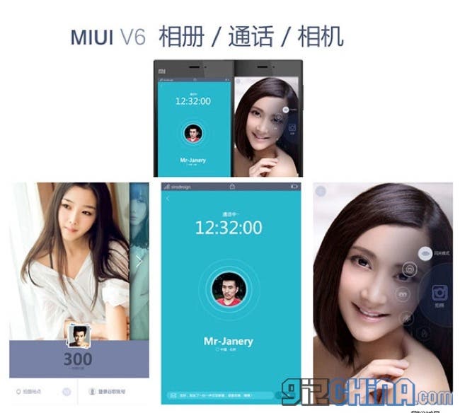
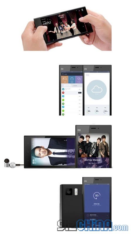
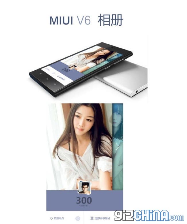
Personally after using MIUI for over a year and then moving to Flyme on the Meizu MX3, I personally hope that Xiaomi do have something similar to this for their next major ROM update. What do you guys think?


fuckin ugly. whoever made that concept has no idea of design. not even closely related to miui
That kind of design is called Skeumorphism. Go google it. fucker.
I hope Xiaomi has better designers than this.
i disagree about MIUI lacking style,with all the theming options MIUI is,nothing but style
I really hope the miui v6 design would be better! It feels quite old and too “manga style”! I’m using flyme 3 like Andy and I really love it’s minimalist design!
No, please! I just run away from IOS7 and I’m loving MIUI V5 design. I hope they don’t screw it in V6 🙁
This is a few months old mockup…. 😛 OLD NEWS!
Its fake, V6 is much better than this
I don’t think it is THAT bad. I actually like it, it has a more minimal and flat design and I would love to see that in android 5.0