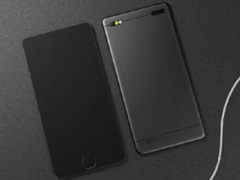
It is no secret that the next generation Meizu MX4 is coming soon (possibly as early as next month) so Chinese fans have been busying themselves with creating renders of what they hope the next Meizu will look like.
Meizu are quite traditional when it comes to phone design and every phone since the first MX model hasn’t changed all that much from the original formula. With no hint from Meizu as to what to expect, Meizu fans in China have let their imaginations run wild with ideas falling to one of two camps i.e. “more of the same”, “new and original”.
First up is this rather blocky render from a Chinese fan who has taken a little inspiration from the dummy iPhone 6 phones which have been doing the round in China. From the render it looks like this fan has opted for a more traditional aspect ratio for the design along with an alloy rear.
Dual LED flash for the rear camera and it also looks like a fingerprint scanner is included on this render.
Next us is a more traditional looking Meizu design. The phone in these renders looks like the MX3 but with a larger home button, dual speakers on the base, and repositioned physical buttons. The designer of this render also shows a new notification method for from the home button which actually has it change shape and even a wooden ‘style swap’ rear cover.
What do you think of these renders? Which designer is closer to what Meizu will produce?
Follow Gizchina.com on Google News for news and updates in the technology sector.
