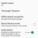
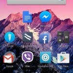
The very-useful-yet-sometimes-spooky Google Now Launcher is now available to all Android devices, the only condition being that you should be on Android v4.1 Jelly Bean or higher.
The launcher first came out with the Google Nexus 5 last year, but had since been made available for GPE devices on Android v4.4 earlier this year. Of course, Android users did the evergreen side-load trick to use it on non-compatible devices, but that’s something you won’t have to do anymore.
The Google Now Launcher allows you to access the Google Now service right from the homescreen. All you have to do is swipe right to get to the Google Now screen and you’re good to go. It also comes with some cool functionality, including hotword detection and offline speech recognition among others.
Download the Google Now Launcher for your Android v4.1 or higher phone via Google Play.
[youtube http://www.youtube.com/watch?v=ma-DGvCajWM]


I tried it on my Mi3. I don’t like it that much. It’s pretty smooth and having Google Now just one swipe away is handy, but there are other launchers like Nova that are look and feel more professionally done. For example, there’s no way for me to change my icons in the Google Now Launcher so I’m stuck with half of Google’s flat understated icons and half of MIUI’s colourful icons. It’s just so messy. Nova Launcher’s also got tabs in it’s app drawer which makes everything more neat and tidy looking. Google’s does not, thus everything is just clustered together. The speed is there, Google just need to add a touch of professionalism and it’ll be golden.
Been using it on my OnePlus One, the icons can be changed on this through CyanogenMod themes. You could try changing the MIUI theme, might work.
@yash Tried it already but didnt find it fascinating also it is not that smooth it made my phone lag. There are better professionally groomed launcher already available in googleplay. I am currently in love with DODOL LAUNCHER. Tried every other but this is more smooth fast and damm simple and gorgeous than others.
@yash Tried it already but didnt find it fascinating also it is not that smooth it made my phone lag. There are better professionally groomed launcher already available in googleplay. I am currently in love with DODOL LAUNCHER. Tried every other but this is more smooth fast and damm simple and gorgeous than others.
it is about time, the best and most efficient Launcher I have ever used on my phones running Android, that is great news :).
it is about time, the best and most efficient Launcher I have ever used on my phones running Android, that is great news :).