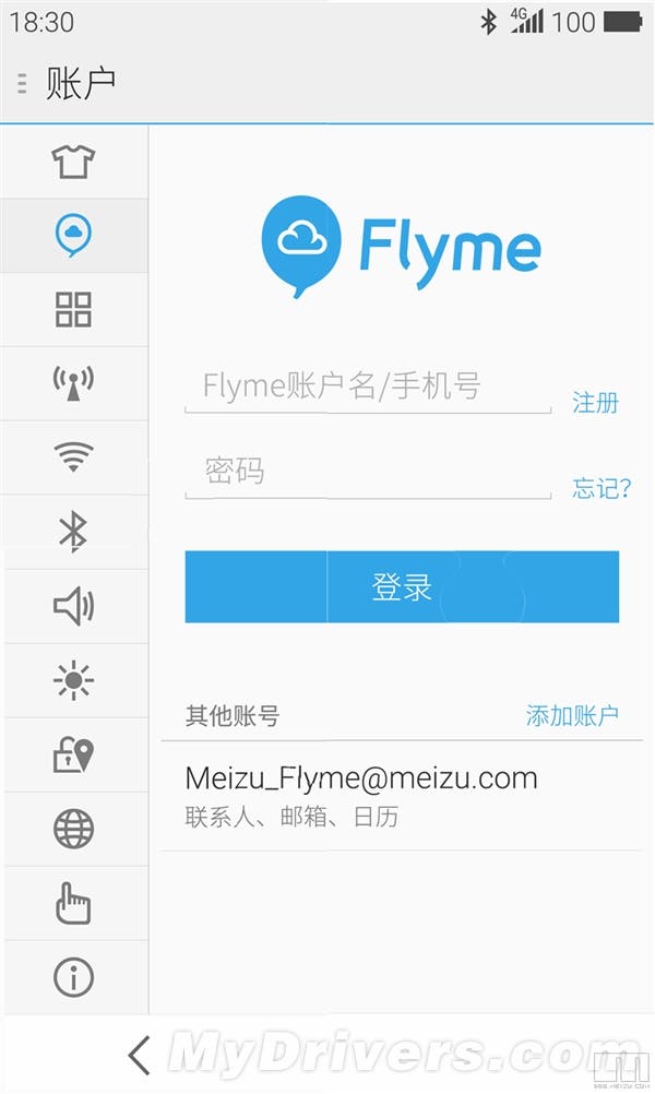
Meizu’s Flyme 4.0 has been pieced together parts of a puzzle post throughout the Meizu forums. The resulting screenshots give us a good look at what we can expect from Flyme 4.0.
Since Meizu launch Flyme 3.0, their Android based custom ROM, the UI of the system has featured a flat look. A year on and now every smartphone maker is producing similar user interfaces for their latest updates, and Meizu is ready to move on to Flyme 4.0.
Screenshots of Flyme 4.0 show us that Flyme has been simplified further still and continues to have a clean and uncluttered look about it. It’s great to see that Meizu have kept to their own method of navigation and listing system menus too. While it not be to everyone’s taste it is at least their own design and can’t be mistaken for anything other than Flyme.
Simple, clean and bright are words I would use to sum up the style of Flyme 4.0, and the use of a white Smartbar navigation across the bottom is more eye-pleasing than the original black version.
Flyme 4.0 Screenshots
The look of the UI is one thing, but what about the features? We want to see some new exciting features from Meizu in Flyme 4.0 and hope we get a more advanced camera app, better security and also custom gesture options. We will have to wait until 2nd September to see if our wishes come true.
[ Source ]


They keep tempting me man if this is available to international buyers I’m buying it and not getting another phone unless necessary this has got my attention on high alert.