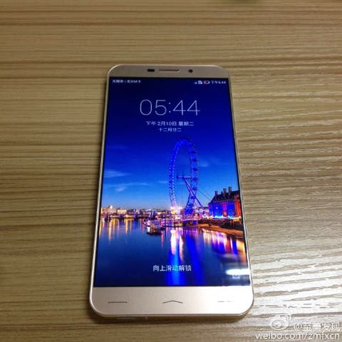
All to often renders of a new smartphone don’t quite live up to expectation once the device launches. Not true with the Serendipity S7 which retains ultra narrow belles even in the flesh.
The Serendipity S7 has been seen and photographed in real photos revealing an amazing narrow screen bezel. As you can see in the photos the 5.5-inch display runs from edge to edge of the phone with very minimal frame-work to the left and right.
Made of alloy, the S7 weighs only 120g and boasts a 5.5-inch Gorilla Glass 2.5D display, 2GB RAM and a 13 mega-pixel rear camera. For now the only other details we know are a 2600mAh battery, 16GB memory, and a Snapdragon 400 CPU, this last detail might lose the S7 a couple of potential buyers who will want the better performance of a 64bit Mediatek chip.
Pricing for the phone remains to be seen, but a first batch of phones will be launched shortly just ahead of the Chinese New Year.
Follow Gizchina.com on Google News for news and updates in the technology sector.

i honestly dont care about the buttons if the phone packs a punch and is well priced!
I do, without them it would be as small as iphone 6. The biggest size that is comfortable if you ask me (after that size it’s a downwards spiral). Also software buttons are very cool, they are there only when/if you need them, with simple tweaks you can have them dissappear when unneeded, you can’t have physical buttons disappear, they are always there reminding you how uncomfortable a phone can be.
Indeed, everything else accounts for about 20% of the bezel in any dimension. So yeah the buttons are the primary occupants of a bezel.
Hence all those buttonless phones with 80% smaller bezels?
Yes. See here: http://www.omegagadget.com/wp-content/uploads/2014/06/Docomo-Sharp-Zeta5-SH-04F-Omega-Gadget-1.jpg
And if it was not for the logo, it would be even smaller. There is literally only two things to put on front, the camera, and the light meter. Imagine how small most phones would be if they followed Sharp’s example. Instead they keep on encumbering the front with things which could well be on the sides (speakers) or not at all (buttons).
Yep, silly how they just added all that empty space behind the docomo branding isn’t it?
Indeed, I don’t see the point. Better have the phone be thicker, it would have been even more ergonomic.
I’m currently using the 5 inch version of this phone (sharp crystal) and I’m holding it upside down. It’s the only 5 inch phone that I can actually use one handed. It’s usability leaves the classic phone makers (apple, samsung, htc) to the dust. I always laugh at the akward movements needed to operate those hefty devices.
Finally someone who agrees with me, btw, you’re right it’s silly how that space is used. Better never to be there… (and let the phone be 0.5 mm thicker, to put the hardware underneath the Docomo logo to be there..,)