Oppo’s bezel-less phone, Is it really narrower than a standard phone with bezels?
PhonesSaturday, 25 April 2015 at 04:46

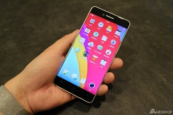
Oppo haven’t been shy and tried to hide their bezel-less device away, but rather let it bask in photographic glory on any occasion they see fit. The following images are the most revealing hands on photos of the bezel-less Oppo today.
This isn’t the first, and nor will it be the last time we see Oppo’s bezel-less phone, but it is these photos give us the most detailed look at the smartphone ahead of it being officially announced.
While many phone makers are striving to build a phone with 0 bezel to the left of right of the screen, only a few phones have been close, but still retain a little meat here and there.
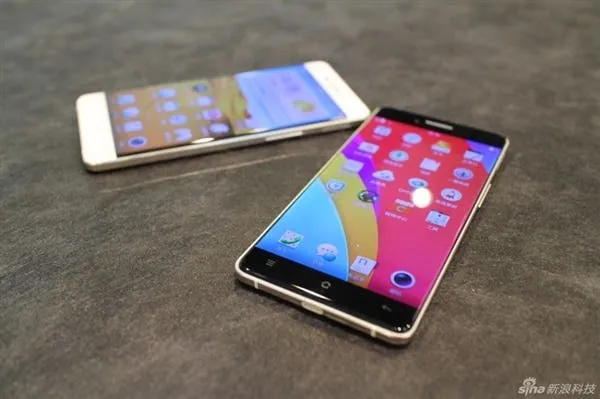
Oppo’s new thin phone does away with the traditional black (white) bezel on the face of the device, instead allowing the edge of the screen to wrap around the sides and and meet a metal chassis.
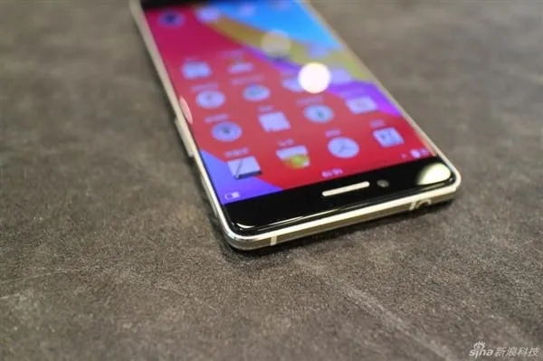
While the design is in fact a bezel-less one it isn’t a borderless design. The metal chassis does poke out a few mm on either side of the phone adding protection against accidental drops.
So finally a bezel-less phone, but does the design actually make a narrower device? Without knowing the dimensions we cannot really say, but a few observations suggest that the new Oppo won’t be much narrower than a standard design with minimal bezel.
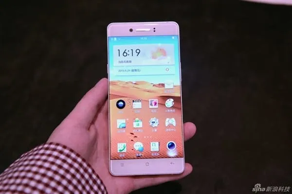
The application icons in ColorOS seems to be more inboard than usual. Our Oppo N3 (running ColorOS) has less of a gap between the application edge and bezel, around 4mm, than there is on this new Oppo phone, which looks considrably more than 4mm in these photos. So while in fact the phone hasn’t a traditional bezel the applications have been move inboard creating unused space. Then that metal frame does poke out much more than on a more traditional phone adding more width.
Obviously Oppo have had to make these changes. If the apps were closer the edge we would continually press them by mistake, and if the metal frame wasn’t there to protect how long would this phone actually survive?
So that begs the question, is the pursuit of a bezel-less phone really necessary, or do our current devices with very minimal bezel really offer the best in design, comfort and protection?
Let us know what you think in the comments below.
[ Source ]
Popular News
Latest News
Loading
