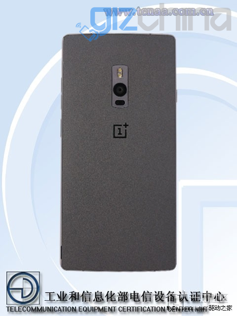
This is the leak that OnePlus 2 fans have been patiently waiting for! The first sighting of the OnePlus 2 on China’s TENAA network approval site.
TEANAA is the place all phones hoping to go on sale go to be approved for network usage. A phone sighted at TENAA is usually very close to going on sale and is photographed from all side giving us an early look at an upcoming model.
According to Chinese site MyDrivers, the OnePlus 2 recently showed up on the mobile site of TENAA showing us a phone which looks similar to the original OnePlus phone but the addition of a few new features.
What we see in the images is a phone with the sale overall shape as the OnePlus One but the addition of a physical home button. The button is an oval similar to the Meizu MX5 and will house a fingerprint scanner.
The rear of the phone shows very little has changed on the OnePlus 2 other than the location of the camera and dual flash which now live closer to the middle of the phone.
The site doesn’t go in to full details of the screen size or resolution etc however, and upon studying the TENAA database ourselves we couldn’t find any mention of the anticipated flagship. This could mean that TENAA have since removed the listing or that the images are fake, I’m hoping the latter as the OP2 in the photos is the ugliest device I have ever set eyes on!
OnePlus will launch the OP2 soon with Snapdragon 810 processor, 4GB RAM, dual SIM, USB Type C, 3300mAh battery and fingerprint scanner. Keep posted to Gizchina for more details.
Follow Gizchina.com on Google News for news and updates in the technology sector.

Lol, seriously? those images are so fake I can’t stop laughing 😀
The smarter part of the shop is the Home button: so sam-ish! I wish they made it round, just to be more hype.
That thing, it’s fugly. No way around it.
front fingerprint like MX5?? WOOOOW
Surely the real thing can’t be this ugly… It’s like 100 steps backwards from the OnePlus One!
What the hell is going on with the Camera placement almost in the middle lol!
Not just that but the camera looks upside down, how often do you see the flash on top of the lens. More of aesthetics than anything else but just doesn’t look right.
to be honest, if the phone gets released with the camera like that, the meaning behind it is because it’s literally more camera centric and the left sidebutton could be a camera button
It’s a design choice. It’s not any more or less camera centric than the flash being on the bottom, left or right. The whole purpose of a flash is to provide light for the sensor when little or none exists. It doesn’t provide any more light by being on the top.