It’s a ZUK kind of day today, with leaks from the company CEO, confirmed launch dates and now TENAA documents leaking more details of the phone.
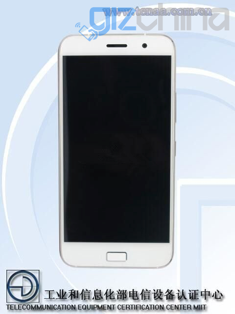
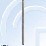
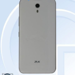
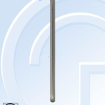
The ZUK Z1 has been spotted at the Chinese Ministry of Communication where it has received network approval. In the database listing, we get to see the flagship Z1 front, back and side for the first time revealing the final shape and a physical home button.
If we compare the ZUK Z1 to the most recent OnePlus 2 Tenaa leaks, then it is fair to say the Lenovo based start-up have done a better job of the design, however it isn’t as flashy or “look at me”as we had thought it might.
From the front the ZUK Z1 could almost be mistaken for the iPhone 6 if not of the rectangular home button on the chin. The button also contains a fingerprint scanner and supports U-Touch gesture control for navigating though the Android 5.1 based OS.
The body appears to be a unibody construction and is rather thin, yet contains a battery of 4100mAh. Another interesting detail is the Z1 will use a Snapdragon 808 chipset which is a 6 core SoC with 2 x Cortex A57 ad 4 X Cortex A53 cores. In comparison to the Snapdragon 810, tests have found that the 808 runs much cooler than the 810.
3GB RAM and 64GB internal memory will come as standard on the phone, which also has full network dual SIM support and USB Type C 3.0.
The alloy and glass ZUK Z1 will be officially unveiled in Beijing on 11th August with an International launch event being held on 21st August in Shenzhen.
Follow Gizchina.com on Google News for news and updates in the technology sector.





Arrrrrrrgh! NO, not that TEENA stuff again!!
Why do people still use that fugly physical button! Noooooooooooooooooo!
For convenience purposes I suppose. Also, to integrate the fingerprint button in it too.
I prefer the physical home button on the phone and as Michael pointed out it makes the fingerprint sensor easier to operate.
it’s definitely ruining the phone’s look and feel imho:
1) it looks like Apple, Samsung, Meizu aso… but for another purpose.
2) it ruins the smoothness and flatness of the front side, and ruins every effort made for speakers, proximity sensor, aso
3) it makes the large bottom bezel mandatory.
Definitively a no-go!
Some other makers were smart enough to put it on the back side, along with the camera, flash…
I do hope that one day the technology will allow to put the fingerprint sensor “inside” the glass of the screen…
I have a Lenovo k3 note and having to double tap the thing to wake it is annoying. Sometimes it works, sometimes it doesnt. Then if I want security I have to enter a pin as well, a home button with a fingerprint scanner makes much more sense in my opinion.
I understand although I disagree.
Personally I prefer bezels on phones, I hate the all screen look. But we all have different opinions. Plus I am just old fashioned and love to have psychical buttons to actually press.
Sure, hopefully we’re all different, to mix the genes :p what I dislike is the ‘mix’ of different technologies and interfaces, when there can be only one. ‘hybrid’ doesn’t sound right in this case, imho.
No bezels means more screen but the phone stays the same. Or smaller with same size screen. Al screen phones no bezels no buttons is the fhture
I realize that. But to me no bezels means an ugly phone. I like my bezels even if they are very small, I still prefer them. I don’t think it is the future, I think some phones will adopt that look others will still have bezels. Look at TV’s, the bezel-less display has been available for years now and still not every manufacturer uses it.
Completely agree with you about aesthetics and as I said before what people also don’t realise is that on a big phone a front fingerprint scanner is harder to press with your thumb with one hand than having one on the back. When it is on the front and the phone is 5.5 inches + you have to almost invert your thumb down to press it and hold the phone right at the very bottom which is very unnatural.
Completely agree with you about aesthetics and as I said before what people also don’t realise is that on a big phone a front fingerprint scanner is harder to press with your thumb with one hand than having one on the back. When it is on the front and the phone is 5.5 inches + you have to almost invert your thumb down to press it and hold the phone right at the very bottom which is very unnatural.
The devices always look worse on tenaa look at the s6,one m9 on tenaa and now look at them in real life.

Mostly what concerns me now are the processors
The exynos one which is used in s6 is just phoney crap for high antutu scores. Real life performance is like sd810 which overheated (at least it does.Not overheat) And gaming is even worse… The gpu is like real meh
sd 808 looks like is the king of the hill in real life performance maybe mediatek will save us and someone will make a helio x20 device.
Sd 820 overheats judging by the leaks
Pisses me off so much that stupid F**king button. What people also don’t realise is that on a big phone a front fingerprint scanner is harder to press with one hand than one on the back.
Pisses me off so much that stupid F**king button. What people also don’t realise is that on a big phone a front fingerprint scanner is harder to press with one hand than one on the back.
All these tenaa leaks!! http://www.amazon.co.uk/TENA-Pants-Super-Large-Packs/dp/B0084D25KS
get an iPAD!
its standard tenaa procedure, leaks my microsoft surface pro lol
(microsoft surface pro = the word I substituted it for)
That’s even worse than i expected design wise(that button must have been designed in Minecraft). Thought the design would be more youthful and dynamic but they went with feminine and washed out roadkill . It’s like an iphone user was trying to make the same thing but different and ended up with less when the goal was very low to begin with anyway. As for SD808, well it’s slower and missing features vs 810 so it’s also worse but at least it should be a bit cheaper.
At some point i kinda hoped that it would be the rumored Vibe X3 ( a bit bulky but not too much and with a reason- assuming it wouldn’t have black bands ofc) http://cdn.gsmarena.com/vv/newsimg/15/02/lenovo-vibe-mwc/gsmarena_003.jpg
That’s pretty
Yeah it is but would be much better without the capacitive buttons and a smaller upper bezel, with the screen lit chances are it becomes more obvious . Still Lenovo was getting much better at design and buying Moto was a big plus design wise too so i had high expectations from their lineup this year.
SD 808 is worse than 810 on paper but in real world performance it is much better, it does’t suffer from any of the problems that plague the 810.
So it won’t breath fire anymore? Why did they still call it a snapdragon then?
lol
Yeah keep telling yourself that lol. Maybe this basic comparison for 2 cores load helps you
http://cdn.arstechnica.net/wp-content/uploads/2015/04/Snapdragon-808-throttling.001.png
I dont need to tell myself that , anyone who has used a device with both SoC’s has already said it.
You are clueless, they can’t even run a single big core at max clocks for long., At 1.6GHz for the big cores the thing would be almost ok
You are beyond clueless run both of them side by side, the 810 throttles so badly the performance is horrible on it. The 808 has sustained performance with no throttling.
You must be a republican. No matter what the evidence you keep going with your lie.
You must know your wrong which is why your trying to change the subject. There have been countless tests done pitting the 808 equipped G4 against every new 810 device released. And over a sustained period of time the 808 is said to be faster in actual usage. You also don’t need fire proof gloves to hold it.
Yeah fire proof gloves are mandatoy with a 810!! The fire that dragon can breath when it snaps is really hot!
Well i have the s6 and i fckin hate it bad bad bad battery . Touchwiz still fked up as hell using most of its Ram and the Antutu points scored by the exynos are just phoney – The device performs meh itself (at least doesnt overheat) all the reviews all bulls##t the s6 is a glorified piece of crap The camera is great tho.My friend has the Lg g4 and now i put my phone one sale at our local craiglist type site .I want the lg g4 but its UX sets me off so i want to see the chinese variants first – Also i need great audio
Im just Angry now because i made such a bad decision using that
S6 is horrible on battery thanks to that tiny battery and 2k screen.
I would urge you to research the battery life for the G4 vs the S6 before buying it. Just find sites that actually test the battery life for both. Just because the G4 has a bigger battery, it doesn’t mean it lasts longer. Ofc it also depend on your usage. You could try to optimize things on the G6, from a black wallpaper that saves power to what features you can turn off most of time. But, again, research the battery life for the G4 on sites that actually test it with numbers.
Edit: went and found 2 quick link for you but dig some more just to be sure
http://www.trustedreviews.com/opinions/which-phone-has-the-best-battery-life
http://www.gsmarena.com/lg_g4_vs_galaxy_s6-review-1266p3.php
Sorry sold
Well at least its better than 1+2 design wise (not the front tho’)
well people liked the one plus one, I am guessing its not that you find it igly but are dissapointed it isnt different
Im sorry i mean the newly baked 1+ 2 (tenaa rendered at least…)
Not doing it for me…
The back and sides look nice but that front is so ugly. I already hate the person that brought the fingerprint scanner to smartphones, it completely ruins the design of most phones and we did perfectly fine without. I personally don’t mind entering my PIN code or pattern to unlock my phone.
Lenovo designed some of the best looking smartphones around. I was expecting a better and also original design.
Puting it together with that render which shared by CEO of ZUK, clearly it’s heavily influenced by the iPhone 6.
To make it differentiated they centerly aligned the back camera and changed the shape of fingerprint scanner. At first look I have the impression that two things seems not quite fits the overall design. It could be just unfamiliarity.
As a rule TENAA pics looks bad comparing to actual device.
Judging by the render its back material is either glossy plastic or glass. I imagine in that case it’s made of glass actual device wouldn’t look bad.
Metal frame looks somewhat thin but it’s impossible to be sure without knowing at least display size. I heard it’a 5.5 incher though I’m not sure whether or not it’s true. Considering it contains a 4000 mAh battery it’s not bulky at all. Also back camera right behind display and despite that it seems not protruding. Assuming it’s really thin, these two things gave me the impression of OLED display.
I don’t see anything even close to resembling the Iphone 6 based on the render above.
I can see it at the grill, USB port, rounded thin metal frame, elongated top and bottom and fingerprint scanner positioning.
guess im in the minority. i think it looks great and i think the sd808 will be great as well.
now i want to know how much it will be in the US and will it get 4G in the US?
This, zuk z1, or lg g4… Hhhhmmmm…..
Those TEENA pics never really do any phone justice…