It’s a ZUK kind of day today, with leaks from the company CEO, confirmed launch dates and now TENAA documents leaking more details of the phone.
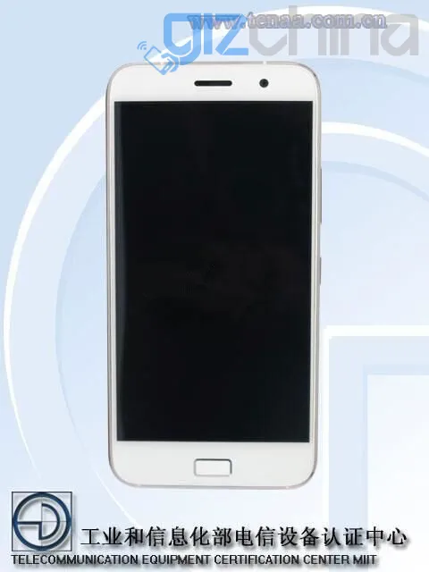
The ZUK Z1 has been spotted at the Chinese Ministry of Communication where it has received network approval. In the database listing, we get to see the flagship Z1 front, back and side for the first time revealing the final shape and a physical home button.
If we compare the ZUK Z1 to the most recent OnePlus 2 Tenaa leaks, then it is fair to say the Lenovo based start-up have done a better job of the design, however it isn’t as flashy or “look at me”as we had thought it might.
Gizchina News of the week
From the front the ZUK Z1 could almost be mistaken for the iPhone 6 if not of the rectangular home button on the chin. The button also contains a fingerprint scanner and supports U-Touch gesture control for navigating though the Android 5.1 based OS.
The body appears to be a unibody construction and is rather thin, yet contains a battery of 4100mAh. Another interesting detail is the Z1 will use a Snapdragon 808 chipset which is a 6 core SoC with 2 x Cortex A57 ad 4 X Cortex A53 cores. In comparison to the Snapdragon 810, tests have found that the 808 runs much cooler than the 810.
3GB RAM and 64GB internal memory will come as standard on the phone, which also has full network dual SIM support and USB Type C 3.0.
The alloy and glass ZUK Z1 will be officially unveiled in Beijing on 11th August with an International launch event being held on 21st August in Shenzhen.
[ Source ]
Arrrrrrrgh! NO, not that TEENA stuff again!! 😀
Why do people still use that fugly physical button! Noooooooooooooooooo!
For convenience purposes I suppose. Also, to integrate the fingerprint button in it too.
I prefer the physical home button on the phone and as Michael pointed out it makes the fingerprint sensor easier to operate.
it’s definitely ruining the phone’s look and feel imho:
1) it looks like Apple, Samsung, Meizu aso… but for another purpose.
2) it ruins the smoothness and flatness of the front side, and ruins every effort made for speakers, proximity sensor, aso
3) it makes the large bottom bezel mandatory.
Definitively a no-go!
Some other makers were smart enough to put it on the back side, along with the camera, flash…
I do hope that one day the technology will allow to put the fingerprint sensor “inside” the glass of the screen…
I have a Lenovo k3 note and having to double tap the thing to wake it is annoying. Sometimes it works, sometimes it doesnt. Then if I want security I have to enter a pin as well, a home button with a fingerprint scanner makes much more sense in my opinion.
Personally I prefer bezels on phones, I hate the all screen look. But we all have different opinions. Plus I am just old fashioned and love to have psychical buttons to actually press.
Sure, hopefully we’re all different, to mix the genes :p what I dislike is the ‘mix’ of different technologies and interfaces, when there can be only one. ‘hybrid’ doesn’t sound right in this case, imho.
No bezels means more screen but the phone stays the same. Or smaller with same size screen. Al screen phones no bezels no buttons is the fhture
I realize that. But to me no bezels means an ugly phone. I like my bezels even if they are very small, I still prefer them. I don’t think it is the future, I think some phones will adopt that look others will still have bezels. Look at TV’s, the bezel-less display has been available for years now and still not every manufacturer uses it.
Completely agree with you about aesthetics and as I said before what people also don’t realise is that on a big phone a front fingerprint scanner is harder to press with your thumb with one hand than having one on the back. When it is on the front and the phone is 5.5 inches + you have to almost invert your thumb down to press it and hold the phone right at the very bottom which is very unnatural.
The devices always look worse on tenaa look at the s6,one m9 on tenaa and now look at them in real life.
Mostly what concerns me now are the processors
The exynos one which is used in s6 is just phoney crap for high antutu scores. Real life performance is like sd810 which overheated (at least it does.Not overheat) And gaming is even worse… The gpu is like real meh
sd 808 looks like is the king of the hill in real life performance maybe mediatek will save us and someone will make a helio x20 device.
Sd 820 overheats judging by the leaks
🙁
Pisses me off so much that stupid F**king button. What people also don’t realise is that on a big phone a front fingerprint scanner is harder to press with one hand than one on the back.