Elephone have released real photos of their Elephone M3 Pro model, but is it as handsome as the previous renders promised.
I know it is hard to keep up with Elephone and their phones, so to recap the Elephone M3 is meant to launch in both standard M3 Spec and high-end Elephone M3 Pro, Update: Elephone say the high-end version will not be called the M3 Pro, just simply M3.
Physically both phones will share the same aircraft grade alloy chassis, rose gold colour options and rear fingerprint scanner but hardware specifications of each phone will differ slightly.
Elephone M3 and M3 Pro
Then base model Elephone M3 will ship with 2GB RAM, 16GB internal memory and 13 mega-pixel main camera, while the high-end Elephone M3 Pro will have 3GB RAM, 32GB memory and 21 mega-pixel Sony IMX230 rear camera.
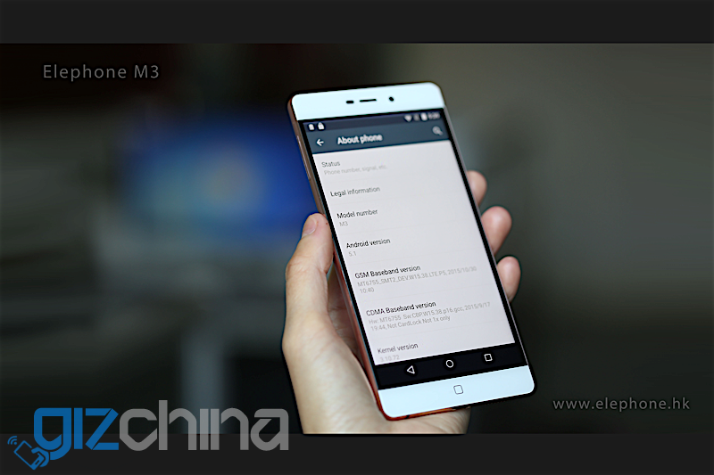
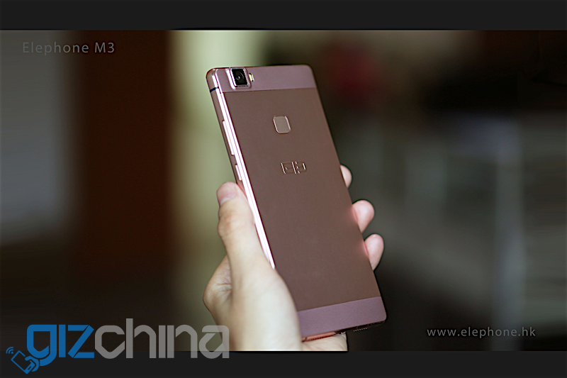
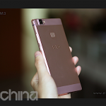
Previously the only visual evidence of the phones were renders that showed a metal phone with slim body not too different from the Elephone M2, and in turn current Oppo phones, but real photos of the phone show a slightly thicker design
From the front the M3 has a black border around the screen and we also see that this version has onscreen buttons. Usually development phones show on screen buttons while production models use capacitive buttons and we believe that this is the case here.
The photo showing the rear of the phone actually shows a phone that is slightly thicker than we were previously hoping for. The Elephone M3 has a metal body, but it looks like there is an additional bulge on the rear and the camera also protrudes slightly. Hopefully this means a huge battery is inside, or it is simply a trick of the light.
Other photos show a stock Android install (which we hope the phone ships with rather than Ele UI) and a settings page photo shows the phone running Android 5.1, however an Android 6 M update is promised.
What do you think of the latest all metal phone from Elephone? Are there any features you hope this phone will come with?




On-screen buttons, and bellow them there is a home button? Stupid.
thats ELEPHONE for u
As was mentioned in the article the on screen buttons are just there for the development stage.
Kinda expected. Thanks for info.
Without the onscreen buttons I reckon it looks ok actually…
well , those black borders are back -_-
Same as on the M2. They are not huge. You won’t see them on the black version.
i thought m2 OR m1 dint have those ?!
and duh , the BLACK is for hiding those :p
Phones always had the bezels, they just used to be white on white phones so you can not see them. Actually those black bezels make devices look smaller. I’ve got a black and golden M2 here and the golden one looks much smaller.
Correct i have the black M2 and can’t see them at all!
When you look at the edges with a close up it looks like a Photoshop job…
It’s been Photoshopped to get that background blur, not natural bokeh. But you have to assume all marketing material will go under the mouse.
Im referring to the edges of the screen.
It’s not 100% parallel on the top for example.
Sure I know. The whole things Photoshopped. Probably a non-working dummy or running a different ROM to intended.
i want more elecrap to keep in my garbage bin
“Real promotional” Photos that all look photoshopped.
they are. you can clearly see it at the each photo on the lower right side of the phone. it looks like the m1 or m2 shopped to look like a m3.