Yesterday we reported how UMi had created a phone from the features that users chose through their Apollo Project. Today, slightly tweaked details of the UMi Touch have arrived with the first official image.
If you missed the news yesterday let me quickly fill you in. UMi set up a questionnaire asking fans to choose hardware parameters so that the first ‘user defined’ smartphone could be created. The result of the project is the UMi Touch, an all metal phone that will be financed through a crowd funding event.
UMi Touch first look and specs
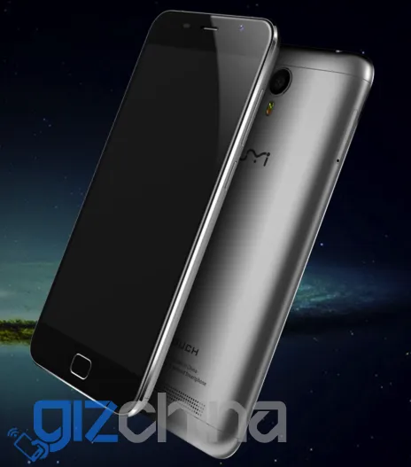
The UMi Touch seems to be moving through development quickly with an update to the specifications today and the first official image of the phone.
Gizchina News of the week
The slight changes are the phone will come with a 3900mAh battery (before a rough idea of the battery size was all we had), and that the phone will cost $149.99. The $99 price tag will be for people who chose to pay $1 and become an ‘Apollo Partner’.
Other hardware (octacore Mediatek, 3GB RAM, 16GB memory, 5.5-inch display, etc) is the same as previously mentioned, and now with an image of the phone we can see exactly what the front facing fingerprint scanner is going to look like.
The render shows that the full metal unibody design of the UMi Touch closely resembles the Meizu MX5, with the only notable difference being the speaker grill on the rear and lack of laser auto focus.
UMi will begin the $1 crowd funding on the 20th January and have already set up a subscription page for follows to take part.
Will you be funding this project? Is an MX5 clone what people had in mind as a ‘user defined’ phone?
Personally I’m not a fan of this design but it’s not the main problem. Thing is – it already exists, Meizu uses it, Xiaomi uses it, there’s no need to use it again. UMI has their own decent design like in the Iron (ok, slightly inspired but still fairly original), they should stick to it.
There’s only so much you can do with a metal phone. Nearly all of them look alike.
Definitely not, there are many different designs.
Not really almost every metal phone follows the same exact design trend, the only differences usually is the camera/speak placements.
iPhone 6, HTC One M8, Samsung A series (2015), Huawei P8, Honor 7, Meizu/Xiaomi – they all look completely different. UMI Touch looks exactly like Meizu/Xiaomi, it’s basically identical.
Completely different? Not even close, Every single one of those phones shares the same base design (started by the HTC One M7) with very little evolution. The only differences in any of those phones you mentioned is camera placement and logos.
Every phone is rectangular with more or less curved edges. Does it mean that all phones are the same? No. Don’t tell me that this:
http://androidphonehub.com/wp-content/uploads/2015/04/Huawei-p8-Back-1000×664.jpg
Looks like this:
http://g02.s.alicdn.com/kf/HTB1raI0IpXXXXbOXFXX760XFXXXY/original-5-5-meizu-mx5-Helio-X10.png
Because it simply doesn’t. On the other hand, here’s Meixu vs. Xiaomi:
http://miworldnow.com/wp-content/uploads/2015/07/16-150FG05R2145_meitu_8.jpg
Identical. Shapes, curves, details. UMI Touch is going to be the third company to share identical design.
There is very little major difference between any 3 of those. The Huawei has the tops painted white instead of silver and the camera is in the top instead of the middle. Other than that it’s the same base design as is the HTC, iPhone and every other metal phone. They have subtle differences but they all have the same base design.
Are you blind? Huawei is more rectangular, flat, edges are sharp (not rounded), different frames, glass element on the top with flat, rectangular camera “eye”. Meizu has neither of those!
Again those are all cosmetic and minor differences.
They’re not, they make it look completely different. Just look at the pictures I posted. The fact thet they’re made of the same material doesn’t make them look the same.
Another useless 6753 device that does nothing more than all the rest at around the 150$ mark.