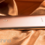
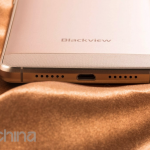
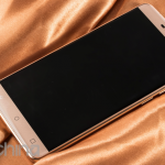
Blackview will be at MWC 2016 with an all new flagship model called the Blackview R7, here are exclusive images and full specifications of the new all alloy device.
Blackview plan to use their presence at MWC this year to really boost awareness of their brand by launching a new flagship smartphone called the Blackview R7. The phone features similar high-end features to rival phones, and is expected to go on sale in April.
Blackview R7 Full Specifications
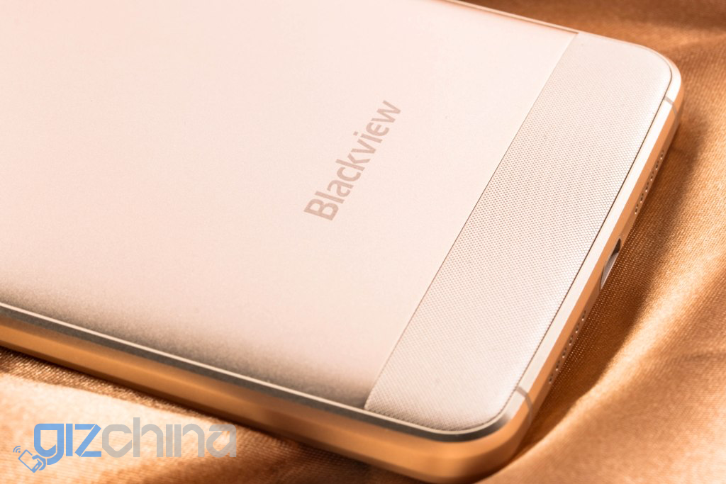
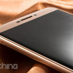
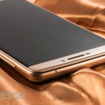
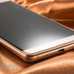
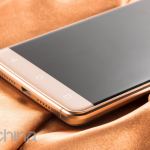
The R7 will be the first Blackview phone to feature an all alloy body and be one of the new breed of Chinese phones with a borderless 2.5D screen design.
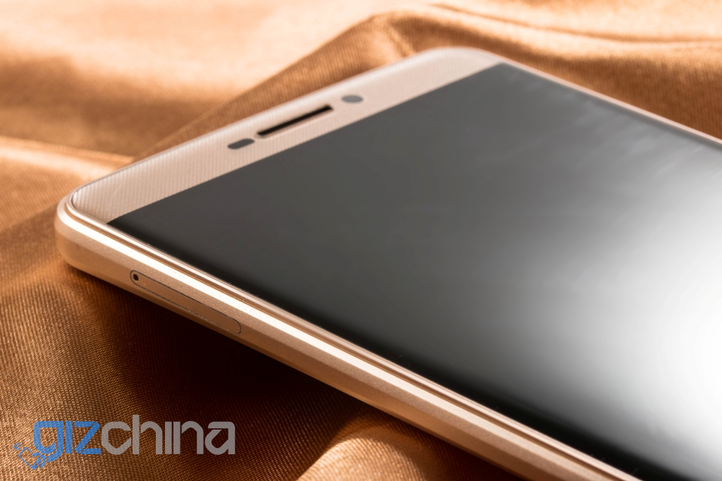
Blackview haven’t been lured in to the 2K bandwagon and have kept the 5.5-inch display a 1920 x 1080 FHD one. This is perfectly fine for us, and should mean that the Mediatek Helio P10 chipset and 4GB RAM are breathing freely for optimum performance.
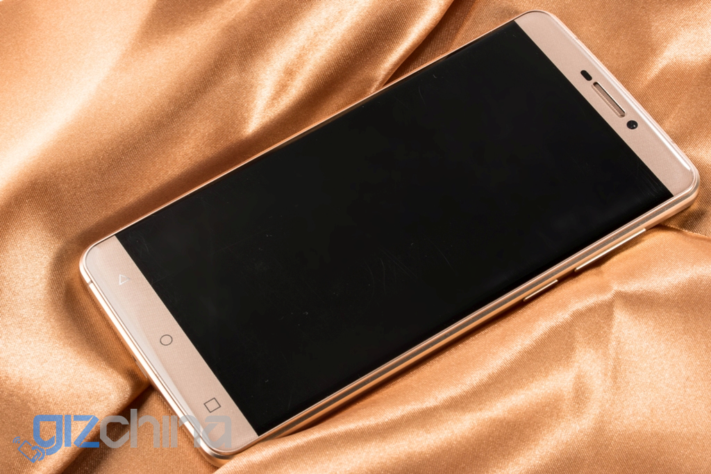
The phone will feature internal storage of 16GB and will also support 128GB SD cards. A 3500mAh battery is also built-in and like all 2016 flagships should, the Blackview R7 has 9V 2.5A fast charging.
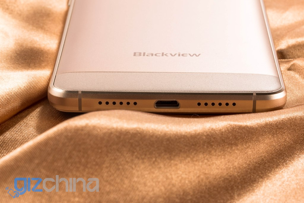
Camera’s on the R7 are 5 mega-pixel on the front and a 13 mega-pixel Samsung 3M2 sensor on the rear. Blackview seem to have a good relationship with Samsung and has used the 3M2 on a few of its devices so far.
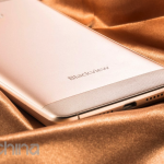
Last but not least the Blackview R7 will have a rear fingerprint scanner and a gold finish option. Pricing isn’t announced at this time.
Blackview R7 Highlights
- Borderless design
- 5.5-inch FHD display
- Fingerprint scanner
- Fast charging
- Helio P10 chipset
- 4GB RAM
- Supports 128GB SD cards
Blackview R7 Gallery
We’ll try to be first with a hands on with the Blackview R7 once we get to MWC next month. For anyone wanting a Blackview phone now but doesn’t want to wait then the Blackview Omega Pro is on sale now, and we will have a review of it soon.
Follow Gizchina.com on Google News for news and updates in the technology sector.




Whyyyyyy? Why they have to spoil everytime? Those ugly icon spaces)
because they are the ones google standardized for their android system. and i like them. they are clean and easy to get.
or did you mean the space between the icons? but then, what is ugly about them?
Same here, it’ annoying, that almost 99,9% chinese phones are using wrong layout psychical buttons. I prefer only onscreen buttons, like Nexus, Sony etc haves – clean and native Android.
It goes out to preference. I like any option that gets to be outside the screen, Just in case the screens breaks I can do at least something until I get a new one.
I like that it doesn;t take up screen space. Phonearena did a test on this, the 6 inch Nexus 6 has about 5.6″ of usable screen space, the onscreen buttons take up the rest.
99%? Maybe 3-4 years ago but most Chinese phones these days have ditched the traditional 3 physical buttons. Personally I love the way Meizu has done it. They have one physical button which serves as the fingerprint reader, home button (click) and back button (swipe).
I rephrase, I meant not psychical buttons, like iPhone, Samsung and Meizu have one button, but these static capacitive buttons below screen, which are wrongly placed (back and menu are swapped) and the painted icons are also horrible and sometimes without back light. OnePlus X have also capacitive buttons below screen, but they are invisible, without any icons and they can be switched off and used only onscreen buttons.
I know the buttons you were referring too, the 3 typical Android buttons like on this phone. But most Chinese phones these days don’t have these anymore. Most either use one screen buttons or they have the type I was referring too.
Because reducing your effective screen size with “onscreen buttons” while wasting the whole space beneath a phones display makes totally sense…
Hmm, lets then add static buttons to computers LCD display too? Anyway, it’s called touchscreen, not static screen. Softkeys is possible to hide, but how to hide static keys? Or suggestion 2, lets all extra small screen below to the main screen, and users can use eny style and any position buttons there.
I was talkin about spaces between icons. They are too separated. You’ll have to use some ninja hand techniques to reach far icon with one hand and the closest is a hard one too. Even if the touch zone is wide you’ll always point to center of it
Looks almost like the gold redmi note 3.
Helio p10 is mid range chip
Yes, but that’s all lesser companies can afford, so their flagships (at least for the first half of the year) will spot this upper mid range chip (which probably can still support everyone of us through every daily task, as long as rom isn’t a complete mess)
isnt it better than x10?
Depends of the use/aplication you will have for it.
Based on early benchmarks it is slower:
Geek Bench:
P10 – 882 (single), 3371 (multi)
X10 – 905 (single), 5154 (multi)
For 2016 Mediatek’s lineup should look like this(not counting the new 3G only chips, or reported variations of chips like X22):
MT6735/53 – budget
P10 – upper budget/lower midrange
X10 – midrange
X20 – lower flagship
X30 – flagship
based on this analysis , i’ll keep my eyes glued for the CHEAPEST P10 phones
Yea if these benchmarks are true it will be a very good midrange chip.
I really don’t care about the benchmarks
It’s only numbers…the real thing is the users
I want u to do one thing…
Dwonload any video from the youtube
And try it with letv le 1s if u have it
And compare it with any flagship with the same video u will see the different clearly
The ClrearMotion is the reason
Don’t have a LeTV
its LATER than x10 but certainly not better … more like a safe all rounder rather than a power player.
Helio x10
Video recording at 480 frames per second with 1/16th speed slow-motion playback
120Hz smartphone display support
H.265 Ultra HD 4K2K video encoding at 30 fps
120Hz FHD display technology
And best feature called clearMotion
This feature is amazing make the media more smooth and more colorful
Helio p10
Display Layer FHD 1920×1080 w/ 12 Blending
21MP@24fps / 16MP@30fps w/ ZSD Dual ISP w/improved 3A/denoise/ demosaic/sharpness
Who is better now?
Thats up to benchmark, not marketing gimmick features
So? They are talking this company’s flagship and not above all flagship if that’s the SoC they can afford well then get used to it. Any ways I think I will keep looking around for my next phone as this sure isn’t it.
now now … lets give blackview a chance , wait for the review … don’t write off any thing without being a 3rd party observer to a rigorous review.
as for the flagship argument , i agree. it depends on the company’s purchasing power to gauge what they take as their flagship specs.
There are two holes on every side of the camera… One is for the flash, but the other?
However I like the design, i don’t like the probably-hidden thick black bezels (i’d rather real bezels more than black ones) and the lack of ir…
I’m wondering if this can be their new start: after the blackview crown (which was a honest-but-good mt6592 device) they kinda lost their track… Meybe this can be as good as crown was for its time
Could be laser focus gizmo.
It could, but like i said to balco: why didn’t they tell it straight in the specs sheet?!
Probably laser focus.
gonne be good !
It could be (i was thinking the same actually), but then why they didn’t pointed that out on the specs sheet?! It’s a nice plus after all, can’t understand why they didn’t highlighted that one
Whyyyyyy? Why they have to spoil everytime? Those ugly icon spaces)
because they are the ones google standardized for their android system. and i like them. they are clean and easy to get.
or did you mean the space between the icons? but then, what is ugly about them?
Same here, it’s very annoying, that almost 99,9% chinese phones are using wrong style and wrong layout psychical buttons. I prefer only onscreen buttons, like Nexus, Sony etc haves – clean and native Android.
It goes out to preference. I like any option that gets to be outside the screen, Just in case the screens breaks I can do at least something until I get a new one.
99%? Maybe 3-4 years ago but most Chinese phones these days have ditched the traditional 3 physical buttons. Personally I love the way Meizu has done it. They have one physical button which serves as the fingerprint reader, home button (click) and back button (swipe).
I like that it doesn;t take up screen space. Phonearena did a test on this, the 6 inch Nexus 6 has about 5.6″ of usable screen space, the onscreen buttons take up the rest.
I rephrase, I meant not psychical buttons, like iPhone, Samsung and Meizu have one button, but these static capacitive buttons below screen, which are wrongly placed (back and menu are swapped) and the painted icons are also horrible and sometimes without back light. OnePlus X have also capacitive buttons below screen, but they are invisible, without any icons and they can be switched off and used only onscreen buttons.
I know the buttons you were referring too, the 3 typical Android buttons like on this phone. But most Chinese phones these days don’t have these anymore. Most either use one screen buttons or they have the type I was referring too.
I was talkin about spaces between icons. They are too separated. You’ll have to use some ninja hand techniques to reach far icon with one hand and the closest is a hard one too. Even if the touch zone is wide you’ll always point to center of icon. I use Oneplus One and it’s a pain with my hand with such icon spaces. In my picture i’ve edited the icons space, compare it to original article photo). As for me Xiaomi Redmi Note 2 uses the perfect outlook and spaces for off-screen buttons IMHO. But they are red unfortunetly. On Redmi Note 3 they are badly aligned by vertical, closer to upper border under the screen
Because reducing your effective screen size with “onscreen buttons” while wasting the whole space beneath a phones display makes totally sense…
Hmm, lets then add static buttons to computers LCD display too? Anyway, it’s called touchscreen, not static screen. Softkeys is possible to hide, but how to hide static keys? Or suggestion 2, lets all extra small screen below to the main screen, and users can use eny style and any position buttons there.
Looks almost like the gold redmi note 3 with minor changes.
Helio p10 is mid range chip
Yes, but that’s all lesser companies can afford, so their flagships (at least for the first half of the year) will spot this upper mid range chip (which probably can still support everyone of us through every daily task, as long as rom isn’t a complete mess)
isnt it better than x10?
Depends of the use/aplication you will have for it.
So? They are talking this company’s flagship and not above all flagship if that’s the SoC they can afford well then get used to it. Any ways I think I will keep looking around for my next phone as this sure isn’t it.
Based on early benchmarks it is slower:
Geek Bench:
P10 – 882 (single), 3371 (multi)
X10 – 905 (single), 5154 (multi)
For 2016 Mediatek’s lineup should look like this(not counting the new 3G only chips, or reported variations of chips like X22):
MT6735/53 – budget
P10 – upper budget/lower midrange
X10 – midrange
X20 – lower flagship
X30 – flagship
its LATER than x10 but certainly not better … more like a safe all rounder rather than a power player.
based on this analysis , i’ll keep my eyes glued for the CHEAPEST P10 phones
now now … lets give blackview a chance , wait for the review … don’t write off any thing without being a 3rd party observer to a rigorous review.
as for the flagship argument , i agree. it depends on the company’s purchasing power to gauge what they take as their flagship specs.
now now … lets give blackview a chance , wait for the review … don’t write off any thing without being a 3rd party observer to a rigorous review.
as for the flagship argument , i agree. it depends on the company’s purchasing power to gauge what they take as their flagship specs.
Yea if these benchmarks are true it will be a very good midrange chip.
Helio x10
Video recording at 480 frames per second with 1/16th speed slow-motion playback
120Hz smartphone display support
H.265 Ultra HD 4K2K video encoding at 30 fps
120Hz FHD display technology
And best feature called clearMotion
This feature is amazing make the media more smooth and more colorful
Helio p10
Display Layer FHD 1920×1080 w/ 12 Blending
21MP@24fps / 16MP@30fps w/ ZSD Dual ISP w/improved 3A/denoise/ demosaic/sharpness
Who is better now?
I really don’t care about the benchmarks
It’s only numbers…the real thing is the users
I want u to do one thing…
Dwonload any video from the youtube
And try it with letv le 1s if u have it
And compare it with any flagship with the same video u will see the different clearly
The ClrearMotion is the reason
Don’t have a LeTV
Don’t have a LeTV
Thats up to benchmark, not marketing gimmick features
There are two holes on every side of the camera… One is for the flash, but the other?
However I like the design, i don’t like the probably-hidden thick black bezels (i’d rather real bezels more than black ones) and the lack of ir…
I’m wondering if this can be their new start: after the blackview crown (which was a honest-but-good mt6592 device) they kinda lost their track… Meybe this can be as good as crown was for its time
Could be laser focus gizmo.
Probably laser focus.
gonne be good !
gonne be good !
It could be (i was thinking the same actually), but then why they didn’t pointed that out on the specs sheet?! It’s a nice plus after all, can’t understand why they didn’t highlighted that one
It could, but like i said to balco: why didn’t they tell it straight in the specs sheet?!
you do know what “exclusive” means, right? it means you are the only one getting the information and others take them from you. but those pictures and specs are all around various other sites for more than 20 hours, aka more than 13 hours before your post.
this comment got deleted. bravo.
Is it really “borderless” or does it have 2 inch thick black lines around the screen, like most of these “borderless” phones we see.
Well, the article says ‘borderless DESIGN’, so: yup, black lines
I dig it. And I like the nexus style capacitive buttons. I really like where blackberry is going with this one…
Just kidding. If everything runs smooth then could be a sweet midrange daily beater. Slick style. Hopefully runs decent.
stewie !
This shit is beautiful, more beautiful than my Letv 1S. I hope it has decent camera and speaker
this is brilliant on paper and in theory … BUT
its needs to have a price that’ll fish for customers non-stop.
that way , they can create some brand loyalty and good brand awareness !
looking forward to it !
Get ready for the budget flagship wars are coming again, courtesy of the Helio P10.
There will be lots of great phones for around 170$ coming out in the next two months.
Just pick the best built quality and camera out of the reviews and you are good to go.
I got my Flex 2 yesterday, so I`m all set this year, next phone might be the Honor 8(when it eventually comes out with the Kirin 950 and half the price of the P9 and Mate 8)
you do know what “exclusive” means, right? it means you are the only one getting the information and others take them from you. but those pictures and specs are all around various other sites for more than 20 hours, aka more than 13 hours before your post.
this comment got deleted. bravo.
Is it really “borderless” or does it have 2 inch thick black lines around the screen, like most of these “borderless” phones we see.
Well, the article says ‘borderless DESIGN’, so: yup, it’s gonna have them black lines
I dig it. And I like the nexus style capacitive buttons. I really like where blackberry is going with this one…
Just kidding. If everything runs smooth then could be a sweet midrange daily beater. Slick style. Hopefully runs decent.
stewie !
This shit is beautiful, more beautiful than my Letv 1S. I hope it has decent camera and speaker
this is brilliant on paper and in theory … BUT
its needs to have a price that’ll fish for customers non-stop.
that way , they can create some brand loyalty and good brand awareness !
looking forward to it !
Get ready for the budget flagship wars are coming again, courtesy of the Helio P10.
There will be lots of great phones for around 170$ coming out in the next two months.
Just pick the best built quality and camera out of the reviews and you are good to go.
I got my Flex 2 yesterday, so I`m all set this year, next phone might be the Honor 8(when it eventually comes out with the Kirin 950 and half the price of the P9 and Mate 8)
why don’t they light up the display ?
Turn on the phone and you’ll find big bad frame around it hehehe….
why don’t they light up the display ?
Turn on the phone and you’ll find big bad frame around it hehehe….
its amazing, i like this phone (Blackview r7) have they announce the price of the phone please someone help
its amazing, i like this phone (Blackview r7) have they announce the price of the phone please someone help
189$ (at geekbuying) for 4Gb of RAM and Android 6 seems like a great deal.
189$ (at geekbuying) for 4Gb of RAM and Android 6 seems like a great deal.
$10 off coupon: $10BLACKVIEWR7
The Blackview R7 is official for $189, here’s the review: http://www.gadgetdetected.com/2016/07/blackview-r7-smartphone/
The Blackview R7 is official for $189, here’s the review: http://www.gadgetdetected.com/2016/07/blackview-r7-smartphone/