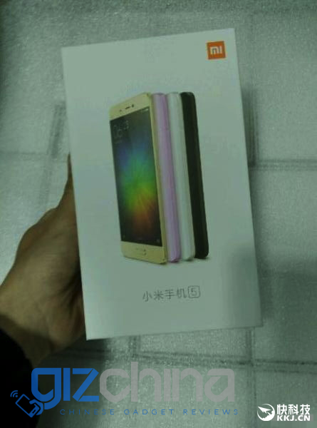
Mr blurry cam is back with more leaks this time with purported images of the Xiaomi Mi5 packaging which include a image of the new flagship.
Blurry low quality images of the Xiaomi Mi5 packaging have surfaced today showing the flagship phone in 4 colour choices. The phone on the packaging is pictured with a narrow border physical home button and curved rear panel (similar to the Xiaomi Mi Note).
The Mi5 is shown in gold, pink, white and black, but the grainy image and poor quality of the photos makes it hard to judge if they are genuine or not.
Earlier today Lei Jun posted a screenshot of the Xiaomi Mi5 showing the phone with NFC and dual SIM support, and a little later in the day it was revealed that the Mi5 would be on show at MWC later this month.

Yeah a real mystery I’d say.
I think is because those are uploaded to shitty forums that compress the images to save bandwidth.
the greenish tint makes and black outline makes me belive it was taken with some nv equipped camcorder or something
yea now i think it is one, i was at a factory tour of htc once in 2014 and one of their particular upcoming devices ( out of the re camera series) was photographed by a worker dude , at half of the day hakf of the or division were interogating him like a slave , he had an infrared camera in his button while we were walking through a dark room a manager saw his button being it up which started scandal in there
Hexadecimal did say the Vowney shots looked like they were professional shots. Now we know what he meant.
The question is why would Xiaomi change their stylish and ecologic plain cardboard packaging to this abomination?
I missed that, haven’t seen the packaging for newer models but it’s still a bad move in my opinion. Plain and compact cardboard packaging was part of their charm and it was a good example for other industries on how to lessen their ecologic impact by not wasting ink and space.
Personally the box isn’t huge for me, it’s what’s inside that matters to me. Although I do love the way Meizu packages phones with the “storybook” style package. Here is the Note 3 package:
Of course the product is what matters not the packaging but the old packaging was obviously stating the irrelevance of the packaging. After seeing and liking that style, this just gives me the feeling that they are becoming like the others and maybe they are trying to distract from the product with packaging.
While on the price/hardware front they are still ahead of most companies, I do feel that their designs are less and less outstanding and now the box change seems to further push the feeling that they need something else to catch attention because the product is not enough anymore.
This is coming from a fan, I like and have many of their products including the gamepad, extension cord, water tester and others…
To me the old packaging was boring and too plain, to each there own I guess.
Well everybody sees it in their own way. Same with LeTV… some people think LeTV was a silly name and LeEco is better, I think it’s the other way around.
There will never be a product that satisfies everybody 🙂
Yeah a real mystery I’d say.
I think is because those are uploaded to shitty forums that compress the images to save bandwidth.
the greenish tint makes and black outline makes me belive it was taken with some nv equipped camcorder or something
Maybe a spy camera?
Hexadecimal did say the Vowney shots looked like they were professional shots. Now we know what he meant.
You killed it.
yea now i think it is one, i was at a factory tour of htc once in 2014 and one of their particular upcoming devices ( out of the re camera series) was photographed by a worker dude , at half of the day hakf of the or division were interogating him like a slave , he had an infrared camera in his button while we were walking through a dark room a manager saw his button being it up which started scandal in there