Chinese phone maker Vernee is recently pretty active with their marketing campaigns because their first ever smartphone Vernee Thor have just entered the market and in our last article we covered its 99.99$ promo activity price.
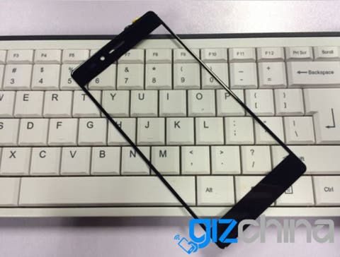
As you can on the pics scattered through the article Apollo is not going to be fully bezel-free but still the ultra thin 2mm bezel is very impressive. After all screen to body ratio about 80 percent is not bad for a 5.5 inch smartphone with 2k display resolution.
Follow Gizchina.com on Google News for news and updates in the technology sector.

Doesn’t really mean that the actual display will reach those bezels. Obviously I hope it does but let’s hope Chinese phone manufacturers have finally departed from the truly horrible “Ele-bezel” design where you have a screen within a frame.
I don’t mind bezels that are a bit larger but I personally HATE the display within a frame design (see Elephone P8000, Bluboo Xtouch, etc…).
Same here: better go for real bezels, at least it does not look that ugly once the screen is on!
Exactly. I’d prefer to have slightly thicker bezels than fake bezels that are clearly evident whenever the screen is on. But Chinese brands are certainly slowly moving in the right direction. As Assefa mentioned above, the Elephone P9000, S3, Ulefone Future, etc, are clearly evidence of this.
?? look how many chinese phones have walked away from the frame design in their models you mention the p8000 what about the p9000, the elephone s3?? ulefone future?? sure there is still some frames but it is a fact that the direction is going the slim bezels route
I absolutely agree with you my friend. I think I didn’t express myself properly — I absolutely commend Elephone, Ulefone, and any other brand that stepped away from that design feature which seemed to have been so prevalent, and I really, really hope that trend continues.
All I was trying to say is that I hope that Vernee does not adopt this outdated design with this specific phone because even though the frame on the digitizer is small and thin (as you can see from the pic in the article), does not necessarily mean that the actual display itself will extend all the way to the bezels on the digitizer, as we had seen previously with the phones I mentioned above.
Having said that (because I like thin bezels), I don’t think the “bezel-less” design is very smart either because it usually means that the robustness and structural integrity of the phone and it’s frame is usually somewhat compromised.
oh i understand you fully my wishes and commendations mirror yours. it is true that such a design language compromises structural integrity, but this is good in the sense of meeting the preferences of the consumers,variety is always good. i dont think you have any issue with variety anyways. but i do wonder this frame ele-bezel is it cheaper to do so? i always wondered why it was so common.
Couldn’t agree more I would much rather go back to slightly larger bezels than to have the horrendous black border. That alone completely ruined my interest in the Mi5.
Yea, I was a bit disappointed that Xiaomi decided to go this route. To be fair, it isn’t really noticeable on the black version since the border blends in with the rest of the frame making it seem like a normal bezel but the white version obviously makes that border very obvious. It’s especially strange since white is Xiaomi’s preferred colour for their phones but in this case the white version I actually think is less visually appealing (again, personal preference of course).
I don’t mind the black version but it’s damn near impossible to get without paying a premium.
i think this model would not have the ugly black border on its display.