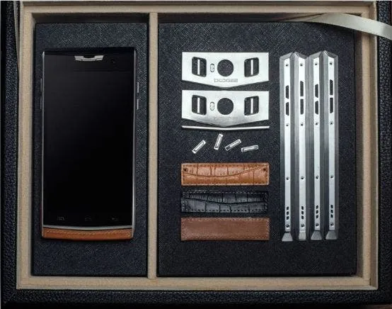
Most things in the nature are symmetrical and the new Doogee T3 just the same, at least the maker company claims that. Apparently the Doogee designers and engineers got inspired by the natural symmetry and T3 is the result.
Both edges of the phone are exactly the same, with the same button placement and every other design feature including the chamfering. And now for something completely different.
Gizchina News of the week
Doogee T3 also has the physical “Smart key” button, which can be used for faster launching of some apps like Facebook or Twitter or assigning some special function to it, just as the user wishes.
Personally I don’t care too much about phones being symmetrical, rectangular or circular. More important is the whole look and feel and of course price/performance ratio. So what’s your take on the Doogee T3?
this phone makes me feel uncomfortable
WHY ?!
i love second displays !
it really doesnt i just wanted to comment something
lol …
please let that be the shutter button too !
this phone makes me feel uncomfortable
WHY ?!
i love second displays !
it really doesnt i just wanted to comment something
lol …
please let that be the shutter button too !
This phone fixed the flawed back copy of the ugly VERTU they went after with previous versions.
I really like this design and I would love it of some manufacturer made a decent performance or speced phone after this design…
Problem is that this will come with an entry level SoC(probably the MT6750)and it will cost 200+$, because there are still suckers willingly paying Doogee’s overpriced entry level devices.