Xiaomi has always been fairly aggressive in bringing about changes to its MIUI software. This is partly the reason why a lot of Xiaomi phones take time to get to the newest version of Android; the company likes to 'bake' the features into its ROM.
MIUI 7 was all about the 2015 design philosophy - flat, blurred and colourful. MIUI 8 is set to bring a change to that, hopefully a fresh and new one.
From what Xiaomi have to share about MIUI 8, it seems as though there'll be a 'symmetric' aspect to the up and coming iteration of the ROM. What exactly? We know only as much as you do!
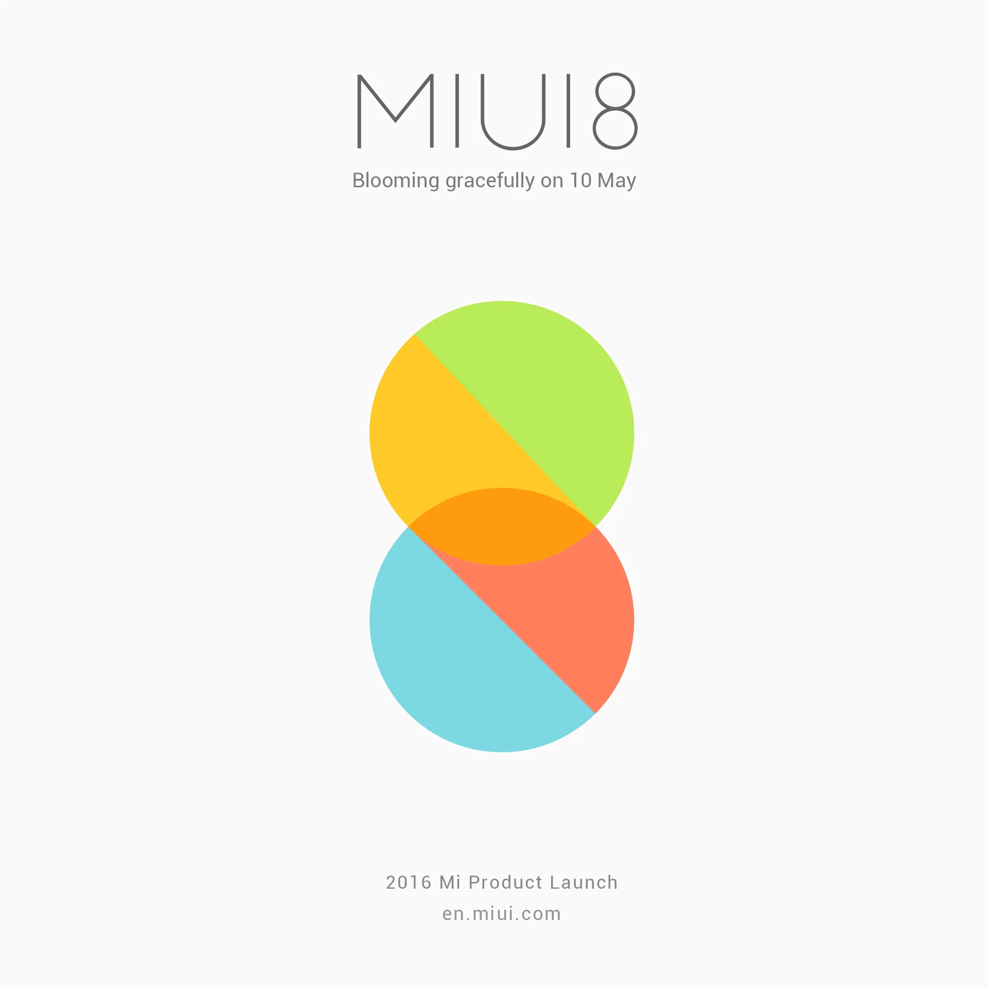
For starters, Xiaomi's MIUI 8 teasers come with the following: A WORD about colors, about mirrors and more. I'm not quite sure what that means, while I hope it isn't just a bad Chinese to English translation from their presentation material.
Anyway, Xiaomi reveal that MIUI 8 will feature stock apps with a fresh design. While this can be expected of any new iteration, it is nice to get a glimpse before the actual ROM starts seeding.
Take a look at the phone app below:


Most importantly, it seems as though the very popular (and honestly, effective) notification area is set to get a major revamp. The toggles will now appear on the same page as the notification (as opposed to being on a different page, one swipe away) which might remind some of Samsung's TouchWiz.
Take a look here:

All in all, MIUI 8 feels a bit like Xiaomi's preparation for the Western markets. Previous versions of MIUI seemed suited more for Chinese and other markets. We'll know more when MIUI 8 is officially announced alongside the Xiaomi Mi Max on the 10th of May.
Thoughts?
Bron: MIUI
Loading
