Leaks and rumours about the OnePlus 3 started flowing thick and fast a few weeks back, and there seems to be no end to them for now.
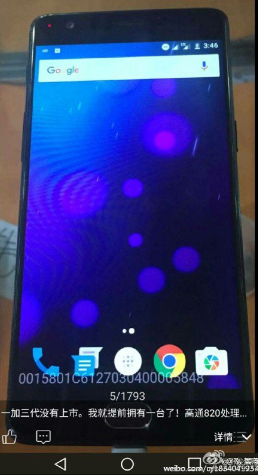
The newest bit of news around the OnePlus 3 (‘2017 flagship killer?’) are some alleged pictures of the phone, giving a glimpse at the front and rear of the phone, along with some info about it’s storage, and general UI look.
One thing that you’ll notice right off the bat is that the phone features an OPPO R9-like fingerprint scanner on a physical home button. While it’s hard to see what’s on either side of the home button, we’re pretty sure they’ll be capacitive keys — although Meizu’s implementation of the home key (that doubles up as the back button) is pretty… kickass.
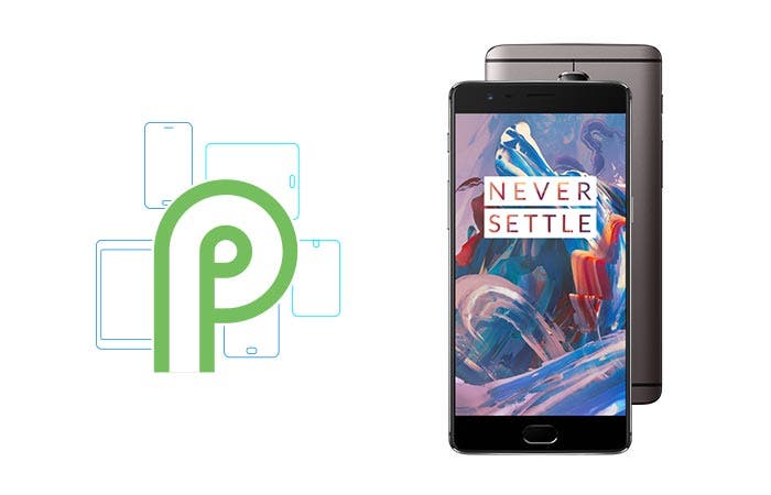
Also seen is the rear of the phone, which features HTC/iPhone-like antenna stripes above the camera module, something we haven’t seen on any other OnePlus phone. The black shade of the phone suggest OnePlus might be working on a matte black (non-sandstone?) finish for the phone.
As for the specs, the OnePlus 3 is set to feature the Snapdragon 820 and 4-6GB of RAM.


Now Will see lots of people not glad with “home button”
yep,
no home button in favor of a smaller phone!!!! put at the side of back. yes it’s most handy in the front but I would rather have non than a larger phone.
No fingerprint doesn’t guarantee a smaller phone. The OnePlus 2 is smaller than the OnePlus 1.
but heavier and fatter. After I got used to nexus 5x, OP 2 felt like a brick.
yes, that’s true but a oneplus 2 without one would be even smaller!!!! 🙂
Maybe, maybe not. A OnePlus One without one was nearly the same size and they used a very similar design for both of them. Without the home button it would have looked just like the One, the dimensions wouldn’t have changed much.
I love home buttons!
i hope it’s a sh*tty fake
So… No laser autofocus?! It would be a downgrade from op2 with no real reason behind…
I’m still not convinced about it… Maybe this is not op3 after all…
This must be the version that would not be part of their dumb invite system. 😉
Maybe it’s the “lite version” with 4gb of ram
design language doesnt scream op tho
I like the front but the back is not that great mainly because of the protruding camera
I think some should ready up their pockets as maybe just maybe the last great phone to come out will be the GIONEE ELIFE E9 but GizChina seems to be lagging into reviewing Gionee units.
I think the last Gionee they reviewed here was the E7 back in 2014. They always do hands on so we know they get the devices but the reviews never come.
You think they do it purposely, or just plainly forget about pricey GIONEE ???
I dont know because they do a hands on of each device, and a few times Yash has told me the review was written but it never got published.
Wooo. That’s a shame…
Personally, I’d say this deffo IS NOT the Op3… That camera lens cover on the back looks just like the type that the ‘el cheapo’ phones have, usually some sort of crappy plastic chrome covered surround that gets chipped off easily and plastic lens cover glass that gets scratched the first time it enters your pocket…
That alone would tell me that it can’t be OnePlus quality…
That was my first thought as well, it looks like a cheap knockoff.
The camera lens cover has similar shape to samsung s4. But the realisation looks more like on honor 7/galaxy s6.
The antennae lines are HTC like, iPhone copied them. I wish more UI’s would incorporate Flyme’s multi-touch home button.
Physical home button? Only the dead can know peace from this ideology. I’ve been looking forward to upgrading my 3 year old Galaxy S3 and now this happens. Lets wait and see if these rumors are true.
Unless the OP design team had a stroke and are brain dead, this is not the OPO3. There is nothing OPO about the phone that is depicted. Totally fake OPO and horrible phone.
Absolutely brimming with fail. So so lazy, just abandon their whole desigbn language and clone the HTC M9. Just awful. Who green lights this crap? Does consistency and refinement mean fu*k all to these clowns?
Excellen, Yash t!!! I like physical home button in smartphones, especially in night environments.