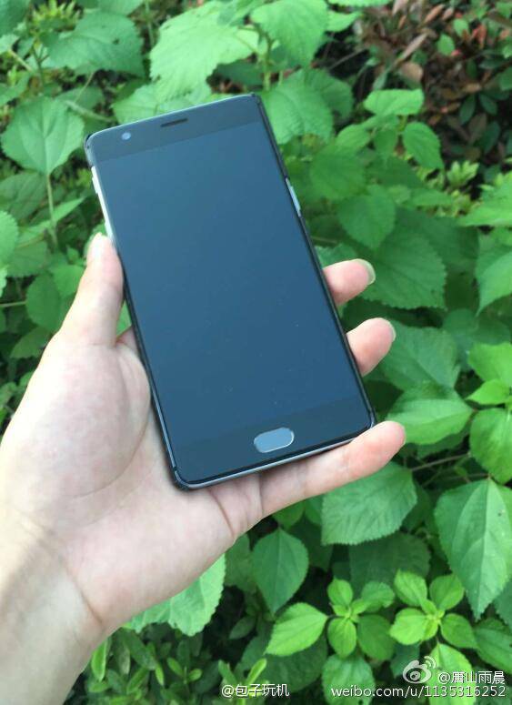
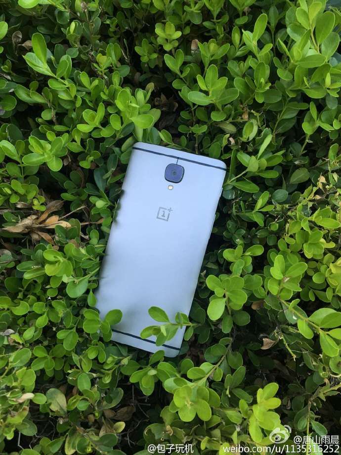
We’ve seen the renders, we’ve seen the TENAA details and we have heard the rumours, and now just a day ahead of launch here are the first real OnePlus 3 photos.
OnePlus are just 1 day away from launching their 3 flagship phone and 4th ever device. The OnePlus 3 will take over from where the OP2 left off, but with a better looking (in my opinion) all metal body that takes inspiration from both Apple and HTC.
These first real photos of the phone match what we have seen in TENAA and render leaks, and give us a first real good look at the new smartphone.
The front of the OnePlus 3 doesn’t look all that different from the OP2, there is a home button and 5.5-inch display, but it does appear that a 2.5D glass panel has been used this time around.

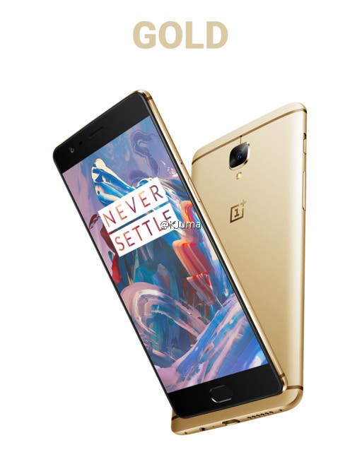
A metal rear shows off the OnePlus logo, dual LED flash and 16 mega-pixel of the phone. This version being grey, but another leaked render shows the possibility of a gold version making an appearance too.

From TENAA leaks the OnePlus 3 is expected to launch this week with Snapdragon 820 chipset, 3000mAh battery, VOOC charing from Oppo, and USB Tybe C, 3.5mm headphone jack and options for either 4GB RAM or 6GB RAM.
Pricing is thought to be around the same as previous OnePlus flagships, so expected a starting price of only 1999 Yuan.


So the same boring colors of every other phone. My Robin looks amazing because it’s not silver, gold or rose.
OnePlus 3 specifications
5.2 or 5.5-inch (1,920 x 1,080 pixels) Full HD AMOLED display
Snapdragon 820 64-bit Quad-Core processor with Adreno 530 GPU
6 GB LPDDR4 RAM with 64 GB storage / 4 GB LPDDR4 RAM with 32 GB storage
Android 6.0.1 Marshmallow with Oxygen OS
Dual SIM
16 MP rear camera with dual-tone LED flash, OIS, 4K video recording
8 MP front-facing camera
Fingerprint scanner
4G LTE with VoLTE, WiFi 802.11 a/b/g/n/ac dual-band (MIMO), Bluetooth 4.2, GPS, NFC, USB Type-C
3,450 mAh battery
Robin’s mint color looks great but on the other hand the phone itself looks like a Lego phone with huge black bezel we don’t see anymore since 2013 (and certainly not at this pricetag). It reminds me of the Oppo Find 5.
why the hell did you buy this phone ? O.o
I love the design of the phone. The only black bezels are on the screen which are the same as the Mi5. On the Mi5 it bothers me a lot more than on this phone because the design on this is so striking. The top and bottom bezel I don’t mind being large because they house excellent front facing speakers, almost as good as those found on an HTC. Overall it is on of the best designed phones I have used in a long time. I love that it is doing something different instead of another boring metal phone with the same boring and dull colors.
There is 4 main reasons I bought one:
1. I am heavily invested in the cloud and I am very curious how it’s OS works.
2. I love to try out new brands, usually I’ll try their cheapest model first but this one only had one model.
3. A friend offered me an unopened one for $100. It is a mintnight model, mint on the top and bottom, midnight in the back. He won it in a contest but already had one himself.
4. Most flagships this year are very underwhelming to me.
Eventually I will end up with another phone either the OP3, Zuk Z2 Pro or Gionee S8. But so far I am excited to try this Robin out.
OK thanks balco.
I get your point, especially the $100 part ^^
…and the deception over this year’s flagships. I deserted the chinese market too, to buy a LG V10 last month, as the latest chinese flagships were so dull and boring.
I don’t know that I would have paid full price for the Robin and only using it a few days there is some things I don’t like. But overall it is a good impression from a brands first device, much better than I had with my Vernee Thor.