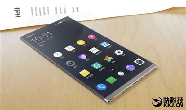
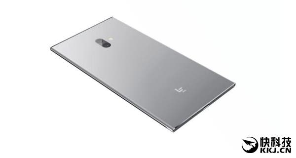
A new concept render from LeEco shows a smartphone that is all 4K display and nothing all else (in terms of physical size at least).
LeEco have reduced bezels as far as they can with their new render for a 4K flagship devices packing all the best bits from the Android smartphone world.

In my opinion the design is be beautiful and even sees the screen extend to the very top of the phone and the main call speak and front camera being located in the viewing area.
The only slight bezel area is on the chin of the phone and just below it (on the bottom edge) are dual speakers and a USB Type C.

The 4K flagship wouldn’t be a true flagship without dual rear cameras, nor a Snapdragon 821 and at least 4GB RAM, all of which the concept has.
This is one of those concepts I would really love to see get made, and looking at LeEco and how they operate they seem like one of the only Chinese brands that could pull it off.


Probably getting black borders anyway. They should call themselves LeBorder.
hahahahha totally agree!!!
lol 🙂
Looks like fan made.
this was possible as already demoed by sharp aquos crystal, however lack of speaker for call is outrageous
Looks beautiful
This looks good, could have a 6″ screen with a the footprint of a 5.5″ phone and lets face it there’s no point putting a 4k screen on anything less than 6″.
*10″
Edit: nvm 13″
Holy crap, this is exactly what I was thinking to do.
That’s not a concept by LeEco ,it’s from some random clueless dude.
You can’t make something that thin,no phone maker would imagine this.
If they could use the 10mm border under the screen to implement capacitive buttons, it would be perfect.
Why? I prefer a bigger screen that can also be used for screen real estate, instead of a strip dedicated to buttons alone. I never understood that logic.
It’s just space optimization. Without capacitive buttons, when buttons are displayed, you’ll have 5″ screen + 0.5″ on screen buttons + 1″ useless plastic/metal/whatever, with capacitive buttons you’ll have 5.5″ screen + 1″ capacitive buttons.
ie. capacitive buttons are not eating screen space but quite the contrary as you don’t have to use a part of your screen to display your buttons, instead they’re implemented in the useless part of the phone’s front face, below screen.
Another point : when you have on-screen buttons auto-hide ON, you have 1 more move to display the buttons before beeing able to use them, which is annoying.
Probably getting black borders anyway. They should call themselves LeBorder.
hahahahha totally agree!!!
lol 🙂
Looks like fan made.
no selfie ?
this was possible as already demoed by sharp aquos crystal, however lack of speaker for call is outrageous
Looks beautiful
This looks good, could have a 6″ screen with a the footprint of a 5.5″ phone and lets face it there’s no point putting a 4k screen on anything less than 6″.
*10″
Edit: nvm 13″
Holy crap, this is exactly what I was thinking to do.
That’s not a concept by LeEco ,it’s from some random clueless dude.
You can’t make something that thin in high end. No phone maker would imagine this as you need to imagine things that are likely to become possible.
Take this,make it 8mm thick , wrap the display around it , add a popup 360 camera and that’s a concept.
If they could use the 10mm border under the screen to implement capacitive buttons, it would be perfect.
Why? I prefer a bigger screen that can also be used for screen real estate, instead of a strip dedicated to buttons alone. I never understood that logic.
It’s just space optimization. Without capacitive buttons, when buttons are displayed, you’ll have 5″ screen + 0.5″ on screen buttons + 1″ useless plastic/metal/whatever, with capacitive buttons you’ll have 5.5″ screen + 1″ capacitive buttons.
ie. capacitive buttons are not eating screen space but quite the contrary as you don’t have to use a part of your screen to display your buttons, instead they’re implemented in the useless part of the phone’s front face, below screen.
Another point : when you have on-screen buttons auto-hide ON, you have 1 more move to display the buttons before beeing able to use them, which is annoying.
no selfie ?
This looks fantastic, I’d love to have it if it wasn’t fake.
This looks fantastic, I’d love to have it if it wasn’t fake.
wooow
This is what I called for a year or more ago…this is revolution a big screen small size phone.
…and 3000 mah battery? 😉
This is what I called for a year or more ago…this is revolution a big screen small size phone.
…and 3000 mah battery? 😉