Smartwatches are quite a uniform breed lately and you can easily tell right away what you can expect from the gadget function-wise. Sure they differ with some details, but the basic core of functions and utility are almost every time the same. That’s why the first smartwatch from the iNew company in form of the iNew H-One model came as a bit of a surprise, because it’s going a slightly different way than all the competitors. Curious how ? Found out more in the following iNew H-One smartwatch review !
The iNew smartwatch are certainly “smart”, but taking a different approach in terms of the whole purpose of the device. Main goal is to provide some kind of a personal health assistant and tracker, so all the functions, design and more or less everything is tailored only to this task and nothing more. So let’s take a plunge into the healthy world and check out the strengths and weaknesses of the iNew H-One. And of course first and foremost we would like to thank the iNew company for providing ther review sample for us.
Packaging
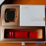
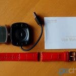
Small white square box looks pretty neat and decent with some minor golden depictions and writing. Inside you can find everything of concern nicely compartmentalized and stored so the first impression is indeed very good. The leather band straps are actually supplied individually so you need to assemble the full watch with your skillful fingers. Aside from the watch there is only a charging USB cradle dock and a thin, but helpful full english manual with instructions. No bloating extra pointless vouchers, papers and crap like it’s common with way too many chinese products, iNew did a pretty good job with the whole package presentation.
Design and build
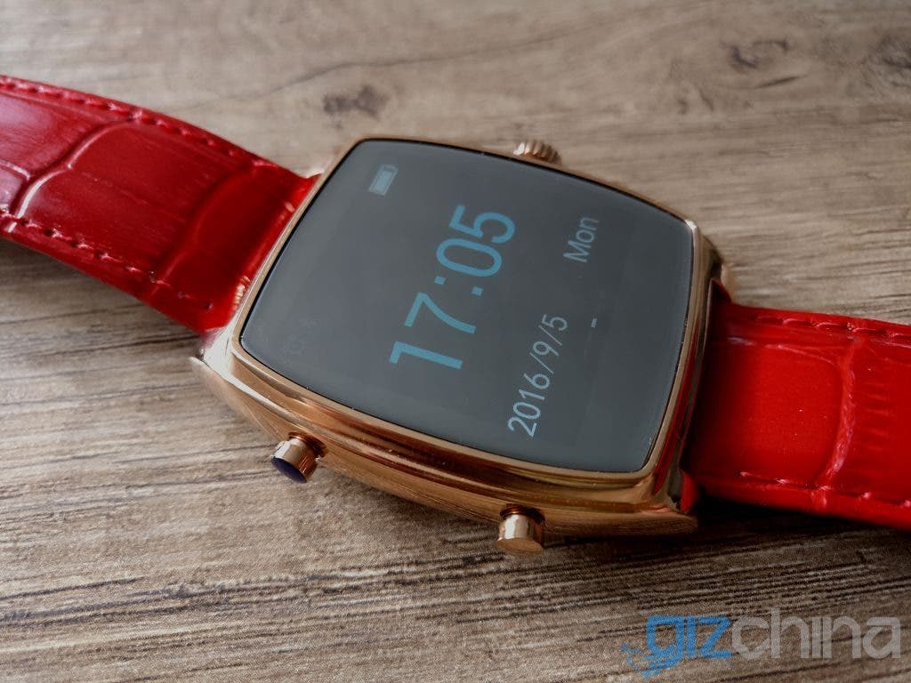
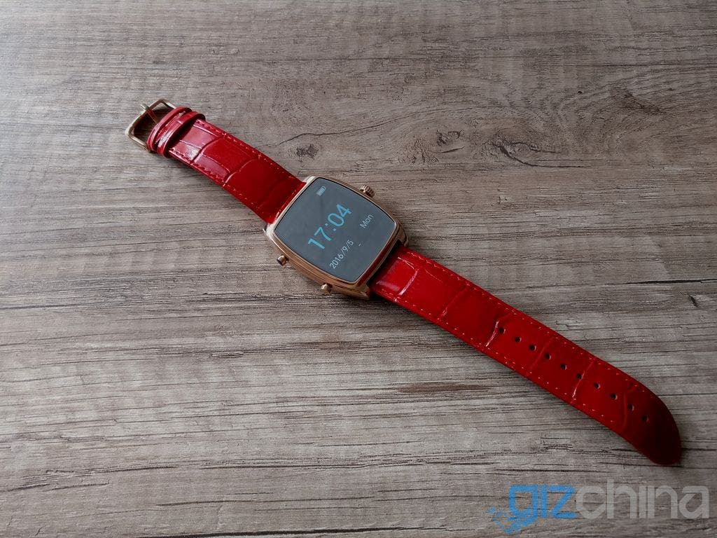
For starters let’s get one thing clear, our review sample came with a bit of extravagant color variant with golden watch body and bright red leather band. Maybe i’m a boring conservative person, but don’t like the combination too much for a guy like me. And for much better suited women’s hands the watch can be maybe too massive and bulky, so not sold on this particular color variant at all. Luckily there are more options to choose from, gold with black band or silver with brown band will probably make much more impact for the majority of potentional customers, the guys.
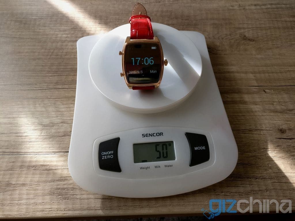
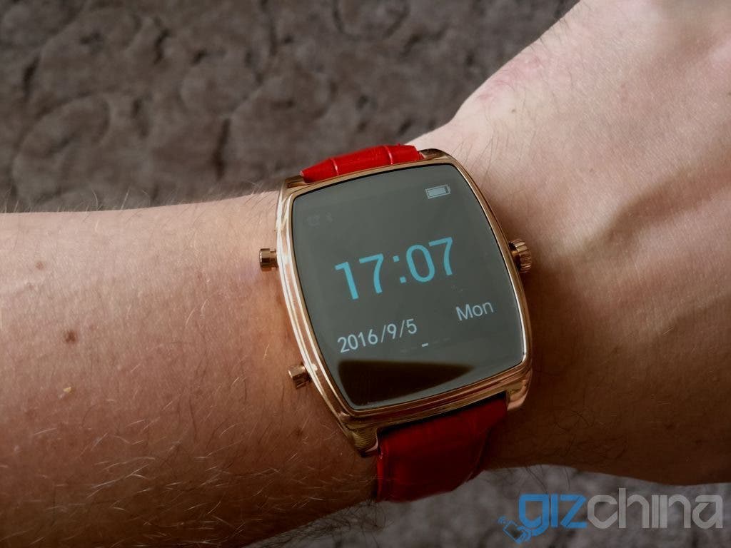
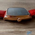
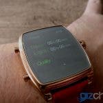
The body of the iNew H-One is roughly a square shape with slightly rounded left and right edges and made of solid stainless steel. While it’s not terribly big, it’s surely more appropriate for the guy’s wrist, you can refer to one of the pictures around for a better idea. The metal has a shiny polish and the quality feels pretty good, while keeping the watch very light (50g of weight including the band).
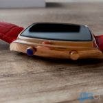
The display is a 1,54-inch one with 240×240 pixel resolution covered with a 2.5D shatterproof glass and while the black bezels are significant, because of all the watches screens being black you probably won’t notice them at all. Interestingly though the bezel below the actual display is bigger than the one above, so the display is not fully centered. The display is a color one, but you will see more or less only four of them, black, white, green and light blue. Sun legibility is also not the best, the screen tends to be pretty reflective. It’s also s a not a touchscreen one so all the controls are done with the three physical buttons, two on the left side are used for cycling through the menu and the right side “fake” dial is used for confirmation and powering on/off the watch.
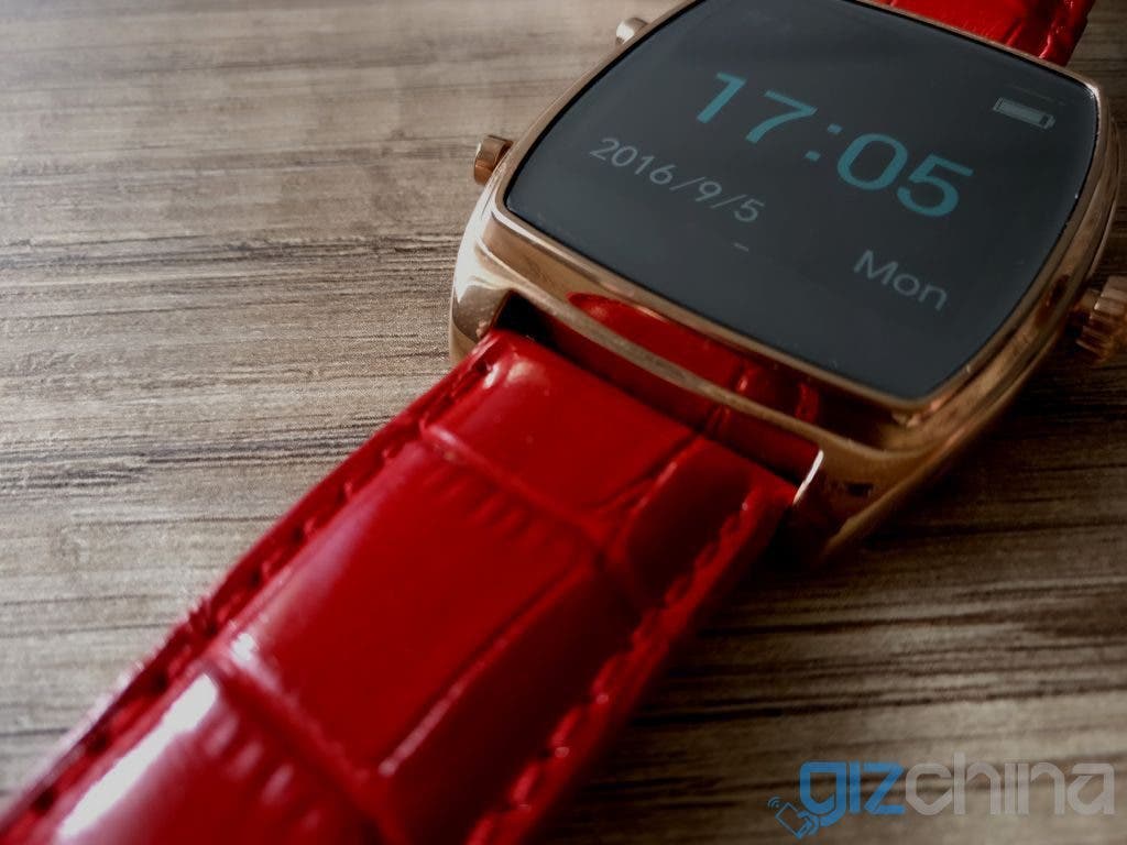
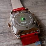
On the back you can find the optoelectrical sensor for the heartrate and blood pressure monitoring with a pretty aggresive green light when on. And of course the charging pins for the cradle. The leather band is genuine calf leather with a texture and the quality is excellent, smooth and comfy feel. The clasp is fairly small, but feels sturdy so i wouldn’t worry about it. The band should be easy to replace, because it uses the standard attachement system and everything.
Hardware and battery life
In terms of hardware we have not much to talk about, the processor, memory and optolectrical sensor used inside the watch are unknown. For connection to your smartphone it uses the Bluetooth 4.0 and it needs at least Android 4.3 or iOS 7.0. The watch also has an IP65 certification, but that’s only fairly small resistance level so sweat or rain will be fine, but wouldn’t take it for a swim or anything. The battery comes with a 220 mAh capacity and more or less exceeded expectation, the manufacturer is stating 3 days of battery life and for once it’s spot on, without the smartphone pairing it can easily attack even way more. Charging time is roughly two hours so nothing that major.
Functionality
And now to the most important part, the real functions and features of the smartwatch. As mentioned before it’s purpose is first and foremost for the health monitoring so it’s really not a typical smartwatch per se, because all the usual stuff like notifications (calls, texts etc.) are just missing. There are only four basic main functions and each of them has a dedicated menu screen, which you can cycle through with the left side physical buttons. The basic home screen shows the time in light blue and in big numbers, date and day, battery level and small icons for alarm and bluetooth connection, that’s it, no chance to change the UI or anything. Big letdown is the inability of lighting up the display by shaking or anything, you have to manually press any button, which is kind of annoying when you just want to check the time.
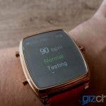
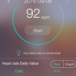
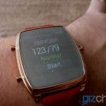
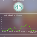
Probably the most used functions will be the heartrate and blood pressure monitoring. For the heartrate you just press the confirmation button and it starts to monitor it until you turn it off. Without pairing with your smartphone this is just an orientational value, which is not saved anywhere. But if you actually start the test from the app all the values are saved, there is a graph available and it also automatically checks your heartrate and saves the average for every half an hour as long as you have the watches on and paired with the phone.
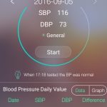
Same thing goes for the blood pressure monitor, full functionality is once again available only when paired with the phone and started in the app. You can calibrate the settings for best results in the app with inputing your usual values. From my experience and testing both the heartrate and bloodpressure measuring seems quite accurate so the sensor is doing a good job.
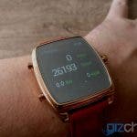
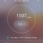
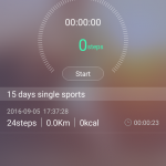
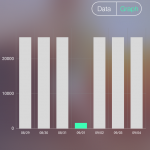
The pedometer is a bit of a mixed bag, i’m not overly sold on the accuracy and the sensitivity of the measuring. It’s also updated fairly slow with big leaps in numbers so a bit confusing. In the app you can set some daily goals, even in calories or a distance, you can start your measured single timed walks or even try to meddle with some GPS tracking functionality, though the app stubbornly showed only Beijing area for me
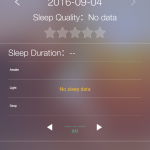
And as for the sleep monitoring i’m maybe a vampire or i have terribly thick skin, because i couldn’t get the sleep monitor to get started. Theoretically you just have to wear the watch and it should start automatically when you fall asleep, but in reality nothing like that happened and in the morning the date showed absolutely empty for several nights in succession. Could be me, could be the watch, but nonetheless not working.
Application and extras
The companion app is a pretty crucial piece of the whole package, because without it you can’t even properly set up the watch, save date and everything. Downloading is pretty easy, you just need to scan the QR code in the manual to get the link for the .apk to download the appropriate H Wristwatch app. Setting the Bluetooth connection is fairly easy and straightforward, but then you need to create an account for full functionality, a bit annoying but common.
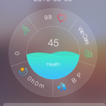
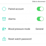
Then you can set up your personal measurements and finally access all the goodies provided by the app, like the data, graphs and all sorts of stuff. You can also set some vibrating alarms on the watch, but it’s not continuous so only one quick buzz. There are also some health tips, self diagnose guides and similar stuff incorporated in the app to full push through the health purpose. Some friend system is in place too, but i fail to see how much is that relevant.
INew H-One smartwatch review – Conclusion
The H-One health smartwatches are an interesting gadget and in the end i quite liked them, though the usability is quite limited and it’s not really a full fledged smartwatch. The design is fancy (except the gold/red variant :P), build is very good and it just looks good and representative at your wrist. The downside is the absence of notifications, sketchy pedometer and sleep monitoring and for me is crucial the lack of shake to wake function. On the otherhand the heartrate and blood pressure sensor is great and the app is doing a good job of tracking and monitoring your health values. Overally it’s probably a niche products for some selected customers, but that has to be expected.
The iNew H-One is also not among the cheapest products on the market, the price hovers around the $100 mark and while you are getting a quality product for your money, it can be a bit high. You can get it for example here and once again we would like to thank the iNew company for supplying the sample for us.
Follow Gizchina.com on Google News for news and updates in the technology sector.







Hi.
Can you give a link to watch’s app at Google Play?
No, it can’t
Actually i can’t, made a mistake in the article, the QR code link is not pointing to the Google Play’s app, but to the individual .apk at the company’s website. Will fix it in the text
As far as I know there isn’t the app at Play yet.
But there is a link to apk: http://120.25.211.226/hw2download.html
Agree with the reviewer, color combination is just fugly. Not a bad looker otherwise. Function wise it lacks and the button press for display is a huge turn off. 100 seems off the mark IMO.
The No.1 G6 seems better value for money
http://en.001phone.cn/product-no-1-g6–sport-smartwatch-126.html
The No.1 G6 seems better value for money
http://en.001phone.cn/product-no-1-g6–sport-smartwatch-126.html