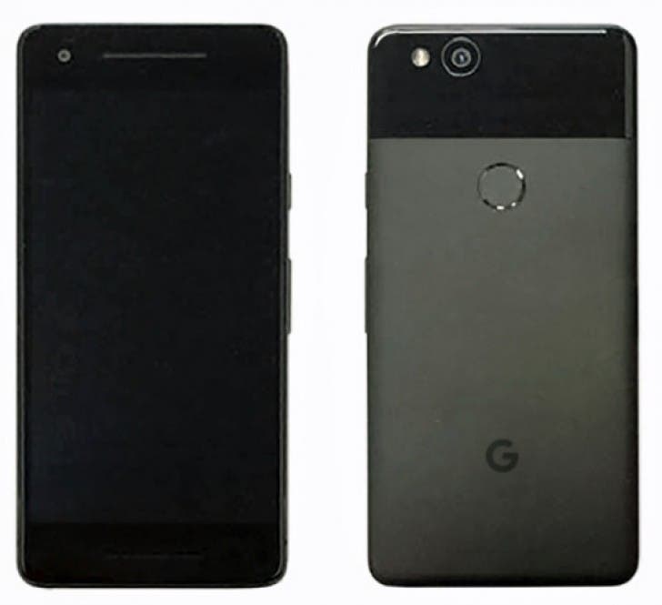
A recent leak by Evan Blass (and Venturebeat) has raised a lot of questions regarding the design of the upcoming Google Pixel 2 model. According to the leaked image – which is blurred I know- the upcoming model seems to maintain the basic design of its predecessor with quite large bezels (top and bottom) – something that doesn’t seem to fit in this year’s main trend.

If you take a look at the image however you will be able to see minor changes: take the speaker housed in the bottom bezel for example, it will work together with the one above to create a stereo effect. We can also see a single main camera placed at the back – which is again so not trendy at this period of time with all those dual camera smartphones popping around. Rumors insist that both the Pixel 2 and the Pixel XL 2 will borrow the squeezable frame feature from HTC’s U11, and they will also drop the 3.5mm headset jack, in favor of the USB Type-C connectivity option.
We expect to see Google’s 2017 flagships sometime this fall, both of them equipped with Qualcomm’s Snapdragon 835 SoC, but wait: if you go for the Pixel XL 2 model rumor has it that you will get smaller (much smaller) bezels than its predecessor.


so the price should drop at least 30% since they didn’t invest in design. If that doesn’t happen, then they’re screwed.
so the price should drop at least 30% since they didn’t invest in design. If that doesn’t happen, then they’re screwed.
So it’s got a massive chin where they could have had touch sensitive buttons, but they decide to use on-screen button. They have essentially wasted nearly a quarter of the phone. Whoever is designing these things must be on crack!
I hope they don’t have the audacity to charge a premium for it. It’s fugly.
Considering the pixel XL is almost one year old and still Is at the same price category of the Galaxy s7 .
Hopefully they wont get away with it and launch a more affordable Nexus type device
Wow that feels prehistoric nowadays 😐 and here I thought they said they would adapt the univisium design :/