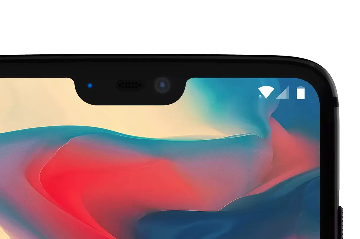
Folks at The Verge were provided an exclusive image of the OnePlus 6, confirming the presence of the Notch on the top of the display. OnePlus reached out to The Verge to make a case for the inclusion of the notch on their upcoming flagship.
In a statement made to Vlad Savov, Carl Pei stated that the main idea of the notch is to provide more “screen related estate” to the consumer. The notch allows for moving the notification bar up, leading to more space for content. He also provided precise measurements of the notch, 19.616 x 7.687mm, smaller than the iPhone X and bigger than the Essential PH-1 notch. Carl Pei explained that going as small as the PH-1 would have meant skimping on the quality of the sensors and camera up top, but it was easier to go smaller than the iPhone X notch thanks to the exclusion of structured light for Face ID that’s been excluded on the OnePlus 6. Talking about specs, the next phone will have the biggest screen as compared all previous OnePlus phones, with a 90% screen-to-body ratio, while maintaining a form factor no bigger than the existing OnePlus phones.
Pei admitted that Apple does accelerate the adoption of things within the industry where it makes sense. This is actually true. But in case of the notch, OnePlus’ motive was different. It isn’t just an aesthetic choice. This is a move made to provide maximum screen area to the user. When it comes to the chin, it is to stay for the time being, unless phone makers adopt a flexible display which is the case with the iPhone X. Pei says,
“It’s a very clear decision: more real estate to the user. In conclusion, learn to love the notch.”
But here’s the deal. Personally, as a consumer, I would rather not buy any phone with the notch just because it will look like an iPhone X rip off. With the plethora of smartphones adopting the notch, from mid range to flagship phones, every Android now looks like a carefully derived product from the iPhone X’s design. Kudos to Samsung for not adopting the notch, yet. To be honest, there’s hardly any design centric innovation that Android phones have seen lately other than the 18:9 aspect ratio. What’s your opinion about the notch? Is it so important for Android phones to look like an iPhone? Let us know in the comments below!


reason = oppo copy
Well, Oppo, Vivo and OnePlus are all owned by BBK, so even though they are distinct companies which seemingly compete with each other, they can cut costs by sharing their designs, chips, manufacturing plants and software enhancements with each other and that’s one of the reasons why OnePlus can offer you flagship devices with competitive pricing on a yearly basis. The failed kickstarter campaign of the Ubuntu Edge was an eye-opener for me in terms of how much developing and manufacturing a phone from the ground up can cost so I would embrace the fact that manufacturers do that and their sub-brands (Honor, ZUK, 1+) can give them a lot of useful data about the market and what users want, sometimes at the expense of cutting corners on the hardware and the software support.
“iPhoen X” is it a new phone ?
Corrected 😄
Personally, I don’t like the notch. I think it’s Apple’s half-assed attempt at making a bigger screen to body ratio while not spending enough time on finding a good spot to place all the sensors to. I’m pretty sure that with the next generation of iPhones, Apple will go for a more refined design and then people will see that all the iPhone X android clones look stupid and there really was no point in copying Apple in this field. Kudos to Samsung for staying true to their 18:9 screen on the S9 (Though it was quite predictable that the S9 would be an improved S8, just like the S7 not being too different to the S6 so I’ve no idea what to expect from Galaxy S10/X/Whatever Samsung decides to call it) and shame on the companies that lack creative people to make their own better designs instead of the same old story every time.