It took a while to arrive but its finally here. We know we’re a bit late with this one but customs and legal hurdles got in way of the package and hence the delay. The Koolnee K1 Trio promises to be your Xiaomi Mi Mix on a budget. Its UPS is the tri-bezel-less screen which is bezel-less from three sides. That’s why it’s called K1 Trio. Coming from Koolnee, an established decade-old manufacturer, it is one of the premium products in their portfolio alongside the Koolnee K1. Koolnee isn’t that much known outside of China but with the tagline “Beyond Expectations,” the company has plans to expand to other countries in Asia.
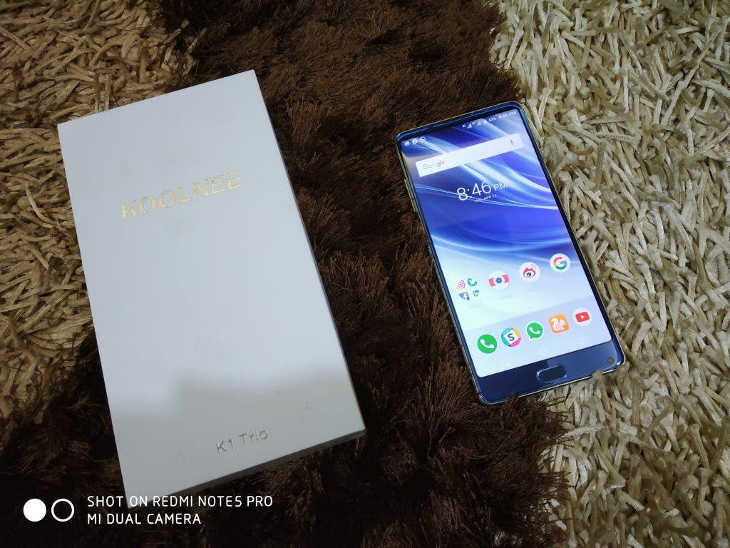
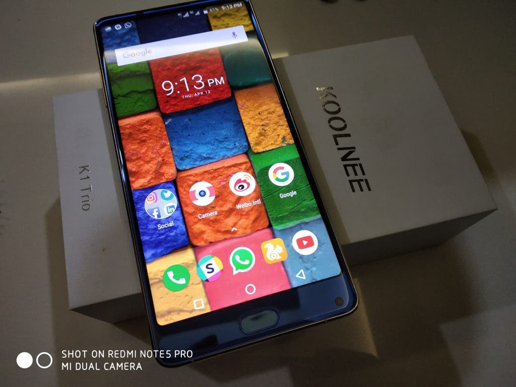
Koolnee K1 Trio: Unboxing
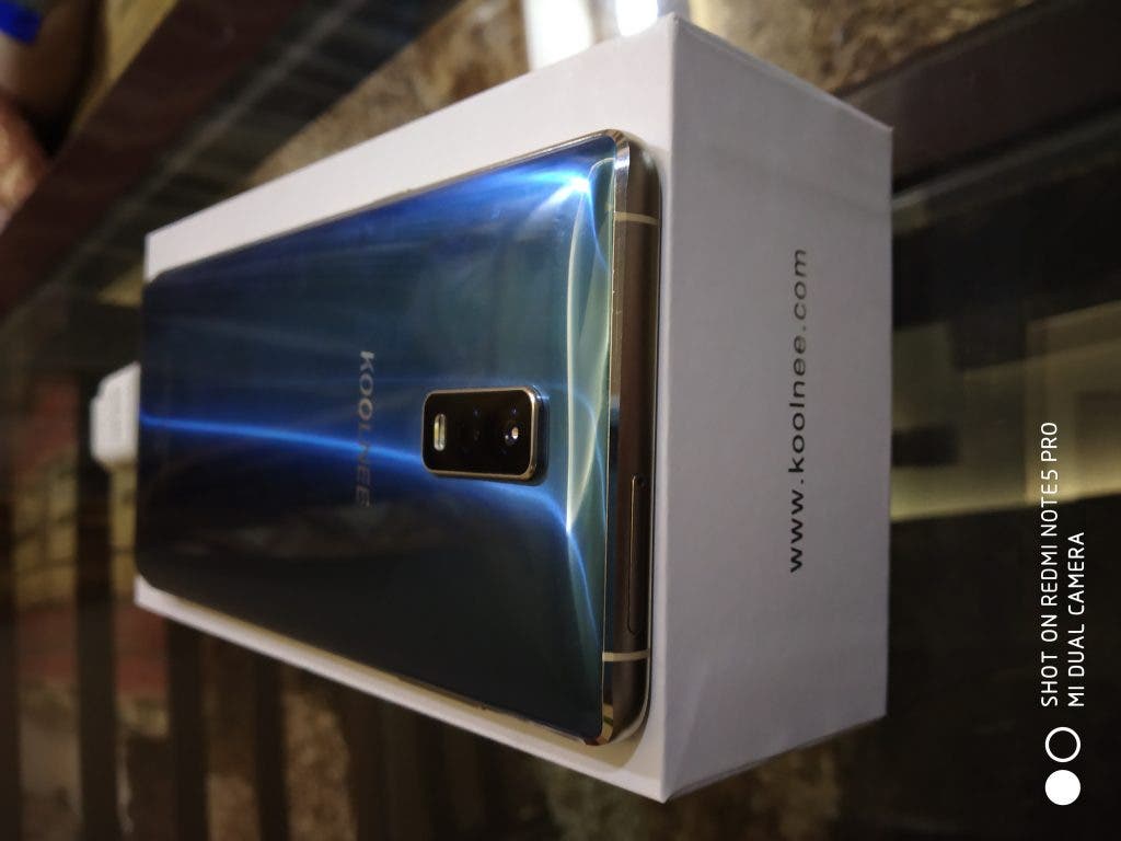
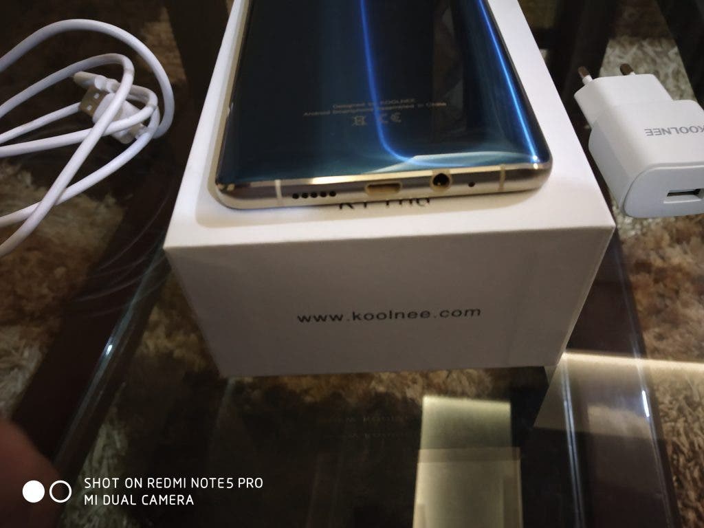
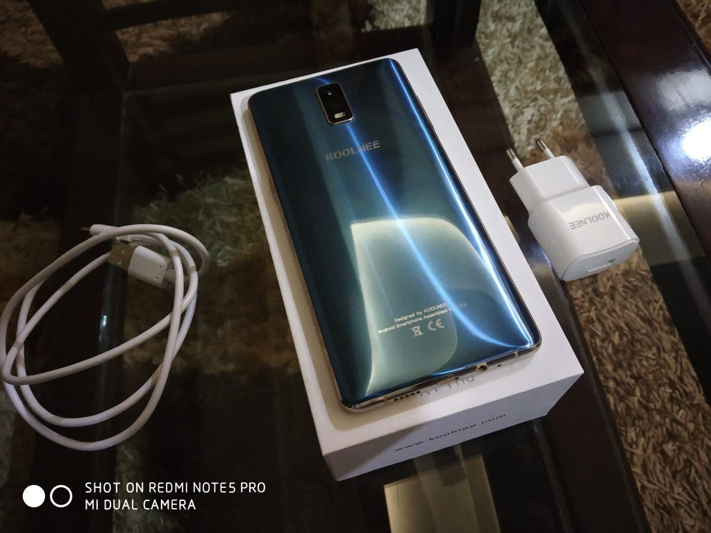
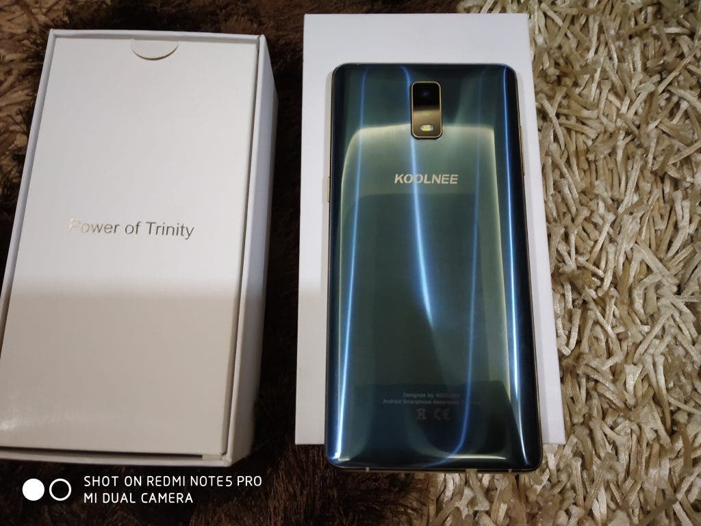
The review unit we received came in a plain white box with just a simple Koolnee branding on the top. That’s it. There aren’t any colours or phone images on the top of the box. Inside you get the phone itself, a standard wall charger and a micro USB adapter, and some booklets and manuals. There’s no back cover although the phone did have a pre-applied screen protector. Oh, and you also do get a SIM ejector tool. That’s pretty much it for the unboxing experience.
Koolnee K1 Trio: First Impressions
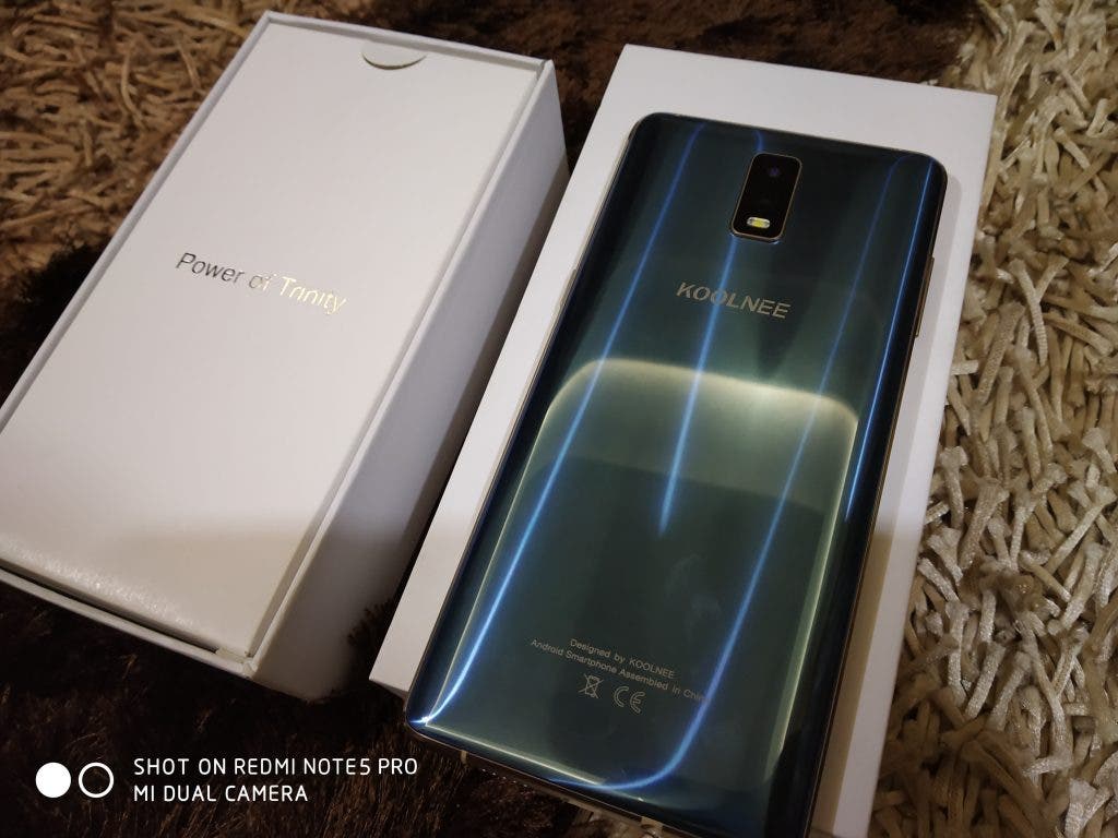
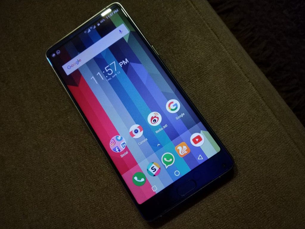
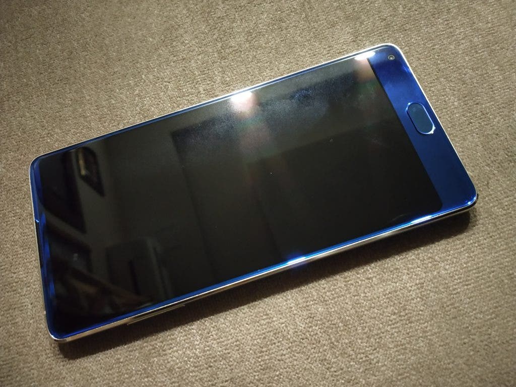
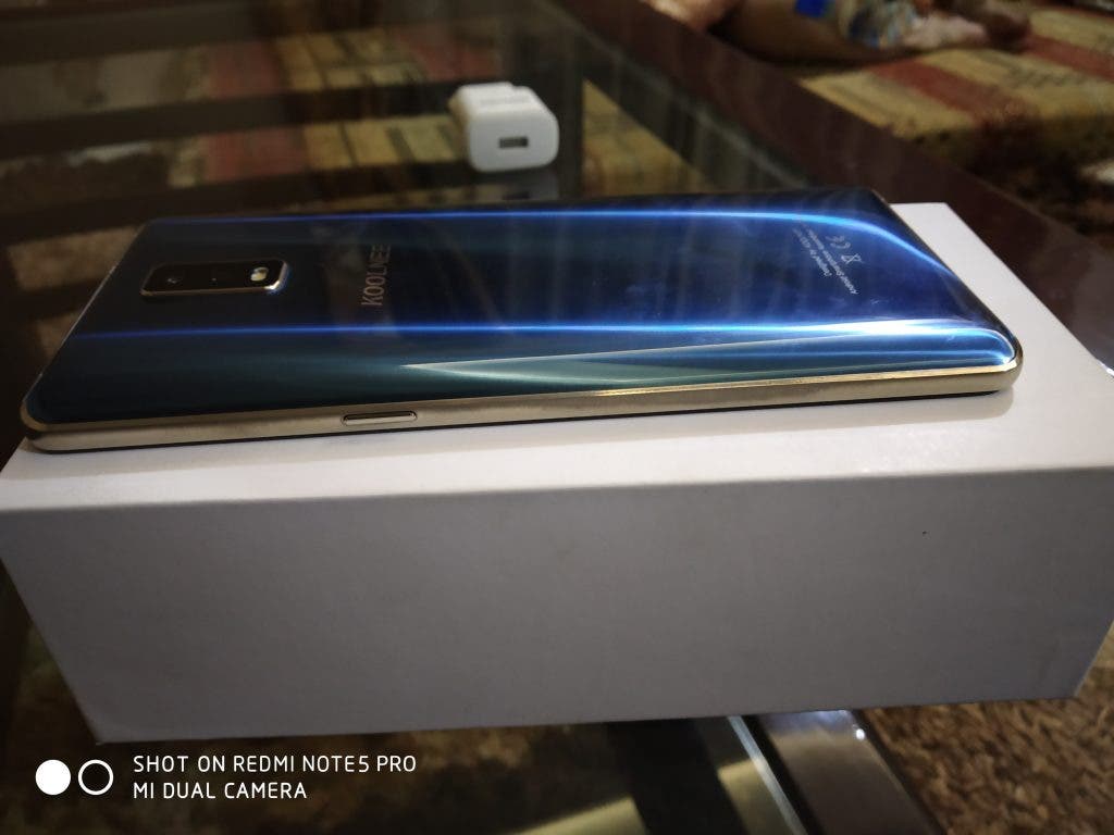
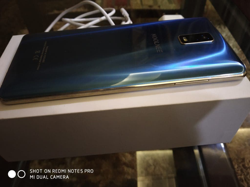
My first impressions for the Koolnee K1 Trio were like, “Wow, this is a great build and design”. For around $250, you get a premium glossy shiny build that will definitely turn heads. I know because mine did. There are two colour options for the Koolnee K1 Trio. The review unit I got was the cool Blue colour. It is somewhat reminiscent of the Coral Blue on the Galaxy S9. It just looks different than all other blue colours and stands out of the crowd. However, the front has a different shade of Blue than the back.
Also, the full metal-build of the phone comes with curved edges at the back which makes holding the phone easy. I could also see the back cameras rise above the chassis and create a small bump. The handset also has chamfered edges again made entirely out of metal.
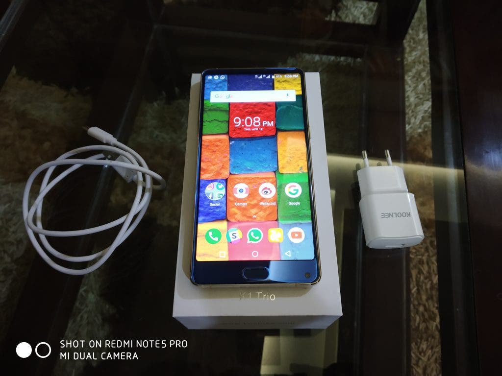
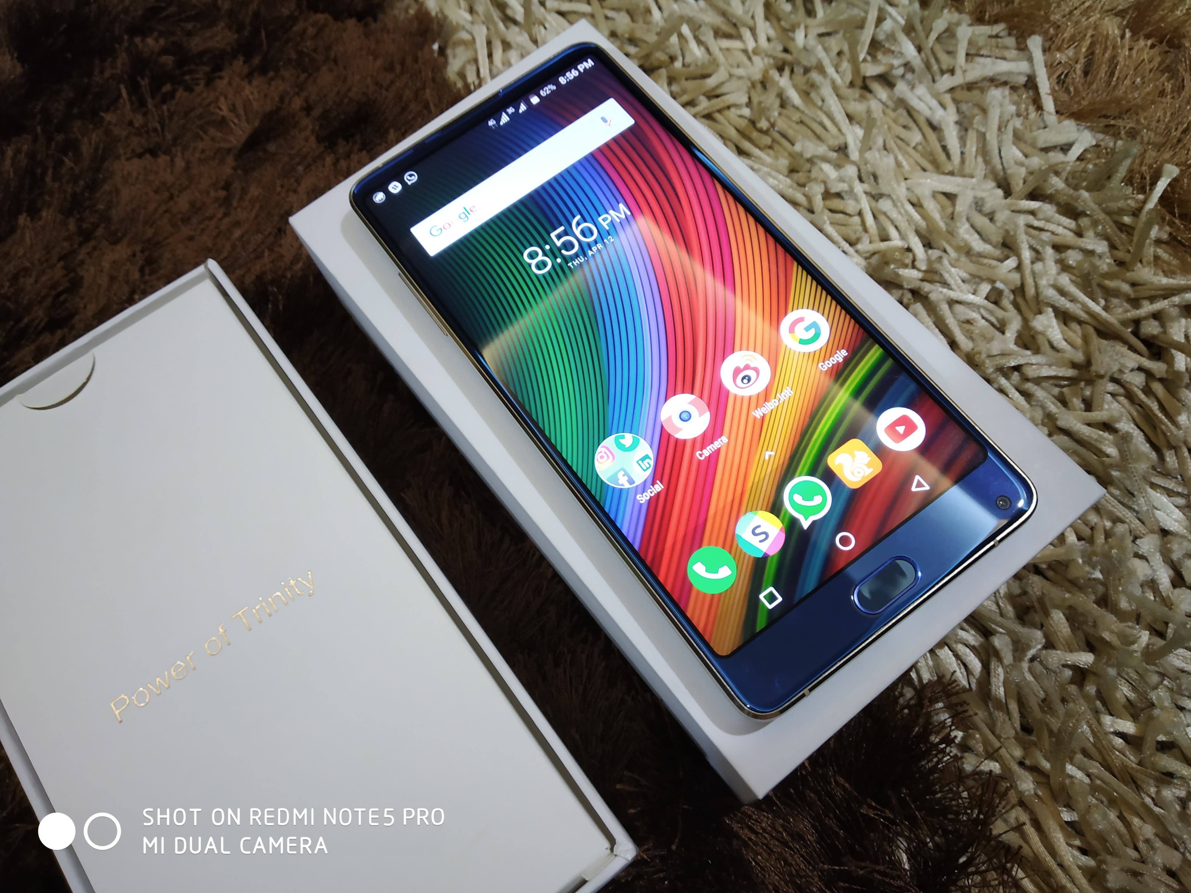
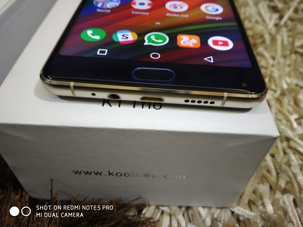
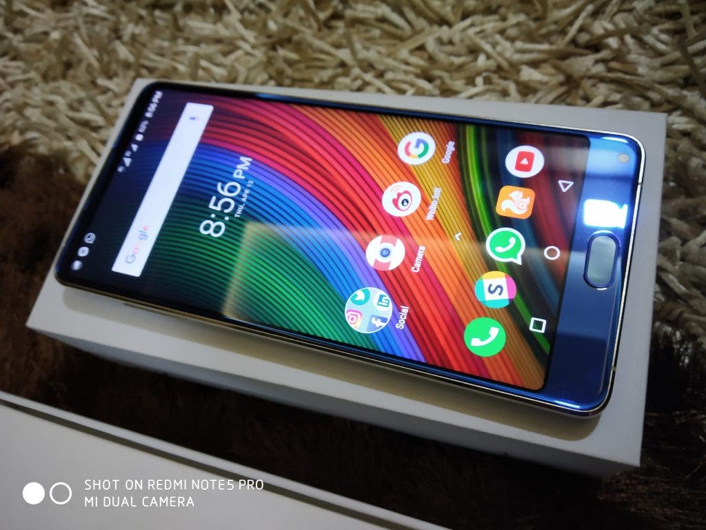
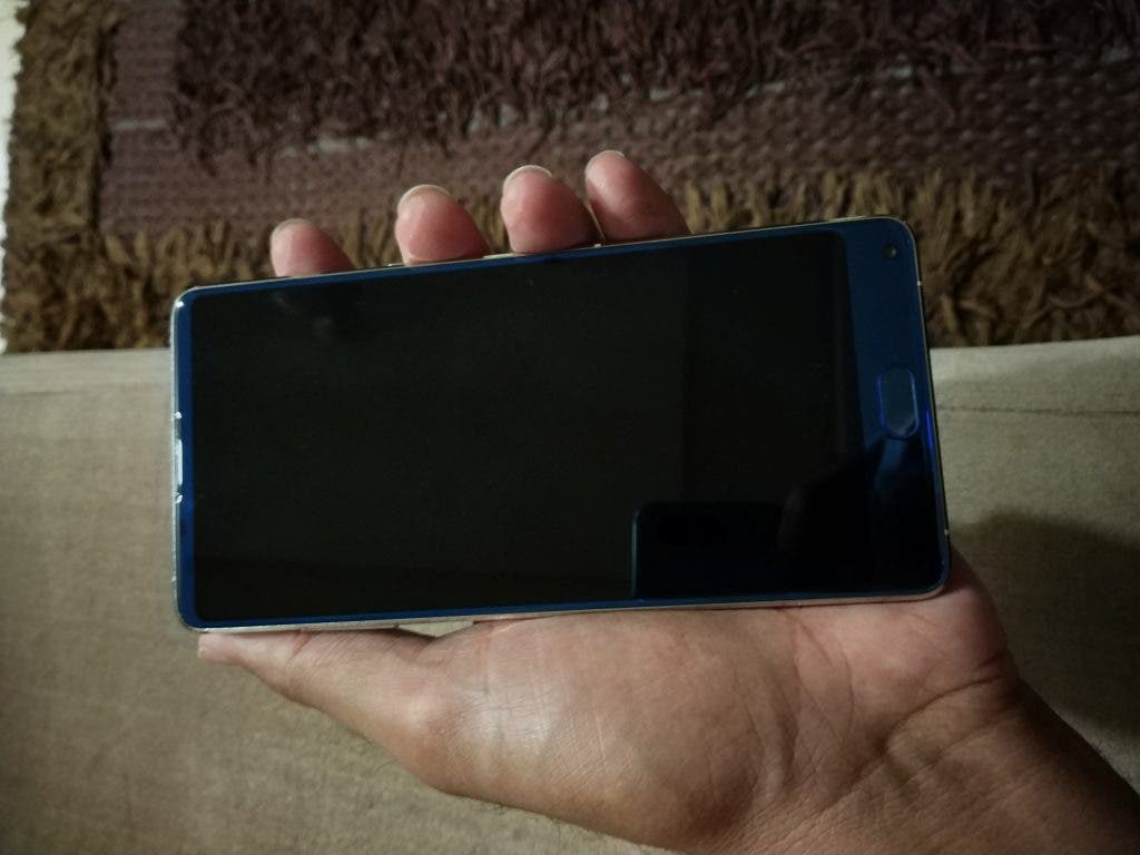
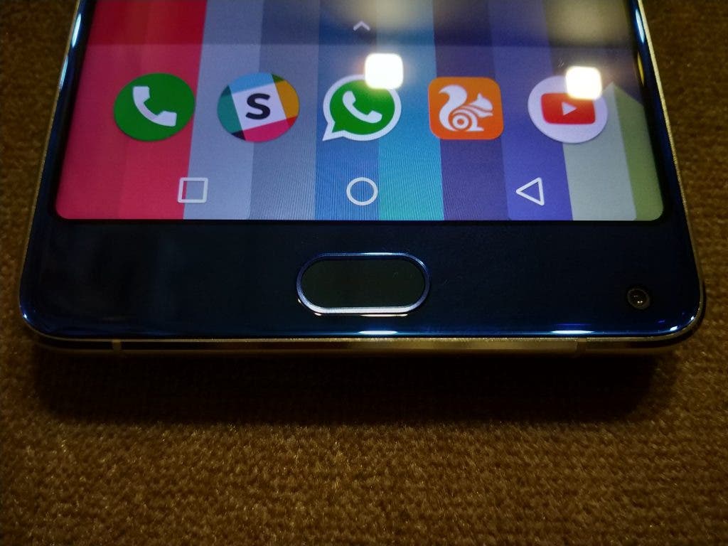
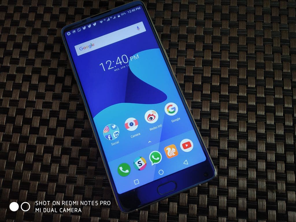
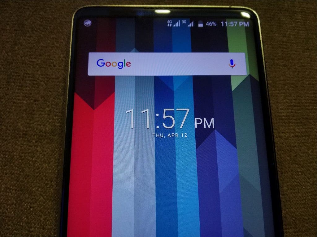
The front has what Koolnee calls 4D Glass on top of a 6.0-inch Full-HD+ display. And it does look good with those minimal bezels, I must say. It is worth noting that the top does have a bezel albeit a very slim one that houses the ear-piece and a couple of sensors. Still, the front design of the handset just looks great and you’ll love the look of it. The bottom chin is somewhat thick as it houses a fingerprint reader. But it is still smaller than the one on the likes of the Maze Alpha. I didn’t mind the bottom bezel much especially because I like a front fingerprint reader.
On the other hand, the 8MP selfie shooter is also on the bottom which was a pretty awkward experience for me. If you’ve used the Mi Mix or any other phone with a bottom selfie camera, you know what I mean.
Also, I found the Koolnee K1 Trio to be somewhat heavy. That is even after using a Redmi Note 5 Pro. I noticed the phone remarkably weighs around 214 grams which is obviously heavier than most phones in this range. We can understand this might be due to the 4,200mAh juice pack and the metal build. The rear is very prone to get smudges and fingerprints on the rear side so you’ll have to keep a cloth with you if you don’t want that.
The volume buttons are on the left while the power button is on the right side and this can be a bit problematic when you use the phone in landscape mode. The buttons are just a bit wobbly, especially the volume button, but they work well.
So, that’s it for the first impressions and design overview of the device. Stay tuned for the full review where we will pen our in-depth thoughts about the various aspects of the Koolnee K1 Trio soon.

