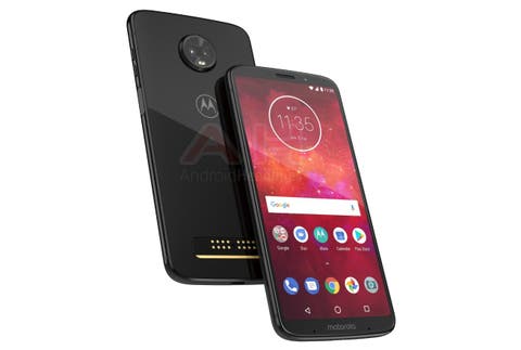
Folks at Android Headlines managed to get their hands on an exclusive render of the Moto Z3 Play. While it borrows a lot from the Z2 Play, the Z3 Play does have a few aesthetic changes which don’t look that bad. Earlier reports have been mostly unofficial renders,but according to Android Headlines, this one’s from a trusted source and is, if not real, closer to the actual design than any other report.
The Moto Z3 Play looks sharp with the glass and metal combination. As compared to the Z2 Play, the fingerprint scanner does not sit below the display anymore. This move might be made to get more screen real estate which does seem to be the case. As compared to it’s predecessor, the Z3 Play has curved edges around the screen, giving it a softer look and making it look flush with the curved edges of the phone.
The back retains the glass and the pogo pins. The fingerprint scanner seems to have taken its place below the volume keys, this shifting the power button to the left side of the phone. Now, there are speculations that the button on the left hand side might not be a power button but rather an extra button that can be re-purposed. Maybe a button for the Google Assistant? This time the Z3 Play will sport a dual camera setup on the rear, an upgrade from it’s predecessor’s single camera. It also loses the 3.5mm jack.
Backward compatibility with previous Moto Mods seems to be on the cards
Key specs of the Moto Z3 Play that are speculations as of now include a Snapdragon 636 chipset coupled with 4GB RAM and 64GB of onboard storage under the hood. Judging from the 16-pin connector that sits on the back of the Z3 Play, it will probably be backward compatible with the Moto mods of last year or before.
Follow Gizchina.com on Google News for news and updates in the technology sector.
