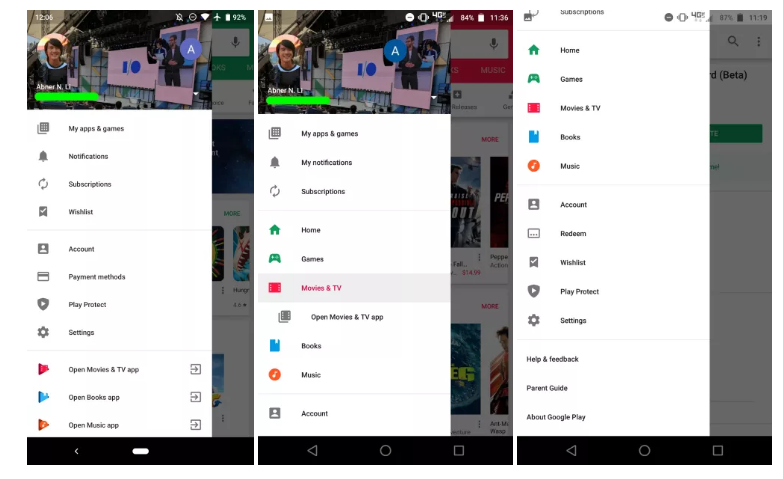
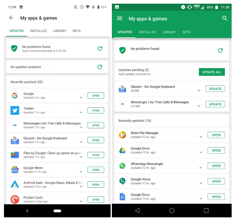
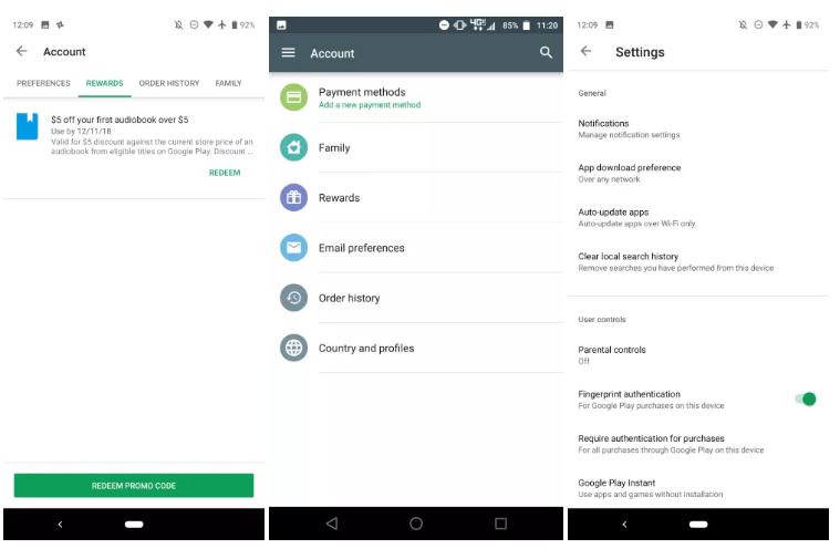
After first clues last spring, Google has finally started the global deployment of the new Play Store interface on Android. On the program, a white design, much brighter and Material Theming.
The global deployment of the all-white design of the Play Store has begun. Here are some screenshots :


 Last April, 9to5Google got its hands on what would be the new version of Google’s Play Store on Android. The specialized site thus published screenshots showing in particular a list of applications and a side panel displayed all in white, as well as the method of payment.
Gizchina News of the week
Six months later, Google finally began the deployment of this new interface. In addition to the list of applications, we can also discover much brighter menus where the green, emblematic of the Play Store has disappeared.
Meanwhile, the app bar in “My apps & games” is now stark white — matching Google’s broader design language — with the previous green accent only present to note what tab you’re currently viewing. Search is frustratingly gone from the upper-right corner, while there is now a back button in the top-left, instead of a menu.
12.6.13 is the current stable version of the app, but this Google Play redesign for Android is rolling out via a server-side update that’s hitting more devices this evening. If you don’t have it enabled, try closing the Google Play Store from the Recents menu and reloading, or clearing data in system settings.


