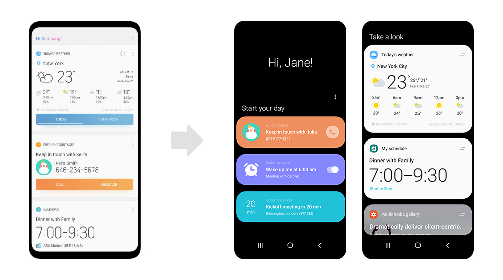
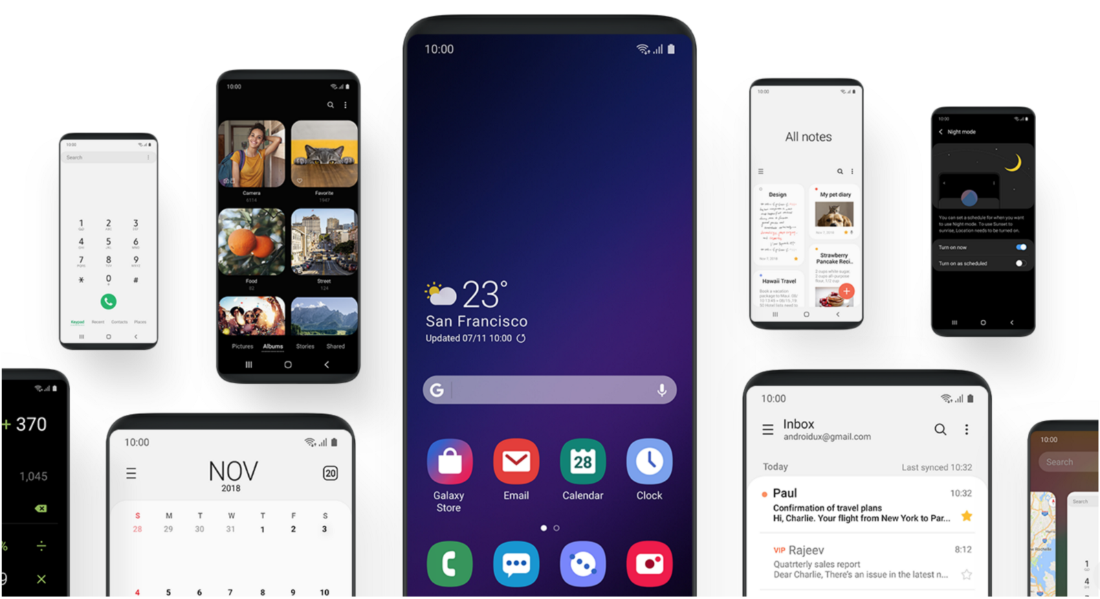
Samsung has recently explained why the new One UI interface is so different from the previous interfaces. With One UI, Samsung wanted to add more clarity to the interface and offer a spacious and orderly design that improves readability.
An example is the new notification panel , since now the quick settings extend closer to the bottom of the screen. The larger space occupied by the quick settings panel allows larger buttons for individual settings, larger text and wider spaces among the available options.

Another change in the user interface has to do with the areas of visualization and interaction. The user interacts with the device by touching the elements that are in the lower half of the screen , while the upper half of the screen shows the content of the applications.
Changes have also been made in the way the device shows the content of the application and the interactive elements. Samsung says that their phones now show the content of the application in focus blocks, which actually show less information on the screen compared to their previous user interface designs.

By reducing the amount of content presented, users can focus their attention more easily. In addition, these focus blocks, along with application icons, have rounded corners, resulting in a more consistent aesthetic across the entire One user interface.
In addition, Samsung has reduced the number of interactive elements accessible to the user at any given time, although the software layer only removes elements considered not relevant to the user’s action.

For example, when a user enters a mobile number in the phone application, only the options to create a new contact or start a call appear. The placement of the interactive elements in the lower half of the screen should also make it easier for people to use their phones with one hand.
The interface also introduces a dark mode for the entire system. When implementing the function, the Korean giant has not limited to changing the colors shown on the screen but the company has also changed the tone, brightness and contrast of the screen to ensure greater visual comfort.


