Facebook is the most popular social network, it has a huge user base and to get away from the competition it must work always on a new features to make the service more rich and modern.
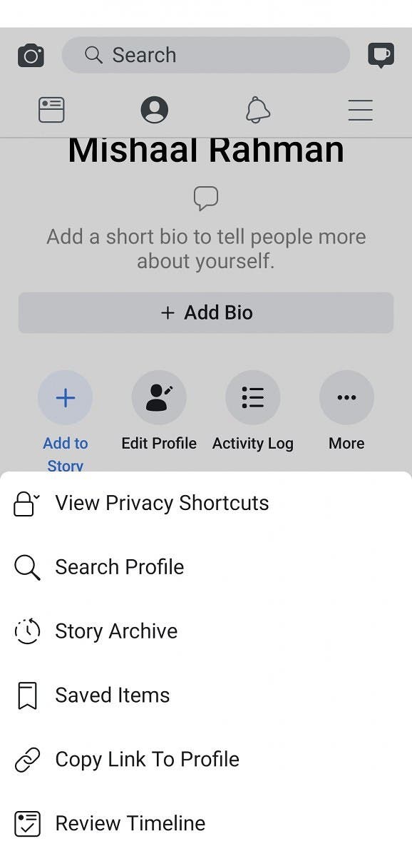
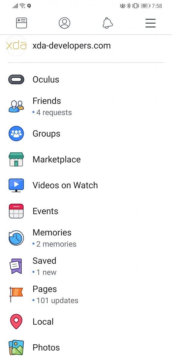
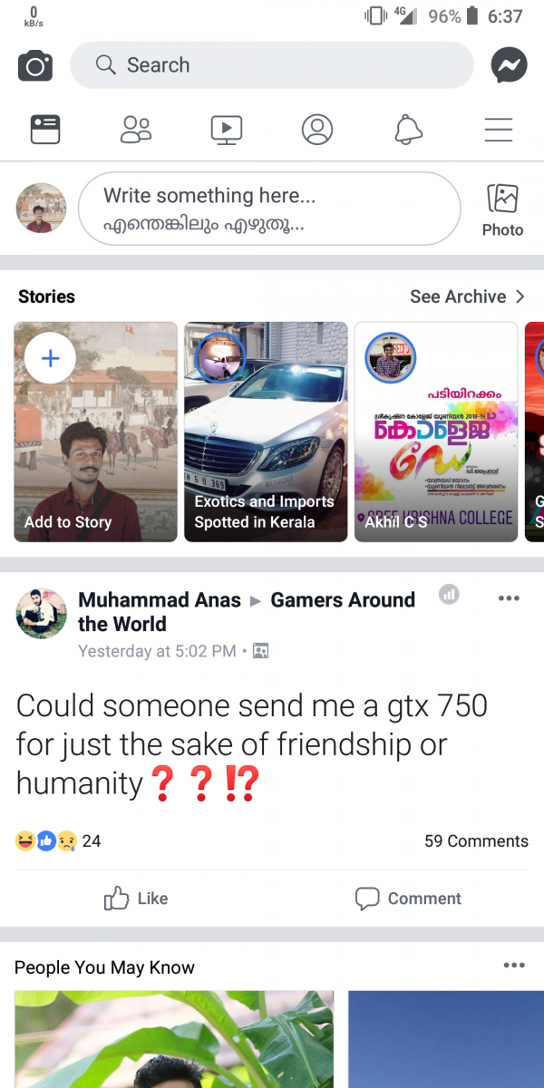
With this in mind, the new user interface that the Facebook team is testing for the Android version of the application must be evaluated. This new interface eliminates the elements in blue and adopts a much whiter appearance.
Here is a gallery of screenshots:
The navigation tabs below the main header now accommodate two more shortcut icons for videos and profile view. Basically, this new user interface brings the application for Android to look much more similar to Messenger.
This new UI design has been tested through a server-side update and therefore, there are no specific settings in the app to activate it.
We look forward to informations from the Facebook team to find out when it will be released for everyone.


Why not a dark mode for this shit as well.🤔