After giving some users a taste of the Material Theme, Google has started the rollout of the new look for their Play Store, which is now available to all users.
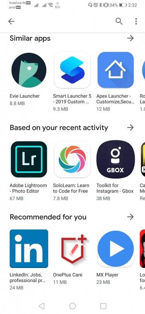
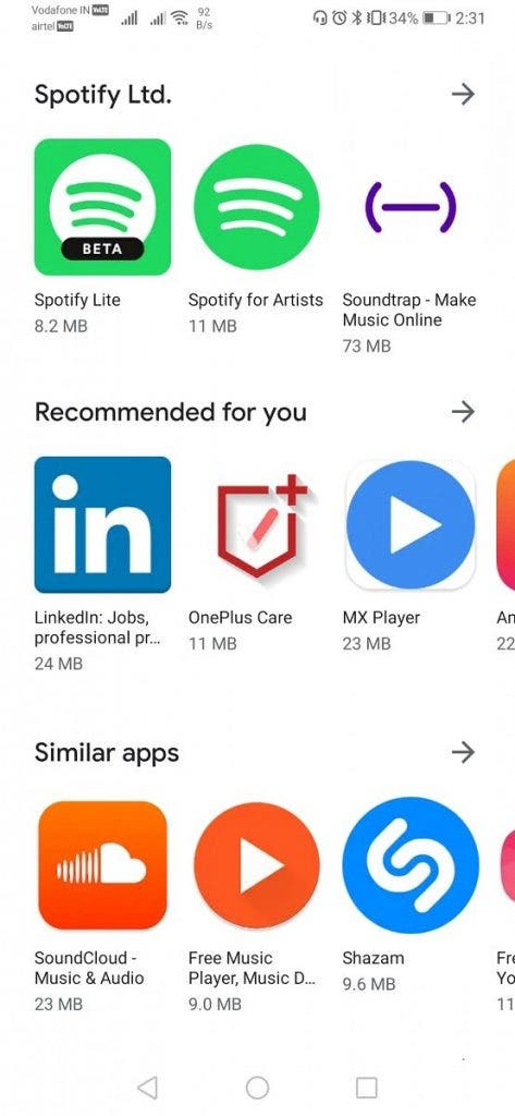
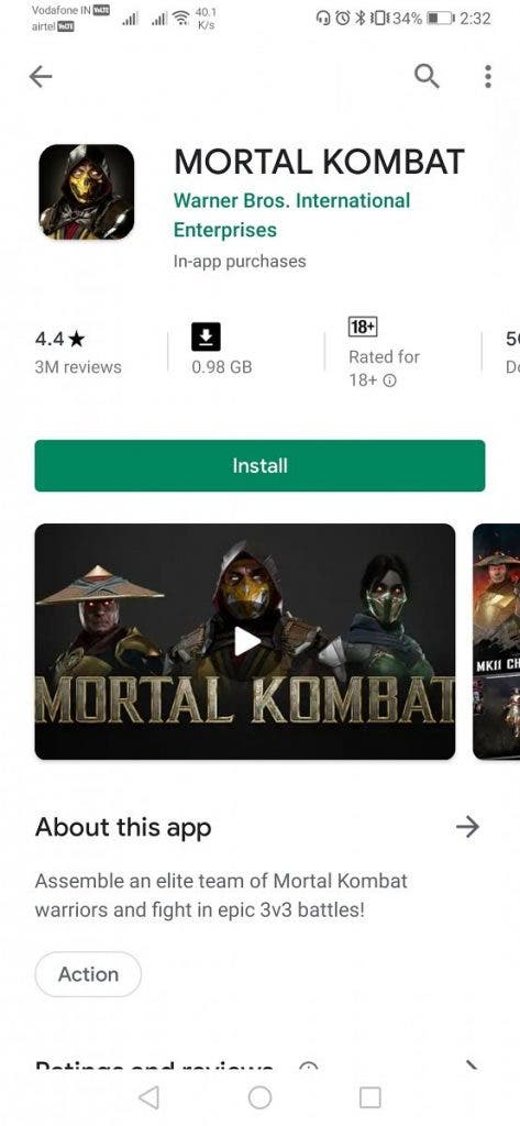
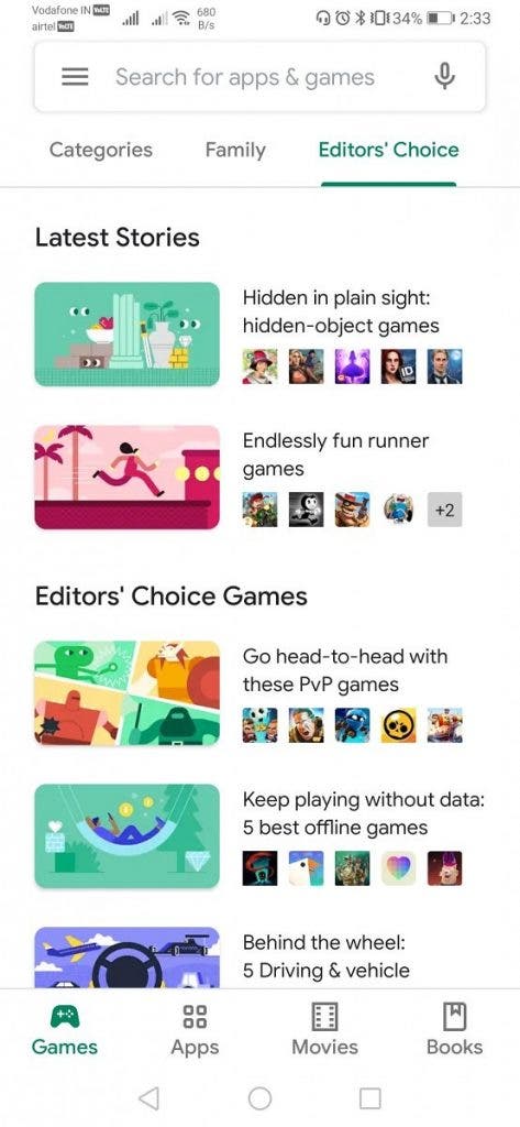
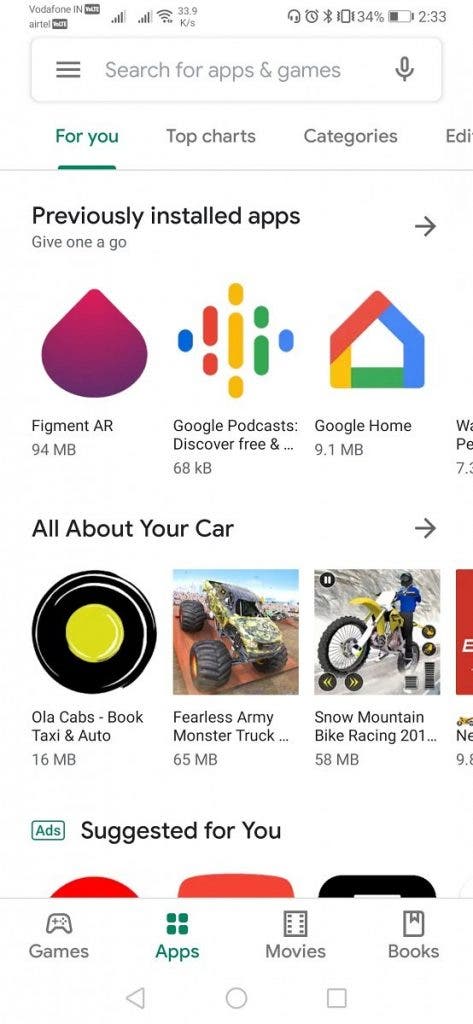
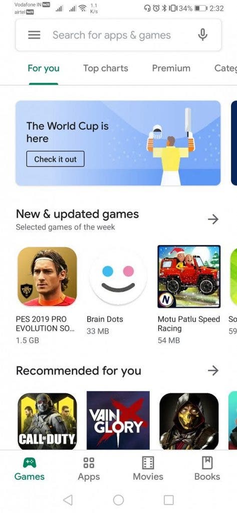
It disappears the green color which for years has been with us in the digital store of Google, replaced by white that now characterizes most of the applications of the Big G. also disappears the word Google Play in the search box at the top, replaced by “Search app and games”.
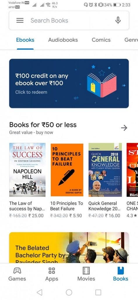
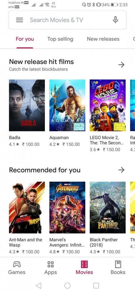
The bottom navigation bar arrives, with fast links to applications, games, movies and books, while the various sections remain visible at the top, without any color distinction between the cards. However, it should be noted that Film and Books have a different accent, with the words respectively in magenta and light blue. Beautiful also the animation that accompanies the passage from one section to another in the lower bar.
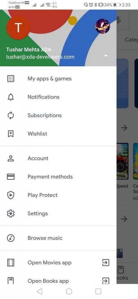
The Google Sans font shows itself in all pages of the application, while the word Other is replaced by an arrow to the right that allows you to view the proposals of the same section. The section dedicated to music almost completely disappears, relegated to the side menu.
Finally, the section “My apps and my games” has been updated, now completely white, without separators, as well as the tabs of the individual applications, now much clearer and with the most spaced elements. The new interface is present in version 15.1.24, currently being rolled out.
If you do not want to wait for the update you can download the apk from this address and follow this procedure: close the Play Store, enter the app information page, clear the cache and forcefully close the application. When you restart you can enjoy the new Play Store.

