Android Auto has recently received a design revamp, featuring Dark Mode. Google continues to improve the interface, and navigation in Google Maps is now more intuitive with new buttons.
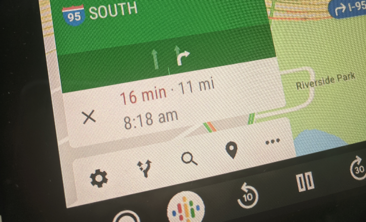
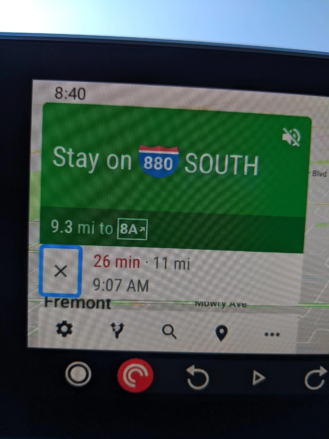
The revelation was made by users on Reddit. Which discovered a button dedicated to alternative routes. Until now there was only one settings button at the bottom of the screen, which is now accompanied by four new buttons, as we see in the picture.
Google Maps on Android Auto

In addition to Settings, users now have the search buttons, alternate routes, destination, and menu available.
The big goal is that the user can have the most tools at hand. From these new buttons, the highlight of users is being given to alternative routes.
We often drive while using Maps, and we want to understand for some reason if there is a better alternative route. With this addition, Android Auto users get this possibility right from the base interface.
Users criticize less screen available

The remaining buttons are less important, but it is still positive to have them as close to the hand as possible. The only criticism from users seems to be that they now have less screen available, especially when they receive a notification.
This is an update that, for now, has only reached a few users. However, it should not be long before it reaches everyone using Android Auto.


