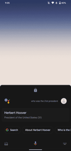
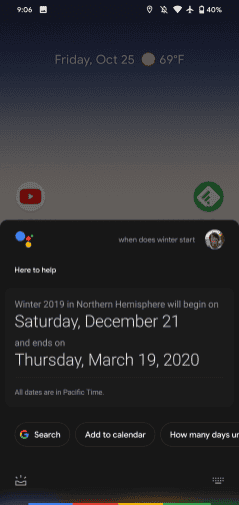
With the launch of the new Google Pixel 4, the company also unveiled a revamped Google Assistant. In addition to introducing a new range of features, it also came with a new, more compact interface that promises a lighter, less intrusive user experience.
As usual, these new implementations have remained exclusive to Pixel 4, but have already started to come up to some Google Pixel 3 models as well. This has become the usual “roadmap” for new features implemented by Google, reaching in a second phase their own older smartphones, and then being released to the remaining Android smartphones.
What’s new in the new Google Assistant interface
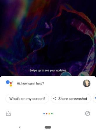
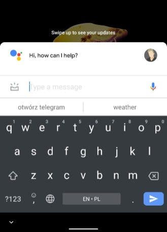
Visually, the new Google Assistant brings changes that are unlikely to go unnoticed. The new interface will no longer occupy your entire screen like how it currently does.
Currently, whenever you activate a command, the Google Assistant window automatically expands, taking up your entire smartphone screen. But most of the time this is not necessary as the answer only needs one line.
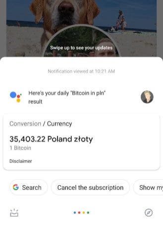
This new, more “compact” version corrects this by using only the screen space that is strictly necessary to deliver a certain response. For example, simple answers will only take up 1/3 of the screen, which is a big difference compared to the full screen.
Also, the panel that appears when you activate Google Assistant is more compact, taking up a little less space on your smartphone screen. Also, you’ll be able to see your Google profile photo in the upper left corner.
When you can use the new Google Assistant
Unfortunately, we do not have any information about the possible arrival date of this new interface to all Android smartphones. For now, it has only been confirmed that testing is already taking place on Google Pixel 3 and Pixel 3 XL. And is available to a limited number of users.
Still, once released for all Pixel 3 smartphones, it would be expected that it won’t be much longer before the update is released globally.
Follow Gizchina.com on Google News for news and updates in the technology sector.

