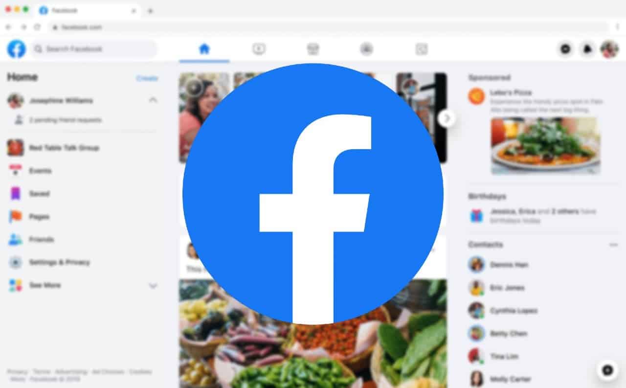
The new clearer version of Facebook for the desktop is now available for some users. It is greatly inspired by the design of the application released a few months ago on mobile.
After the application, it’s the turn of the web version. Facebook is rolling out the all-new design of its site. Some users have been invited to test it to replace the current one.
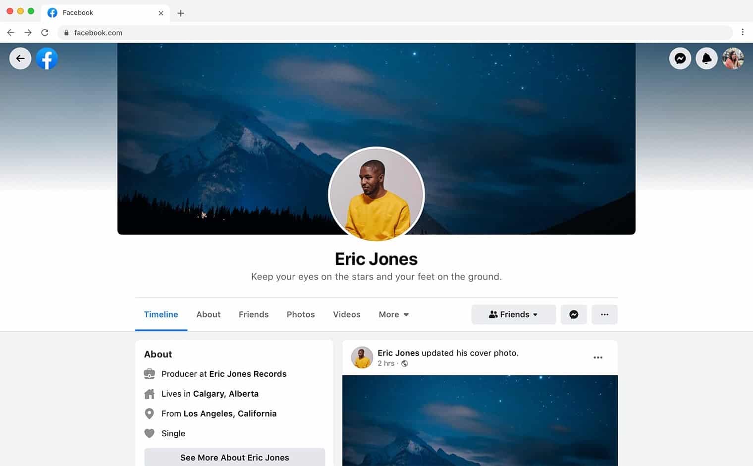
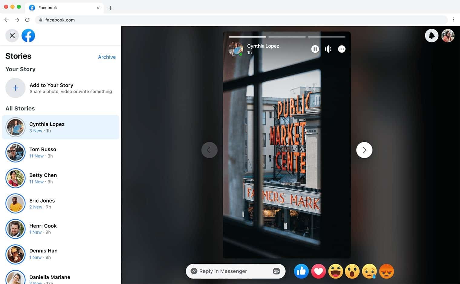
We can see a clearer news feed, new icons and an organization by thematic tabs, as in the application. You can head down to check out some screenshots of the new update.
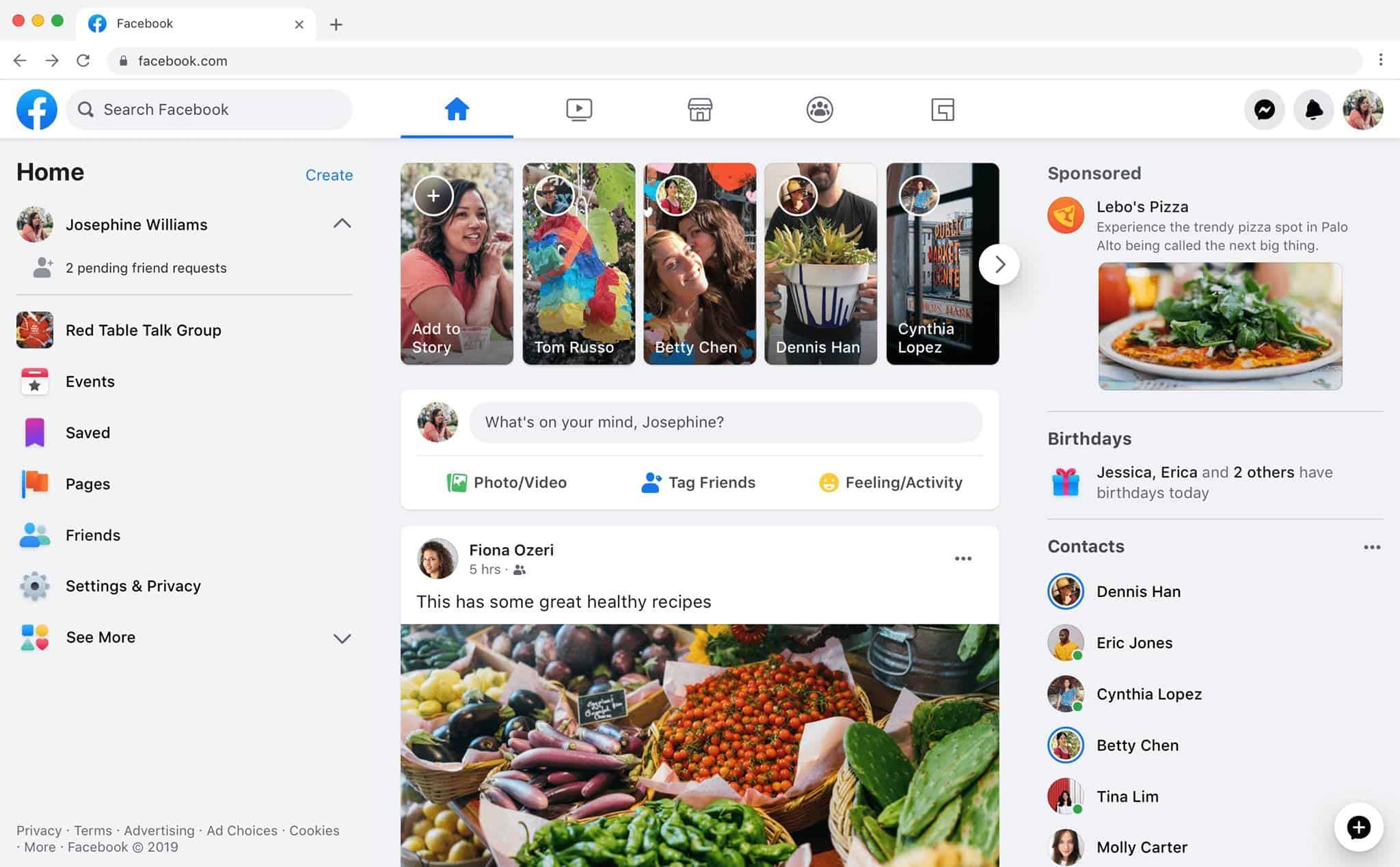
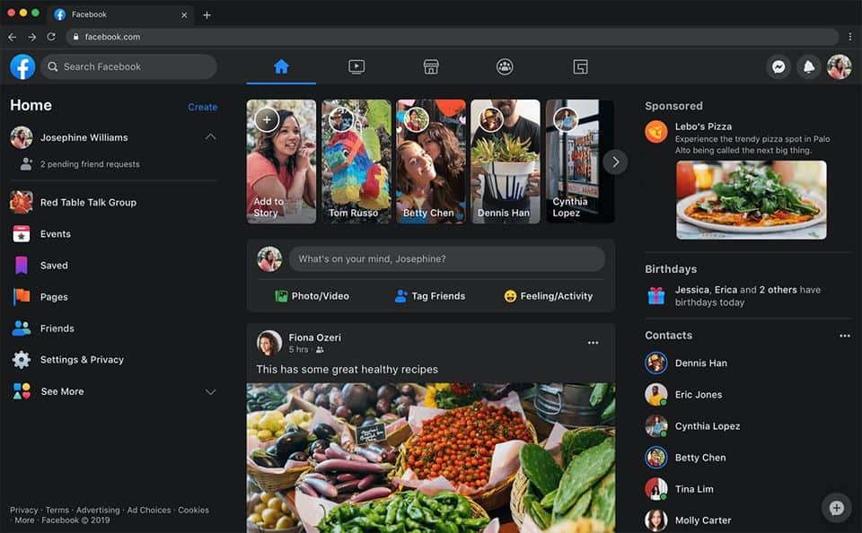
Facebook dark mode on the desktop
The design of the profiles has also been reviewed, as well as that of the stories. This new interface is also offered with a dark mode, as is now the case for many mobile applications.
It looks like Facebook is on the verge of releasing the final design. The company is now inviting users to test the new design. The invites appear to be random and are not following any pattern. The new design does change the overall look of the website and it looks much more modern than the existing design.
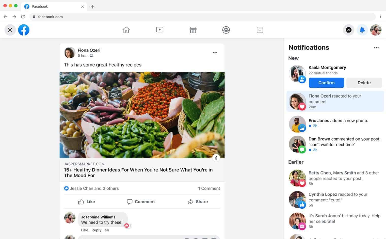
Facebook has not communicated the deployment date of this new design to all its users, but the test is now launched, it should be effective in the coming weeks.
It is worth to mention that according to App Annie, the Facebook app on mobile was the most downloaded app of the past decade followed by Messenger, WhatsApp and Instagram. The giant company led by Zuckerberg monopolizes the podium, bringing all its main applications to the top of the rankings.
App Annie took this opportunity to offer us an interesting analysis of the apps that have achieved the largest number of downloads and those that have been used for the longest time over the last 10 past years in Android and iOS.

