Facebook wants to bring some colors to its Android app: a rather curious choice is that of Mark Zuckerberg’s company, which only a few months ago turned the UI of their respective mobile apps upside down by introducing a completely white user interface.
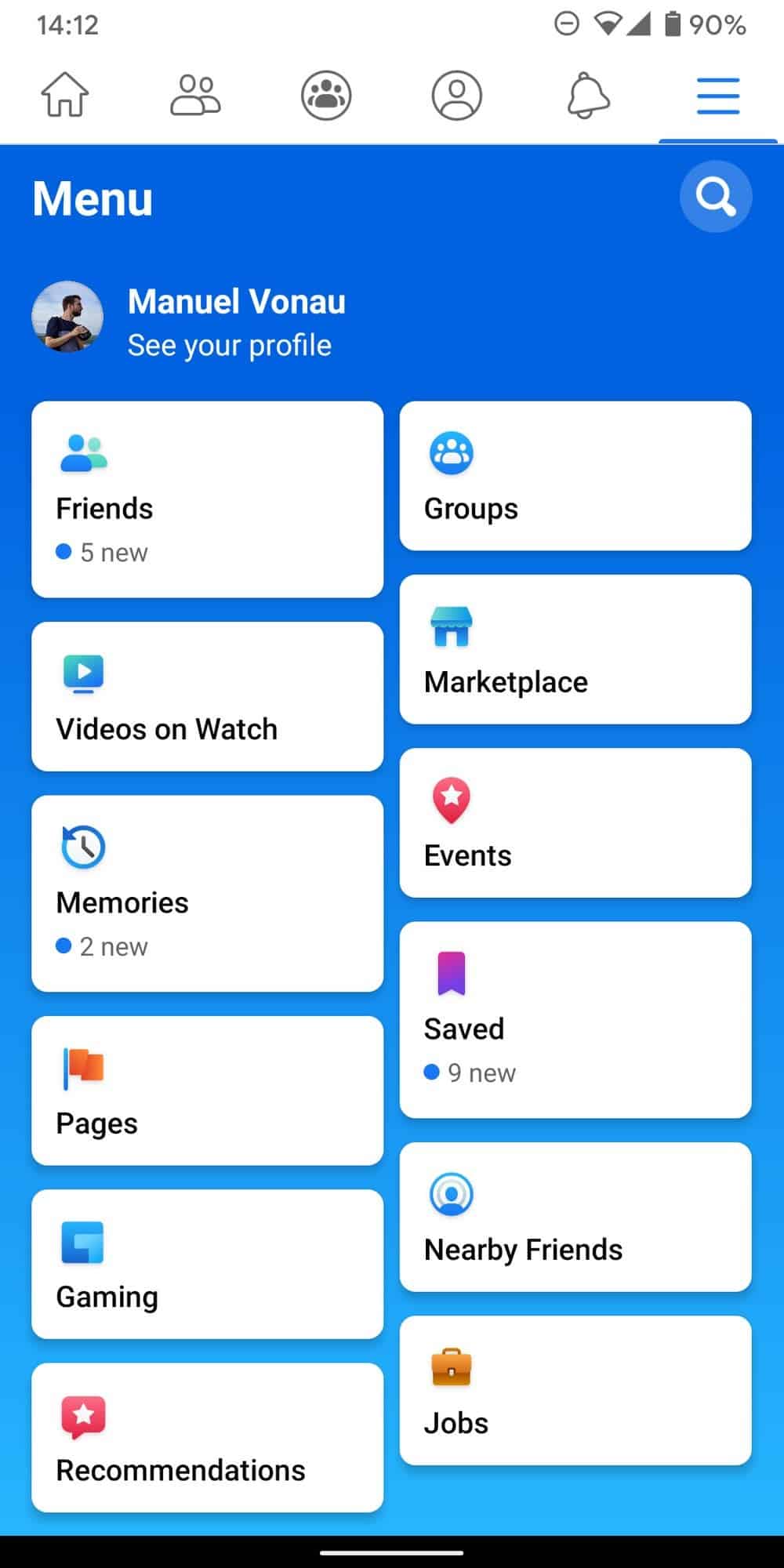
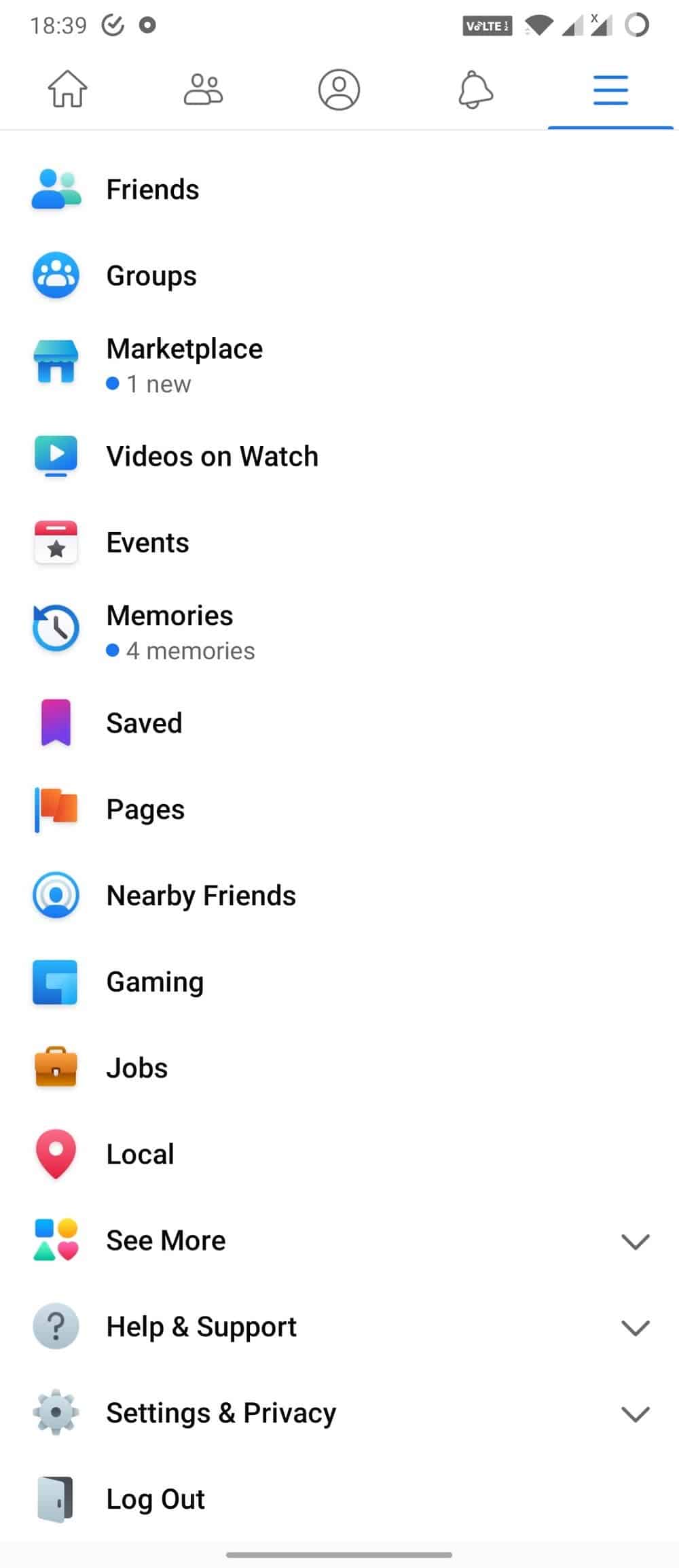
The new changes have begun to show up in recent weeks and would only refer to the side menu accessible from the button on the far right. It is not only the background color that changes – it goes from white to blue with shades of light blue – but also the arrangement of the elements, now enclosed in rectangular bubbles.
The Facebook app has a new, very blue menu


On a functional level there is not much difference between the old and the new UI (see the image above). The only changes introduced are present only from an aesthetic point of view. Users can once again count on all the sections and the various privacy settings. But they will have to give up a chromatic uniformity between the different tabs.
The new user interface is currently available for a limited number of users. It is unclear whether the remaining sections of the app still in white will be involved with the next updates.
It is worth mentioning that recently, and s has happened for Windows Mobile in the past few months, the official Facebook app has also been removed from Microsoft Store for Windows 10 PCs and tablets.
After a few emails circulating in the past weeks that wanted the end of support on February 28th. The stable and beta versions of the apps were removed from the Microsoft Store without any particular notice. For those who have already installed them, they continue to work. But it is no longer possible to download them, leaving access via browser as the only alternative.


We just want dark mode Facebook! Stop messing arround
It looks like a fitness app