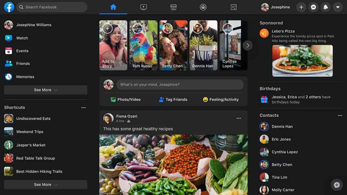
The new social network interface is now available to all users. In addition to a completely redesigned interface, a dark mode can now be activated. Almost a year after the appearance of the dark mode on the Messenger mobile application, and more recently on WhatsApp, Facebook is finally deploying the new version of its interface with dark mode for all users.
The menu organization is completely revised so that the display of the site occupies the entire screen. Also, there is more focus on stories, events, marketplace and videos.
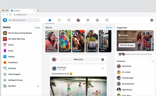
The news feed, meanwhile, has been reorganized and is now a little closer to what exists on the Android mobile application. The different menus (Home, Watch, Marketplace, Groups, Gaming, etc.) are now directly accessible from a toolbar at the top, in the center of the interface. It overlooks the stories, the publication box, and the posts in the newsfeed.
Facebook rolls out its new interface with dark mode
If this new interface is now accessible to all users but you should activate it manually. To do this, from the Facebook home page, click on the drop-down menu in the upper right, then on Switch to New Facebook.
After the switch to the new interface, take the opportunity to activate the dark mode if you wish, and get to know the new design of the social network.
You can very easily switch from the dark theme to the light theme, and vice versa, from the drop-down menu displayed at the top right.
And if this new interface doesn't suit you, Facebook lets you revert to the old version via the drop-down menu at the top right by selecting Switch to the classic version of Facebook.
The deployment is still in progress and is likely to take place over several weeks. Also, this new interface may not be available to all users immediately.
Loading

