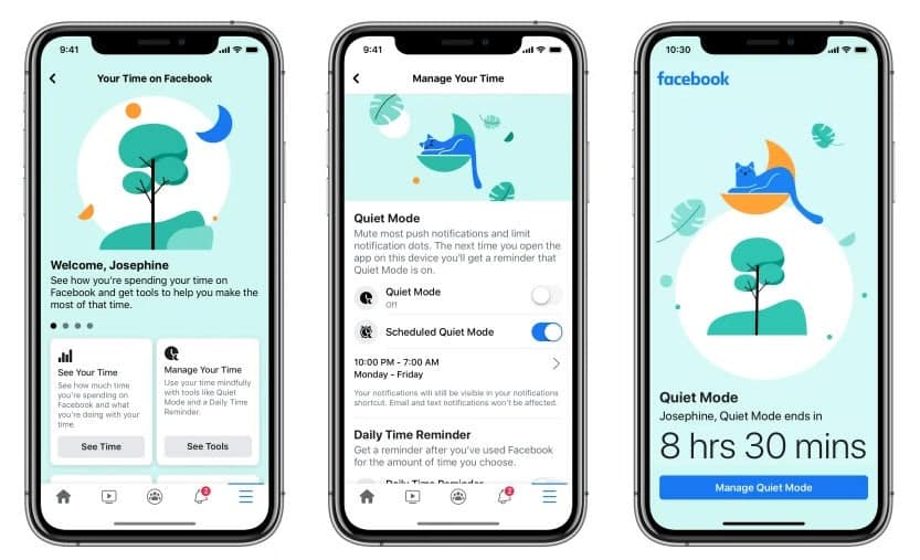
Facebook today presents a novelty concerning its iOS and Android application. It is a silent mode which cuts off push notifications. The social network specifies that this concerns “most notifications”, but does not say which ones are exempt and can always be received.
This mode, which can be activated manually or configured to be activated daily for a certain period, will also display a message on the screen when you open the Facebook application. The user is warned that the silent mode is activated with a timer indicating the remaining time. You can touch the button displayed at the bottom of the screen to go to the settings and make adjustments.
Facebook app has now a silent mode to mute push notifications
Facebook says it has also added shortcuts to notifications and news feed settings to more easily control what you see when you open the app.

Silent mode is available from today on iOS and Android. You have to open the Facebook application, touch the three horizontal bars in the navigation bar. Then go to the “Your time spent on Facebook” section to find it. The social network warns that this is a gradual deployment and that some people do not have the silent mode today. It will actually be available to everyone in May.
It is worth mentioning that according to informed sources, Facebook developers are preparing to make changes to the user interface of the mobile social network application for Android devices. The updated interface will make the process of interacting with the application with one hand more convenient.
Over the past few years, the design of the Facebook mobile application for Android has repeatedly changed. However, developers do not stop there, continuing to transform the user interface. So that the application controls are more streamlined and user-friendly. At the beginning of this year, developers began testing a new tabbed news feed. So users can quickly access the most current and most viewed publications. Now it became known that the developers began to distribute an updated interface. Now, users will find the tabs (located previously in the upper part ) in the lower area.


