Yesterday, Google released the Android 12 Developer Preview 2 (DP2) first for Pixel phones. Following the DP1.1 patch released earlier this month, DP2 provides developers with many new features for them to use in their applications. Like the first version, DP2 is still in the “priority window” for developers to test the upcoming Android 12 API and submit feedback. Let us take a look at the top 10 features on the Android 12 Developers Preview 2 system
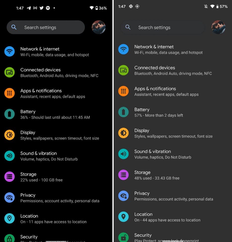
1. Dark theme now lighter and brighter
On the Pixel, it uses a true dark theme to catch the eyes of AMOLED enthusiasts. Now, in the second preview version of Android 12, Google makes the dark theme lighter and brighter. With the release of this latest version, the theme changes from dark, jet black to light gray. According to Google, the gray theme saves more power on the OLED display. It consumes much lesser power than the white theme.
2. One-hand mode is active and fully usable
In the “gestures” section of the Pixel settings menu, Android 12 DP2 adds a “single-hand mode” option. Users can activate this feature by swiping down at the bottom of the display. By default, this feature is not active on the Pixel 3 XL test device. Its working principle is very similar to Reachability in iOS.
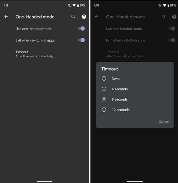
This update comes with a complete menu and users will have three options. First, switch on/off to actually enable the function. There is also a second lever to automatically turn off the one-hand mode when switching between apps. Finally, there is an option to exit the one-hand mode after a set time. You can choose 4 seconds, 8 seconds or 12 seconds, or turn off the timer completely.

3. Wi-Fi sharing is now in bright theme mode
In Android 10, Google added a convenient function of quickly sharing WiFi passwords. However, with the Android 12, this feature is changing. In Android 12 DP2, the WiFi sharing UI interface is always in light mode.
The WiFi sharing interface in the Android system will display a QR code as well as the network name (SSID) and password. This screen is hidden behind the PIN code or fingerprint of the device to ensure security.
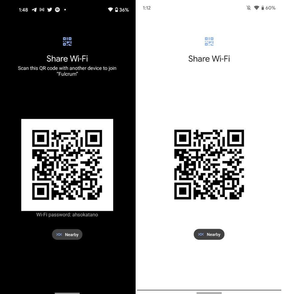
Google now forces this user interface to always be in bright mode. This is a small adjustment, definitely to make the camera easier to read QR. However, it brings an annoying side effect. When your device is set to dark mode, the plain text password and network name become invisible. Nevertheless, users can easily solve this issue by switching back to bright mode. Google will almost certainly fix this problem in time.
4. Redesigned widget list, lock screen PIN code, and pattern input adjustment
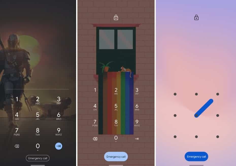
Google has made some subtle adjustments to the PIN code entry on the lock screen. The dividing line between the number you enter and the number pad no longer exists. Also, the enter key no longer uses the blue button. However, the “emergency call” pill did take this shade and is now more prominent. Another small change here is that the line of the pattern lock is now thicker.
In addition to the light and dark themes on Pixel devices, there is the Widgets list. The page now hides the rotating band and does not show which widgets are available in the app until you expand it. This makes it more compact. In other words, the application icon is much larger and contains an appropriate count.
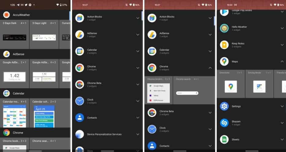
Only one carousel can be deployed at a time. The redesign of widgets in Android 12 provides a cleaner approach and is less unacceptable.
5. The picture-in-picture feature brings new gestures and hiding
When exiting the media application that is playing the video, Android 12 DP2 will immediately switch to the picture-in-picture mode instead of waiting for the animation to slide back to the homepage to complete. Google said, “This makes the transition smoother and improves perception performance”. The picture-in-picture window can now also be temporarily hidden/shelved by dragging it to the left/right edge of the screen”.
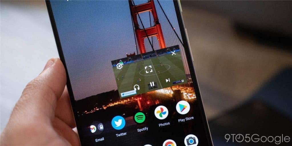
A single click will only display the controls instead of expanding them all. However, a double click will switch between the current and maximum PIP size, instead of entering the full screen. The window can also be resized by pinching to zoom.
The following is a video demonstration:
6. The media player user interface now uses system accent colors
Google is changing the media player UI accent color to match your system theme, not any content playback.
Although it may not be a huge change at first glance, it will change the saliency of certain parts of your device. The changes will be most prominent on your lock screen. Android 12 DP1 actually adjusted some layouts, but this is just a color change of the media player UI.
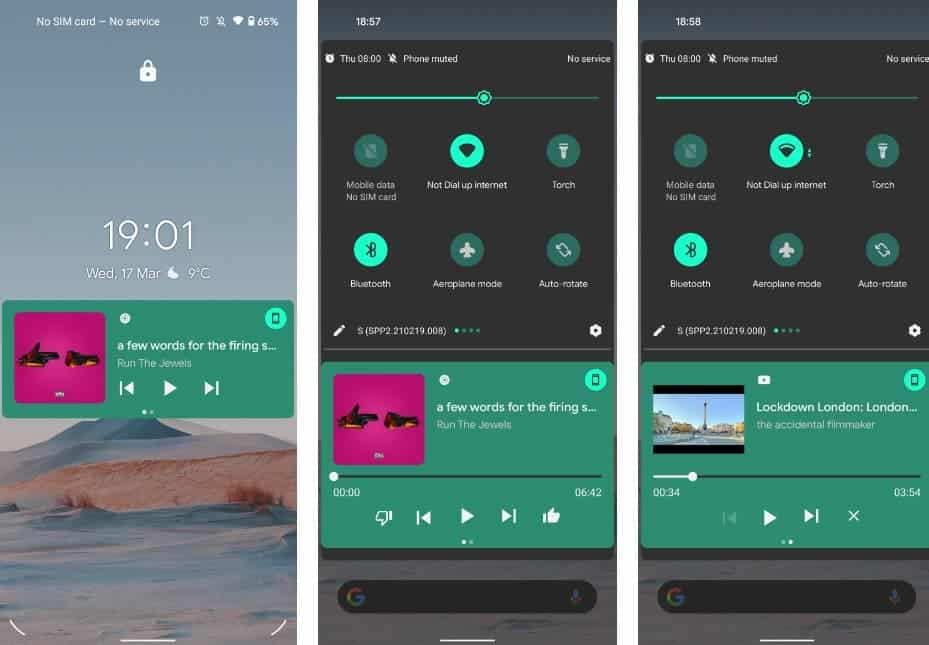
When you select the key color of the system theme in the “Style and Wallpaper” section, the color you choose will be used for any quick setting switch, and setting page. Now, this key color will also apply to the media recovery UI and the lock screen media player.
7. New Pixel Launcher search bar is under development
Google Assistant is now the focus of any type of search on Android, especially on Pixel devices. However, Google seems to be preparing to make device search easier on your launcher. It may debut a new bar with the Android 12.
Users can perform local device search on the Android launcher through the Assistant search bar. Although you may search for an application specifically on your device, you will also get Google search results.
In Android 12, Google is preparing a new device search bar to replace the Assistant/Google search bar. As shown in the figure below, after activating on Pixel Launcher, this new option does not have any Google logo. If you use this feature, it just searches the content on the device directly. Unfortunately, this is not a function for the general public and it is not ready for normal use.
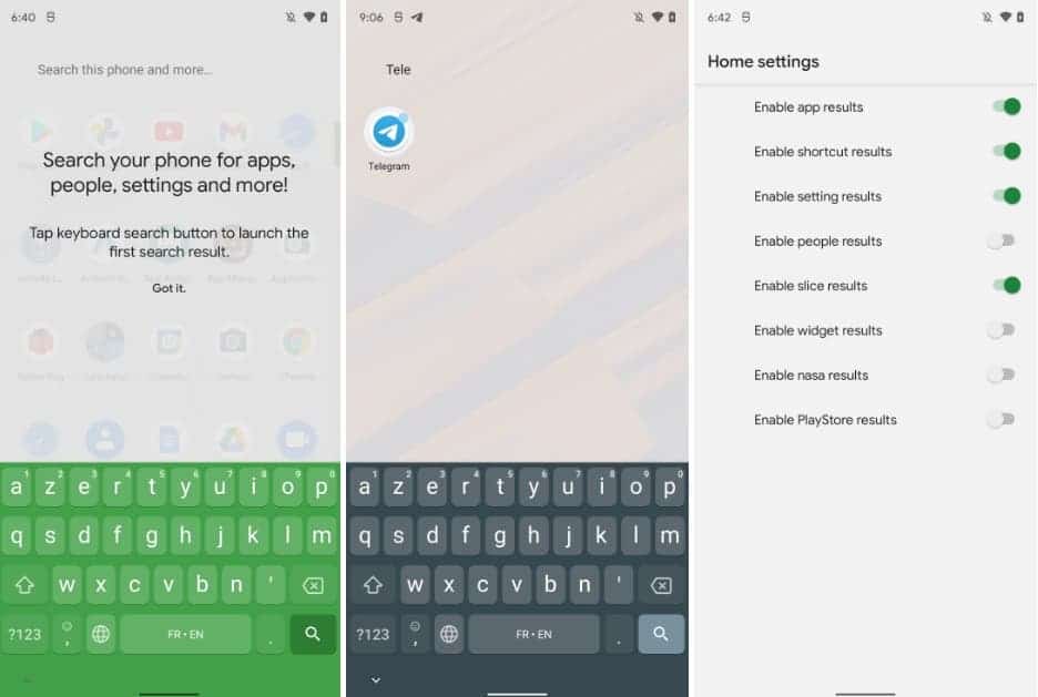
As you can see, there is a settings menu where users can switch on and off different search result sources. Possible results include applications, application shortcuts, settings, contacts, widgets, and Play Store. There is also a “nasa” code name, but it is not yet clear what it is.
8. “Game Dashboard” will add quick access to recording, YouTube streaming, and other functions
Google is developing a “Game Dashboard” for Android 12 – perhaps exclusive to Pixel phones. This feature adds useful controls and information. These features include frame per second counter, simple capture options, and YouTube streaming shortcuts.
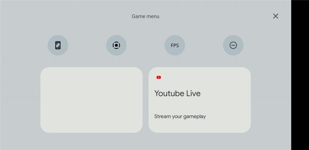
The Android 12 game dashboard quick settings seems to be for gamers to easily access screenshots and recording options. Unlike others, this frame-per-second switch is not a function from general third-party apps on Android. It is a function commonly used by hardcore gamers, especially PCs.
At the same time, the two large squares in the game dashboard seem to facilitate the use of functions that players may need. The box on the left is currently blank, and the box on the right provides quick access to live streaming your mobile game to YouTube. Currently, clicking on this option in the Android 12 game dashboard just opens the YouTube application directly
One thing to note is that the code for this Android 12 game dashboard is filed under “com.google.android.systemui” instead of the usual “com.android.systemui”. We think this may indicate that this is for Google Exclusive to Pixel phones.
9. The contact space widget is formed to remind you to chat with relatives and friends
In the leaked mockup, Android 12’s upcoming more interesting feature is “People Space”. This feature can put your friends and family on the home screen. With the release of Android 12 DP2, this People Space widget has begun to take shape.
In the early mock images, the “People Space” widget was advertised as a “conversation”. It puts your loved one in a prominent reminder position.
With Android 12 DP2, users can enable the People Space widget. When you add a widget to the home screen, you will be asked to choose from a list of recently received notifications. These are marked as “conversations” by Android. For example, in the screenshot below, you can see that it supports Telegram and Slack.
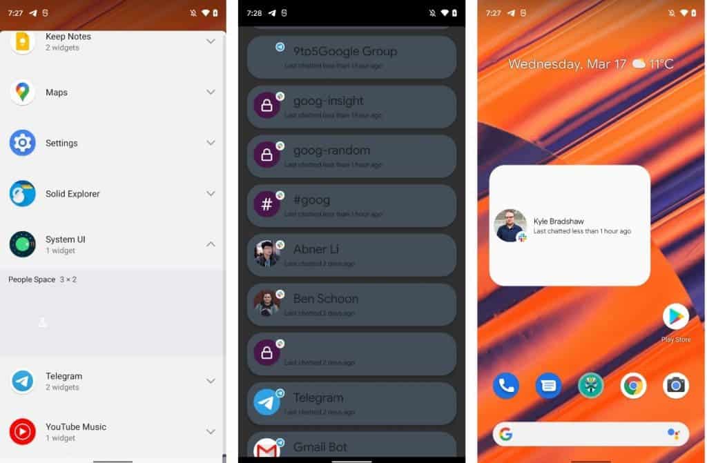
Once you select a conversation, you can place the “People Space” widget on your home screen. Here, it will tell you how long you have been chatting with that particular person or group.
It’s strange that the “People Space” widget defaults to a “3×2” size. This is obviously much larger than what is needed for a single dialogue reminder. In addition, in the initial leak information, we also saw multiple widgets arranged in different corner curves.
10. Google Pay is already available
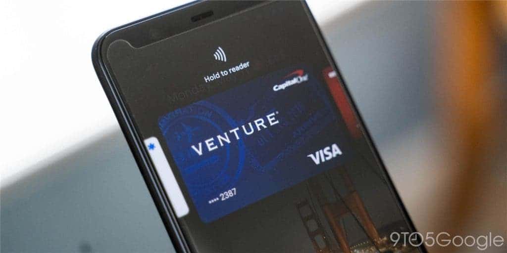
Due to the lack of NFC payment, most people will not install the early Android developer preview version. Google Pay is now active in Android 12 DP2. According to Google, there is no more issues with its NFC payment through Google Pay.
Other updates and instructions
Security
Android apps can ask the user to unlock the device before it can take action on the lock screen notification. For example, a chat application can require authentication before deleting a message. At the same time, developers can prevent overlays from appearing in their sensitive apps and workflows.
User Experience
Apps can request details about the round corners of the device. The radius, center point, and other data allow developers to adjust nearby UI elements. This prevents any sort of truncation.
CompanionDeviceService API
Android 12 introduces the CompanionDeviceService API feature. This function aims to improve applications for managing devices such as smart watches and fitness trackers. When a wearable device comes into close contact with your phone, the companion app will be active.
As long as the device is nearby, the system will maintain the binding of the service. When the device enters and leaves the range or shuts down, the system will notify the service.
Other changes
Other changes in Android 12 DP2 include a more accurate bandwidth estimation API. It is also easier to apply graphics effects (blur, color filters, etc.).
Google Android 12 developer preview system can be used in Pixel 3 (XL), Pixel 3a (XL), Pixel 4 (XL), Pixel 4a, Pixel 4a 5G and Pixel 5. Users can also use the Android 12 in the Android emulator. Google officially states that Android 12 DP2 (SPP2.210219.008) is still “only for developers, not suitable for daily or consumer use”.

