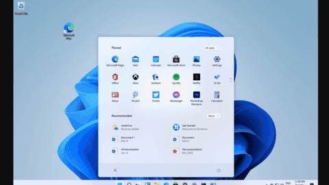
Today, the Windows 11 preview version mirrored out on the internet. Many netizens have already installed and experienced the new user interface. We have seen screenshots of parts of this system such as the start menu and taskbar and so on. From the screenshots so far, the user interface of Windows 11 is a complete revamp of its predecessor. The window is designed with rounded corners, the start menu eliminates the dynamic tile, and the taskbar is centered by default. This is quite similar to the discontinued Win10X system.
According to recent reports, a new Windows 11 “SE” SKU is hidden in the leaked build. So far, it seems to have locked a bunch of customization options in the settings and disabled the Microsoft Store application. This may be a Windows version designed to run on the Microsoft PC cloud computer service.
Microsoft has announced that it will hold an event on the Windows system on June 24. Microsoft CEO, Satya Nadella, will launch a new generation of Windows. According to reports, this system will come with the most significant changes in the PC operating system in the past decade.
Windows 11 brings a lot of Windows 10X elements
Just like Windows 10, Windows 11 will have Windows 11 Home, Pro, Enterprise, and others. There are plenty of new icons with shadows and a light 3D-like effect. This is a major departure from the flat design well established by Windows 11.
The new system from Microsoft shares many similarities with Windows 10X, a system that targets hybrid devices. Although Microsoft did not continue with the project, it appears to transfer a couple of details from Windows 10X to Windows 11. This new system also comes with a new logo, a blue Microsoft logo. The icon replaces the trapezoidal logo. It appears that Microsoft is making its system more Microsoft-branded than Windows-branded.
In addition, this system comes with a brand new Start Icon. Furthermore, Windows Search also gets a brand new appearance. Microsoft seems to borrow some elements from Sun Valley UX. These include floating, centered fly-outs. Moreover, the new search menu allows you to filter down results by apps, documents, settings, and more. Looking at the apps, there is no real change in terms of design. However, we can not be so sure that this will remain the same in the final version.
We can expect the widgets to come back with Windows 11. The design seems to be close to macOS, and it is likely to replace the Live Tiles. The appearance of the widgets will not be the same in dark mode.
