Microsoft recently announced its new Windows 11 and people have mixed reactions about it. Some say it’s a really great chance for other the change isn’t enough. However, it’s clear to see that Microsoft wants to make Windows more modular and adaptive to compete with macOS. So here are the top features that they are doing better and MacOS should definitely have.
Vertical Browser Tabs
Apple recently revamped Safari’s tab management in a big way with the upcoming launch on macOS Monterey, but Windows 11 comes out with a feature that makes the overall look a lot cleaner & makes it even easier to see and organize your tabs. Instead of collecting them in a horizontal row above your window, which causes clutter when you have a lot open, you can also see them in a vertical list by clicking an icon in the top left corner. In an instant, you’ll be able to see your open tabs as if they were bookmarks in Safari’s sidebar, which makes it easy to find individual pages in a sea of open tabs & makes the whole browser cleaner.
Widgets

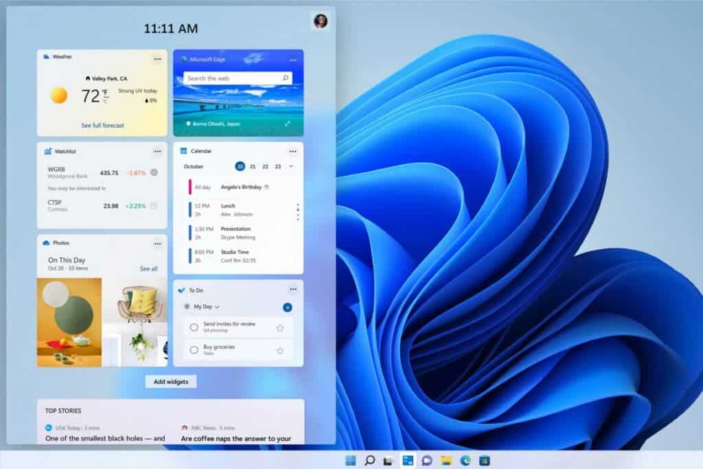
Windows users will finally get widgets with Windows 11 arriving on their desktops and laptops. Microsoft has also integrated widgets with a news feed to give a full dashboard of information. Rather than a skinny rail of widgets, users can expand the widgets pane in Windows 11 to fill the entire screen, and here they’ll find many tiles of useful information, from traffic and sports to a customizable news feed. Microsoft has even built a way to contribute to local publications if you like what you read. With Apple News and News+, it seems like a wasted opportunity to leave all those articles cooped up in an app. While PCs are supposed to be more for the professionals, a quick look over to see your information would be nice.
Smart external display adaptations
If you have ever tried to use a MacBook on an external display, you would know the hassle of rearranging the windows when you unplug from the display. The open windows get resized incorrectly and just cause a mess, but Windows 11 has a neat trick for this mess. When Windows 11 detects that a display has been removed, the windows that were on that screen will automatically minimize to avoid a mangled mess of overlapping apps. And when you plug it in again, those windows will return to the place where they were. Even better is that if you open those windows they will automatically resize according to your display.
Snap layouts

One of Windows 10’s most useful features is the ability to quickly snap any app to the left or right side of the screen to quickly work side by side in full view, it saves you a lot of time and hassle, and the windows resize accordingly to your display. Apple introduced a similar system in macOS Catalina that lets you use apps side by side in Split View. But Windows 11 takes it a step even further with new layouts that let you use two, three, or four apps at once in several preset layouts for quick and easy multitasking, and there are different layouts for different monitors setups and dimensions. With just a couple of clicks, you can easily make your workspace cleaner and better.
These are some of the features that macOS could really copy from Windows 11. So, what do you guys think? What is your favorite feature from the above-mentioned list? Would you like to see these features on a MAC? Share your thoughts in the comments below.
Read Also: WHY WINDOWS 11 REQUIRES TPM CHIP: EXPLAINED!
Follow Gizchina.com on Google News for news and updates in the technology sector.


