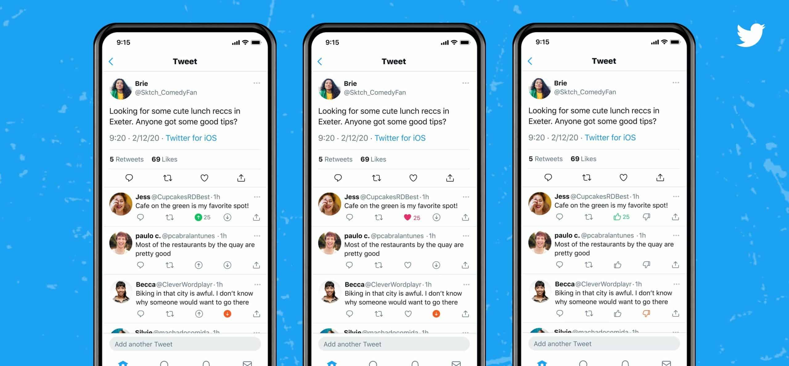
Social network Twitter has begun testing new ways to respond to posts. In addition to the standard comment and retweet buttons, a small number of iOS users have two new options for responding to a tweet. Instead of the traditional “like”, you can now vote both for and against a tweet. It seems that the social network is preparing to release the dislike button.
As explained on Twitter, new options are offered to users of the updated test application in different styles. These can be up and down arrows, thumbs up and down icons, or a combination of the familiar heart and down arrow icons. The testing was launched so that the administration of the service could form for itself a general understanding of user reactions to tweets. Based on the results, a decision will take place whether to introduce the innovation to the public or not.
So far, there were no reports regarding Twitter’s plans to add up and down votes for all users. We also do not know whether this functionality will affect the formation of the feed in the future, as is available in Reddit, where this approach determines the order in which posts show up. At the moment, they clarify on Twitter, the new function will definitely not have such an impact.
This is not the first time the microblogging service has experimented with message responses. So, in March, some users were able to put not only the traditional “like” with a heart, but also choose one of several alternative reactions, as is available in Facebook and Facebook Messenger. The head of the development department Kayvon Beykpour noted that Twitter has been working on the system of likes-dislikes since last year, and the priority of this idea for the service is quite high.

Twitter is testing the ability to post full-width photos
Twitter is testing a new timeline layout that stretches photos to the full width of the screen. Thanks to this, the interface design of the microblogging service will more resemble Instagram.
A screenshot from social networking researcher Jane Manchun Wong shows the new interface; She periodically posts information about the upcoming changes to Twitter. Judging by the image; now there will be no fields on the sides of the photo that eats the useful area of the screen.

As a reminder, Twitter announced recently that it would be phasing out the Fleets feature; which is reminiscent of Instagram stories, in August. It was available late last year. In addition, the company’s chief product officer conducted a survey; to see if users would subscribe to Twitter Blue if it allows to edit tweets within minutes of posting.


