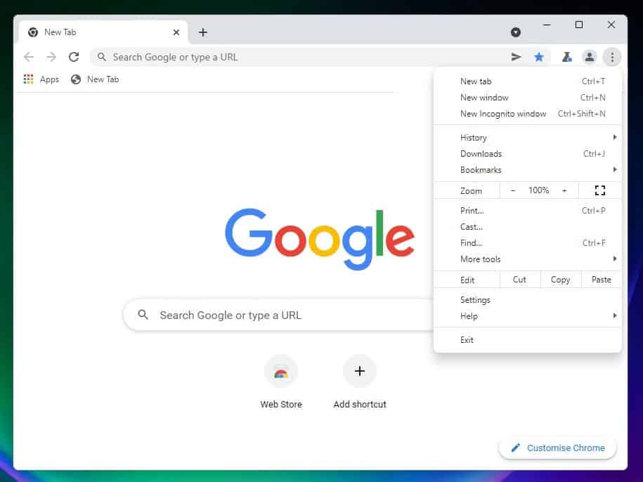
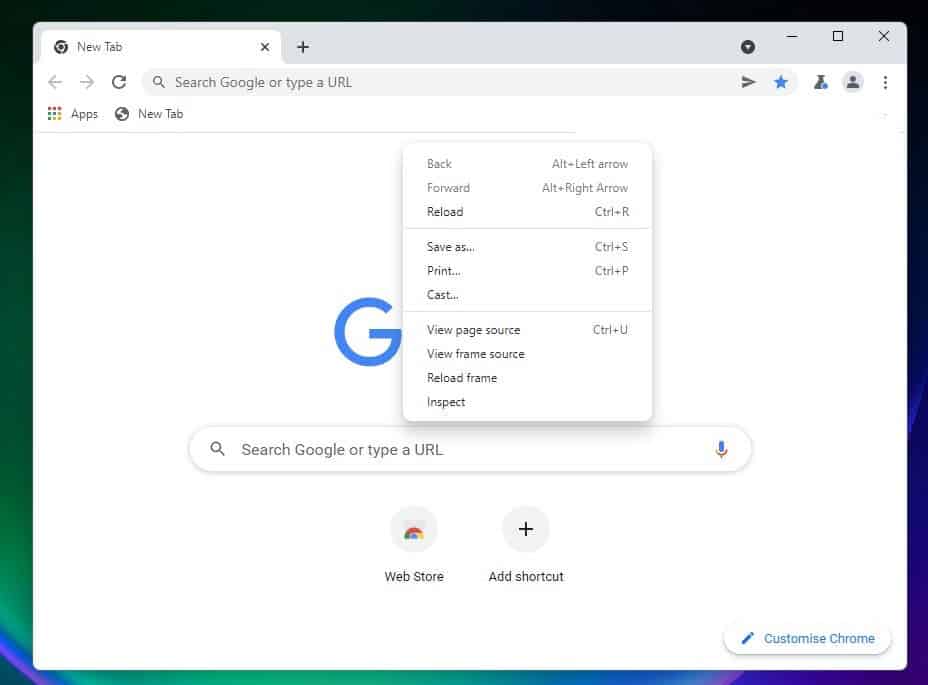
According to online sources, Google Chrome browser has received an updated design to better match the style of the Windows 11 software platform. Visual changes appeared in one of the latest test builds of Chrome Canary, but to run them, you must activate the corresponding option on the experimental features page.
Google update Chrome design to match Windows 11 style
As far as the changes to the look of Chrome for Windows go, there aren’t many at the moment. The developers have updated the design of the context menus that appear when you right-click anywhere in the browser or when you open a menu item. Rounded window corners and drop shadow effects were one of the notable design changes. Also noted is the emergence of an experimental feature, the activation of which makes the browser context menus transparent.

Microsoft recently confirmed that applications using the new design elements will not affect the performance of the operating system. According to the available data, all changes are thoroughly tested for impact on overall performance. This means that the rounded corners of the windows, redesigned menus and other innovations will not slow down the platform.

You can try out the new Chrome design now. To do this, you need to download and install the latest version of Canary, on the Chrome: // flags page, activate the Windows 11 Style Menu option and restart the browser. Most likely, these are not the last changes to the look of Chrome, and soon the version of the browser for Windows will have more innovations.
Google tests “smart” grouping of visited pages by topic in Chrome
Google Chrome developers are experimenting with new features to help users explore topics of interest by comparing their open page to other search results. The feature provides additional ways to track your subject.
The new feature automatically matches pages and information related to the same topic; so users do not have to browse history themselves or create new folders with all these pages in bookmarks. In addition, Chrome shows additional search hints, which also makes it easier to learn the topic.
Pages are grouped by topic locally, and the results are not synced to your Google account; which means that such groups cannot be accessed across devices. But it is possible that such an opportunity will appear in the future. The new feature is currently only available in a preview build of Chrome Canary. You can find travel experiences of the topics you study on the browsing history page.
Another companion feature is the search sidebar. Having opened the page following the link in the search results; the user will see an icon in the form of the letter “G” next to the address bar. Clicking on this icon in the sidebar will open other search results. This will allow you to compare the open page with other search results; without having to repeatedly open adjacent tabs and move between them.
This feature is currently in tests on the Chrome OS Dev channel. If the tool is released to a wider audience in the future, the sidebar will become available on more platforms; and support for other search engines will be added.


