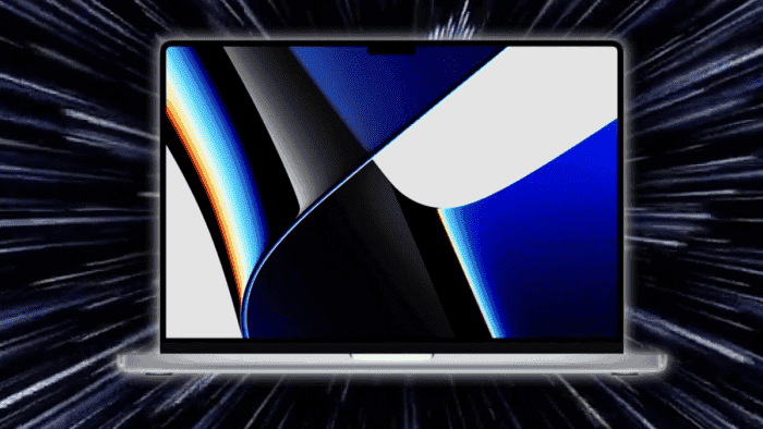
Apple unveiled the new MacBook Pro with a major refresh in design. Besides the new displays, more ports, and returning elements, one of the biggest changes was the Notch at the top of the display. Like it or not, Apple has brought the iconic notch that has been present on iPhones since 2017 to the MacBook Pro lineup. Some enjoyed the result, which has actually made the MacBook Pro a unique laptop in the industry. However, there are some inconsistencies with the notch and the macOS is showing them.
It’s almost like Apple has forgotten about the Notched Design in MacBook Pro series
A recent report from The Verge shows that the early adopters of the latest MacBook Pro are finding inconsistencies in the Notched device. Apparently, macOS isn’t consistently handling the notch across the UI and in individual applications. An uncommon behavior happens where status bar items can get hidden under the notch. These inconsistencies almost make it feel like Apple has completely forgotten to adapt its operating system to the notched device. Or at least, it forgot to tell its developers that it was bringing a laptop with a small cutout at the top of the display.
WTF HAHAHAHA HOW IS THIS SHIPPABLE? WHAT IS THIS?! pic.twitter.com/epse3Cv3xF
— Quinn Nelson (@SnazzyQ) October 26, 2021
Quinn Nelson, the owner of Snazzy Labs, has posted two videos on Twitter demonstrating some of the early notch issues. The first video demonstrates what appears to be a bug in macOS. Status bar items like the battery indicator can get hidden underneath the notch when status bar items are extended. He also demonstrates that iStat Menus can be hidden under the notch. Also, it’s possible to force system items like the battery indicator to be hidden underneath the Notch. In fact, Apple has issued guidance to developers on how to work with the notch, the developer behind iStat Menus says the app is just using standard status items. He clarifies stating that Apple’s recent guidance can’t solve the issue apparent in this video.
Nelson states that an older version of DaVinci Resolve avoids the notch. Moreover, apps that haven’t been updated for the notch, the user can’t even move your mouse pointer into it. Apple blocks off this space so that older apps can’t display menu items underneath the notch. Interestingly, the notch can even expand certain issues. For example, DaVinci Resolve can take over the space used by system status items. According to MacRumors, this is regular macOS behavior, however, the notch reduces the amount of space for both the menu items and status items. Interestingly, this is giving popularity to some apps like Bartender and Dozer as they allow users to manage the macOS menu bar. We’re yet to see if Apple will adapt and fix these issues.


