Cupertino giant Apple has shared a new support document today, explaining to users how they can ensure than an application’s menu bar items do not hide behind the notch or, as Apple calls it, the camera housing on the new 14-inch and 16-inch M1 sporting MacBook Pro models.
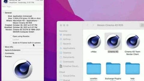
In this new support document, Apple mentions that users can turn on the “scale to fit below built-in camera” option for an app to change the active area of the display, which in turn ensures that the app’s menu bar items will be visible below the notch.
How is Apple Fixing this Peculiar Issue with the MacBook Pro Notch?
This comes after Quinn Nelson, host of YouTube channel Snazzy Labs demonstrated in a video that the notch was hiding the Menu bar items, which made using apps quite the hassle.
In order to turn on this new “scale to fit below built-in camera” option for an app on the new models of the MacBook Pro, users need to open the Finder app, after which they need to click on Applications option in the sidebar.
After this, they need to right click on the application of their choice and select “Get Info”, once that window is open, they need to check off the “scale to fit below built-in camera” after which the display will be automatically scaled, with this feature being demonstrated by Joseph Angelo Todaro, a design advocate for Sketch.
Apple also notes that devs can update their applications to work easily with the new notch, which, if done, hides the “scale to fit below built-in camera” option.
Why Was This Fix Necessary?
As mentioned earlier, this fix comes after a recent report from The Verge shows that the early adopters of the latest MacBook Pro are finding inconsistencies in the Notched device. Apparently, macOS isn’t consistently handling the notch across the UI and in individual applications.
These inconsistencies almost make it feel like Apple has completely forgotten to adapt its operating system to the notched device. Or at least, it forgot to tell its developers that it was bringing a laptop with a small cutout at the top of the display.
Nelson states that an older version of DaVinci Resolve avoids the notch. Moreover, apps that haven’t been updated for the notch, the user can’t even move your mouse pointer into it. Apple blocks off this space so that older apps can’t display menu items underneath the notch. Interestingly, the notch can even expand certain issues.
For example, DaVinci Resolve can take over the space used by system status items. According to MacRumors, this is regular macOS behavior, however, the notch reduces the amount of space for both the menu items and status items.
Interestingly, this is giving popularity to some apps like Bartender and Dozer as they allow users to manage the macOS menu bar. We’re yet to see if Apple will adapt and fix these issues.
Follow Gizchina.com on Google News for news and updates in the technology sector.
