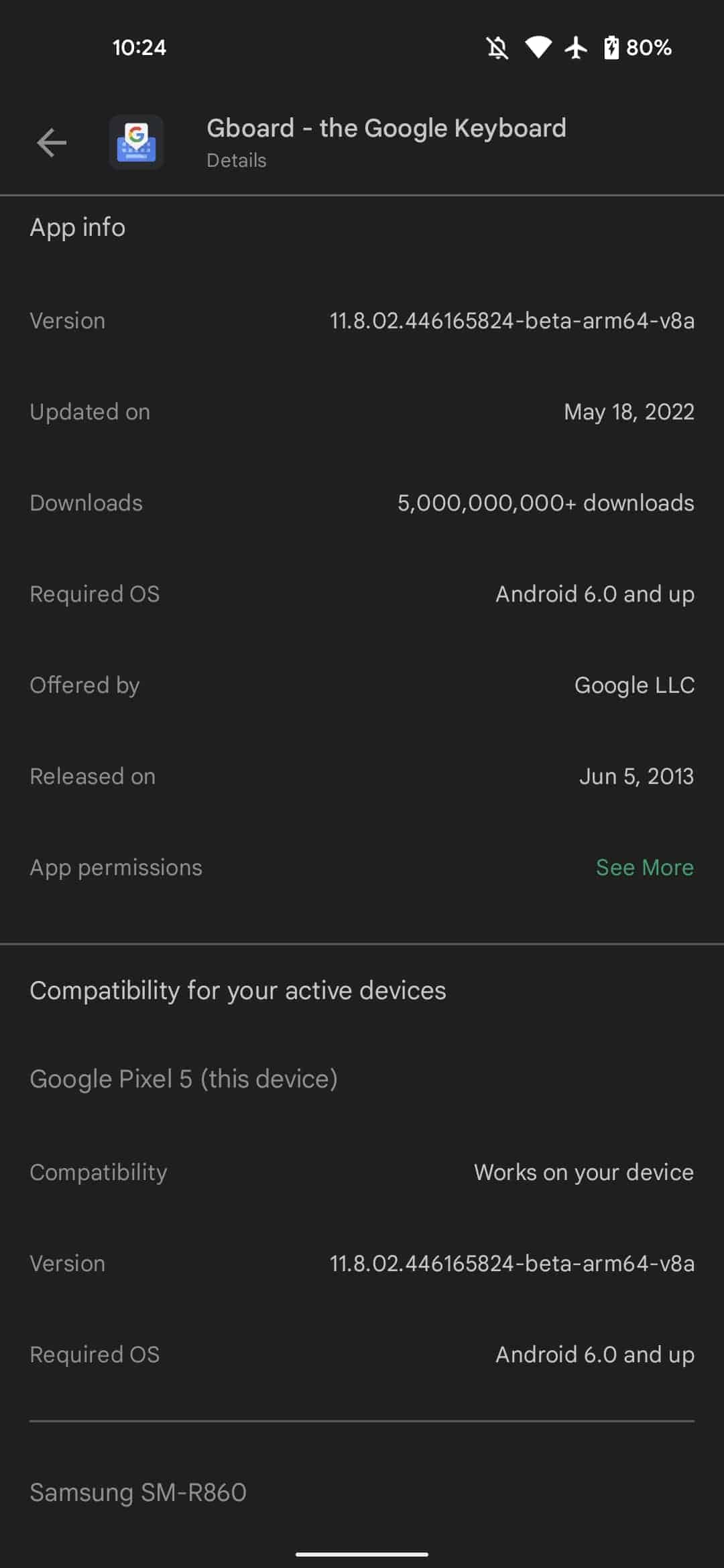
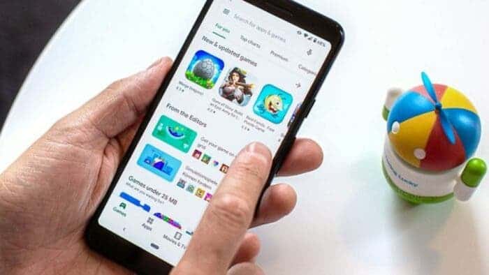
In parallel with the redesign of Google Play, Google began to add other features – the section “Compatibility with your devices” was added to the mobile version of the app and content store.
If in the PC version the ability to evaluate compatibility with available devices existed before, now similar functionality has begun to appear in mobile versions. At the same time, the user sees only information about devices linked to his Google account and “active” over the past 30 days.
Compatibility appears for both smartphones and devices such as wearable gadgets based on Wear OS and models on Android / Google TV. Other data is also available for viewing, including information about supported operating system versions.
Now Google Play has become more than just a platform for smartphones and tablets. You can also find software for other variants of Android in the store, from OS for car media centers to wearable devices with Wear OS.
The option is already available for some users with Google Play version 30.6.16-21. Later, it will probably appear in other smartphones.
New features in Google Play Store

The Google Play website has got a redesign and is now widely available. Other noteworthy features include:
- On mobile, this revamp leverages a bottom bar.
- The tab indicator slides/animates over to a section upon selection.
- A developer page will immediately show all available apps instead of you having to first click a button.
- The bottom of the page contains links to: Play Pass, Play Points; Gift cards, Redeem, and Refund policy, as well as Parent Guide and Family sharing.
- The Books tab links to Your library and Your wishlist where you’ll find the old design still in use.
- The Play Movies & TV player is unchanged.
Google is finally launching a major revamp of the Play Store’s web interface. In November of last year, the company began testing the new web user interface makeover. The Play Store’s web interface has got modifications to match the look and feel of other Google services and apps.
In terms of style, the Play Store site now resembles its app version; as though it were here for larger screen devices such as tablets. The tablet Play Store, on the other hand, is not the same as the redesigned web design.
Returning to the user interface, the new top ribbon is the first thing you’ll notice. From the side panel, the menu selections for Games, Apps, Movies & TV, Books, and Kids have been moved to the top. Which appears to be the most practical and sophisticated option.


