Google does not often update the appearance of its icons because there is really no need for this. However, you will agree that when a popular icon becomes too old, there may just be a need for a change. Even when Google updates its icon, the upgrade is in most cases very insignificant. In fact, if you don’t look carefully, you may not be able to tell the difference between the upgrade and the old version. The last time Google changed the icon of the Google Play Store was in 2016. Now, there are reports that the store is about to get a new icon, making minor changes on the current basis.

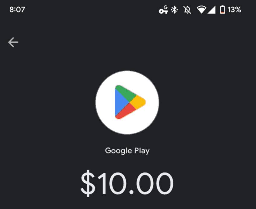
By comparing the upper and lower images, you can see that the new Google Play Store icon also uses a triangle and four-colour block design. However, the corners in the new version are more rounded and the colour looks darker.

Google Play new icon is live in some apps
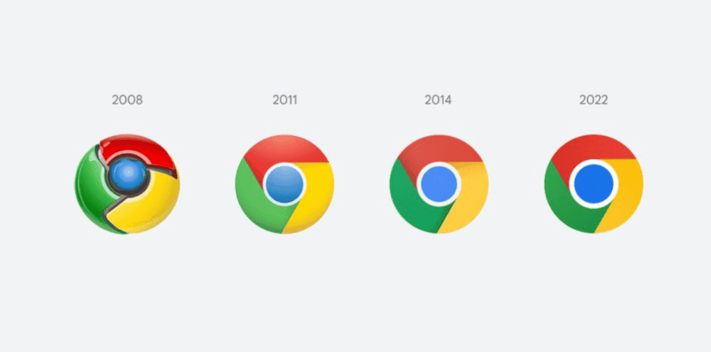
According to reports, the new icons are already live in GPay and Google Pay, and it is unclear when the official update will be made. Google launched a new icon for the Chrome browser in February this year, removing shadows, optimizing proportions and brightening colours, thereby simplifying the main brand icons to match Google’s more modern brand expression. It’s unclear if the new Google Play Store icon serves the same purpose.

As usual with Google’s icon change, this is the first Chrome icon change in many years. We may not even call it a change because it is more like a little tweak to the old icon. Google’s interaction designer, Elvin Hu, shared the new icon design on Twitter. “As some of you may have noticed, there’s a new icon in today’s Chrome Canary update. Yes! For the first time in 8 years, we’ve updated Chrome’s icon. The new icon will start appearing on your device soon,” he said.


