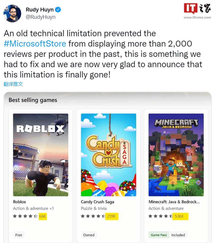
Rudy Huyn, the chief architect of Microsoft’s Windows 11/10 app store, revealed on Twitter that the app store finally supports the display of more than 2,000 reviews. Rudy Huyn said that, due to an old technical limitation, the maximum number of reviews per product in the Microsoft App Store was limited to 2,000. In time past, there have been several complaints of users not being able to add their reviews to a product. Thus, when the product no longer meets up to its previous which generated so many positive comments years back, there is no room for new users to state the current situation of the product. Microsoft claims that it is happy that this limitation is no longer there.

As you can see from the screenshots, the Microsoft App Store can now display the correct number of reviews for a specific app/game. This helps users determine which apps/games are more popular. Before now, users did not really notice this limitation. Although it is no advance update, it is a “big step” on the road to becoming an excellent app store. Although nothing significant, this is a long-awaited feature that many users are excited about. Microsoft also recently released new rules to allow paid open source applications to enter the app store, and pledged to “commit to an open store that supports developer choice and flexibility.”
Windows 11 app store launches a new web version
Microsoft quietly changed the new interface for the web version of the Windows App Store in March. The company switches from the original Windows 10 style to the Windows 11 style. Now, the newly designed web version of the store has been officially launched. This new version no longer has the preview version label.
The web version of the Windows 11 app store, named “Microsoft Apps”, has been redesigned in layout. The app category is on the left while the search bar is above. This makes it easy for users to find apps and this is more efficient than the client version.
The UI of the application also adopts the same rounded corners, shadows, dynamic effects, etc. of Windows 11. Thus, there is no need to see the ugly black line on the button border.


