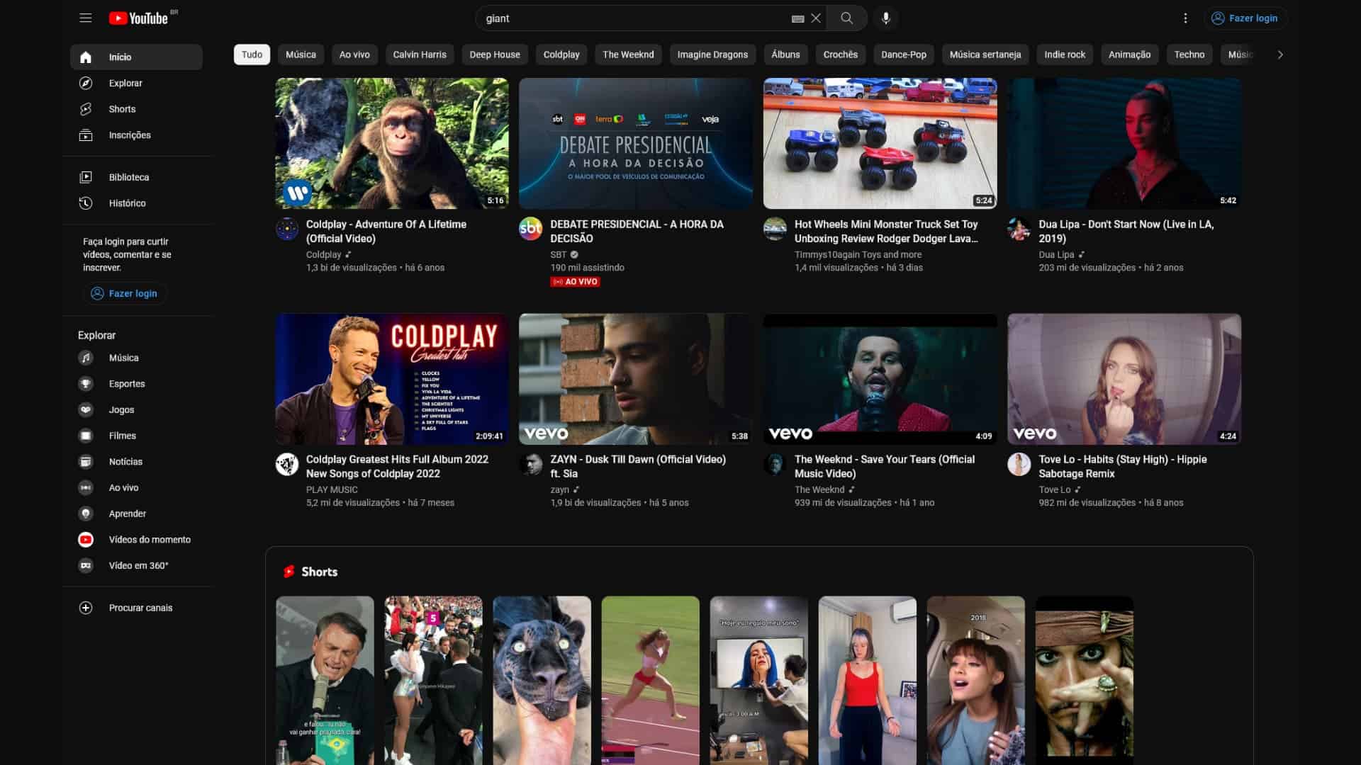
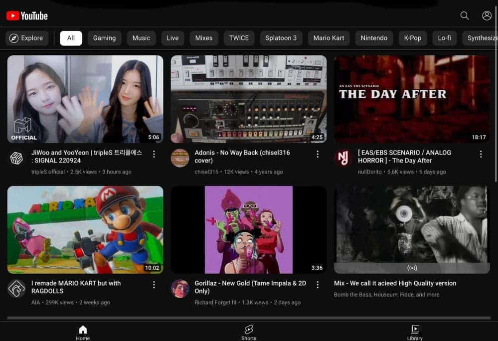
YouTube, which has received criticism for its recent advertising decisions, has started rolling out a new design. Google is bringing the Material You design language for the YouTube platform.
The company began implementing the same design language across all platforms after creating the Material You design language for the Android 13 version. YouTube has undergone a significant redesign that affects both its desktop and mobile designs.
YouTube is getting ready to appear with its new design!

The buttons’ corners will be soft in the new style. The design will also have rounded corners on thumbnails, and the Explore section has been shifted to the left.
The desktop design has seen more revisions than the mobile design. The corporation made some significant adjustments, one of which was its decision to switch from gray to a black theme. The YouTube Music platform’s Android application design uses the same design components.
It’s important to keep in mind that the new YouTube site is still undergoing testing. The new design components are not complete yet.
Comparatively speaking to other Google platforms, the video streaming platform has traditionally had its own design language and will now continue that trend with Material You. The business, which has sped up work on its new design, will reveal the outcome shortly.

The Google-owned social media network for sharing videos, YouTube, just recently introduced a new ad style that will take effect later this month. YouTube viewers without a Premium subscription will now get up to five ads before the video even begins.
The story became public when a number of YouTube Free users began talking on Twitter and Reddit about having to watch 5 advertisements rather than 2 before they could view their YouTube video. Several free users said that they received five unskippable ads instead of skippable ones prior to a video-watching session.


i see it when logged out but not logged in
same bro