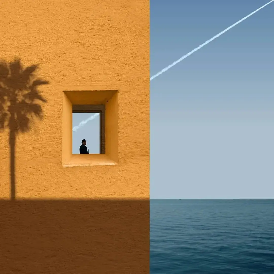
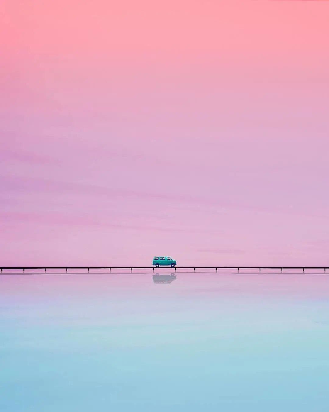
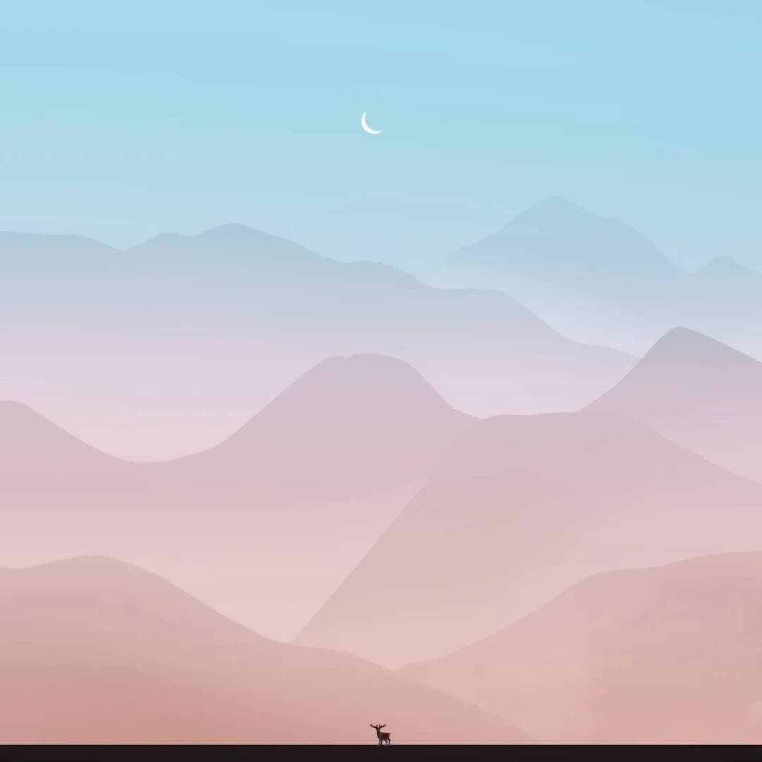
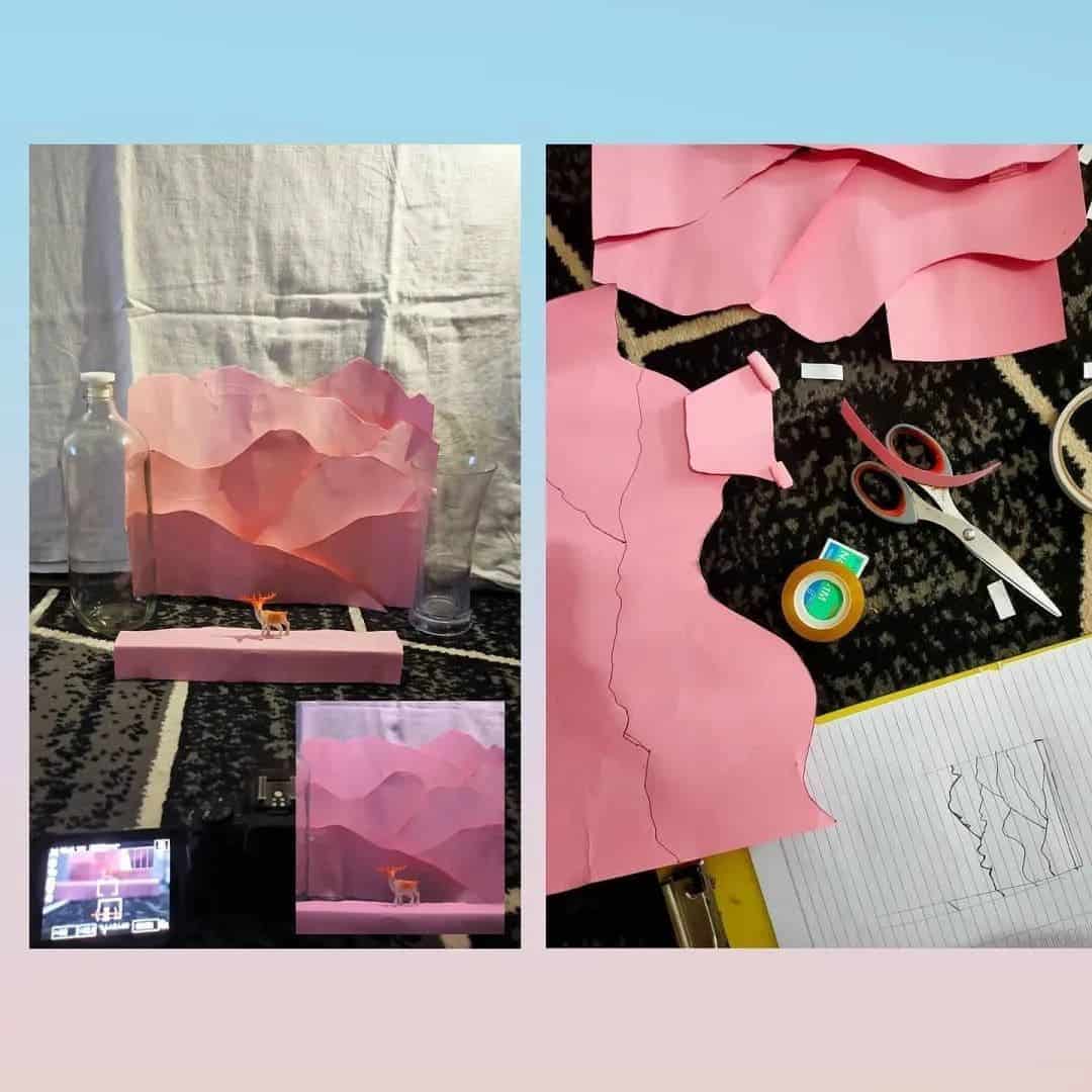
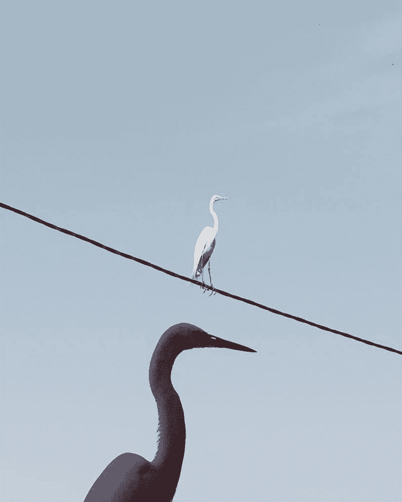
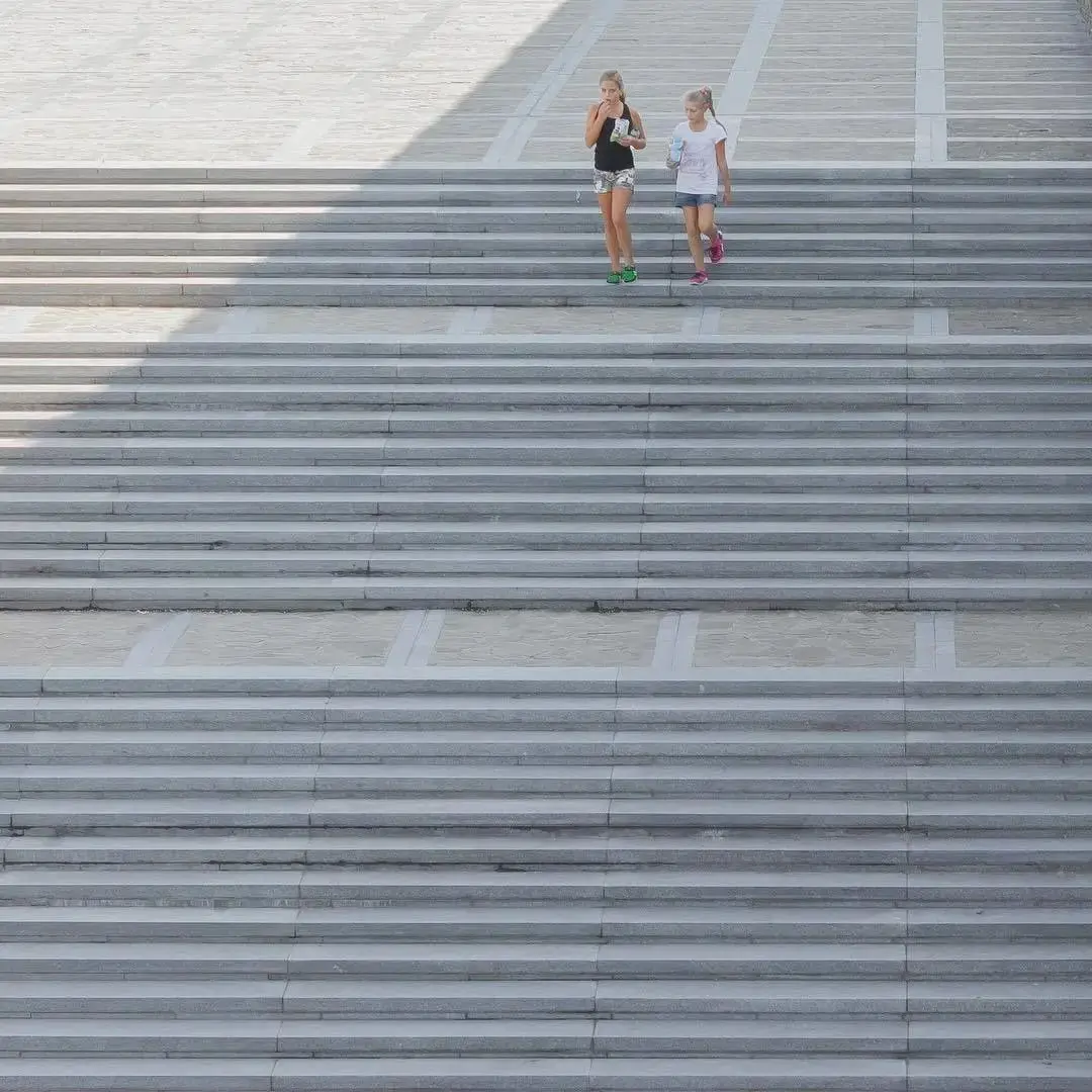
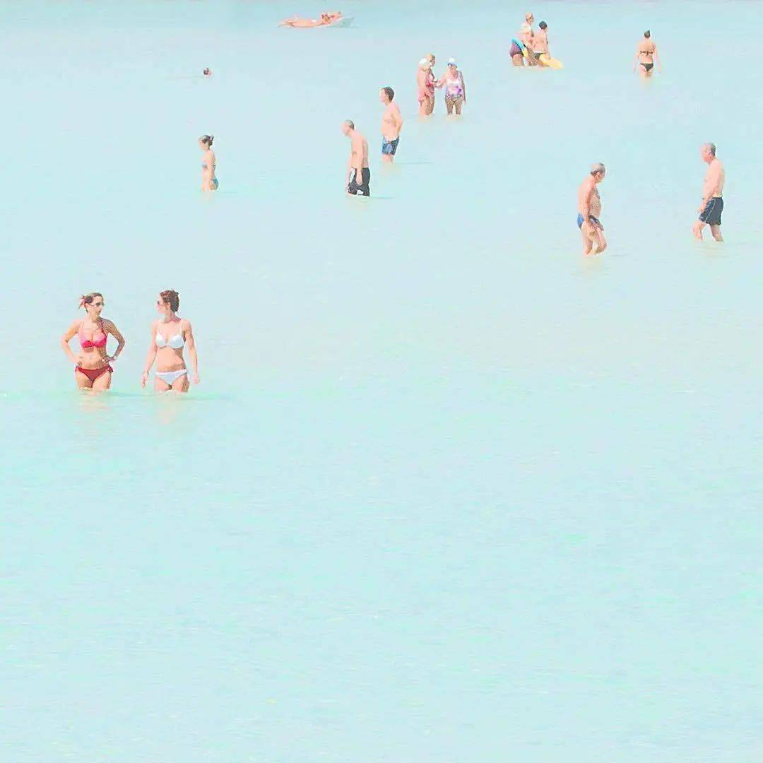
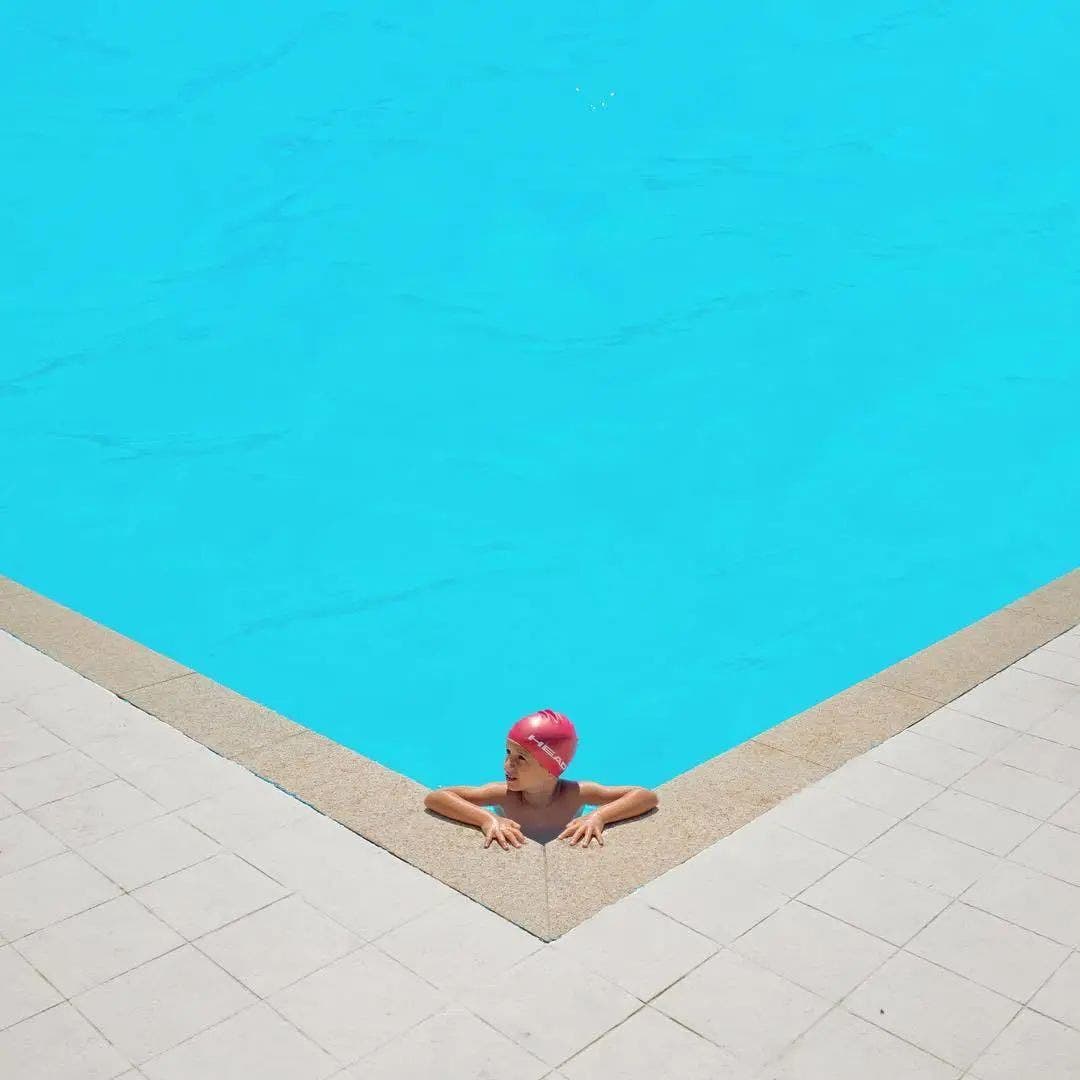
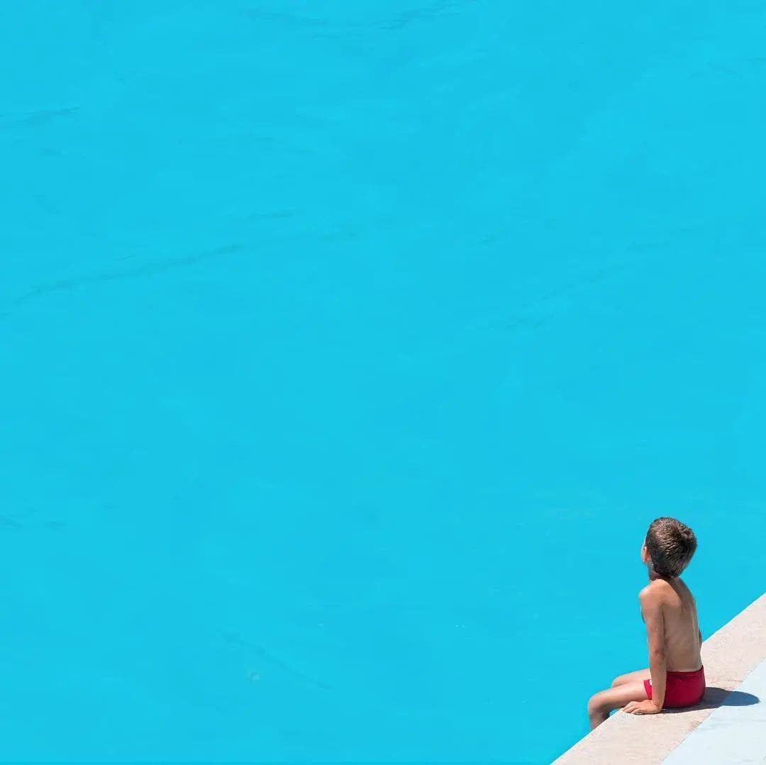
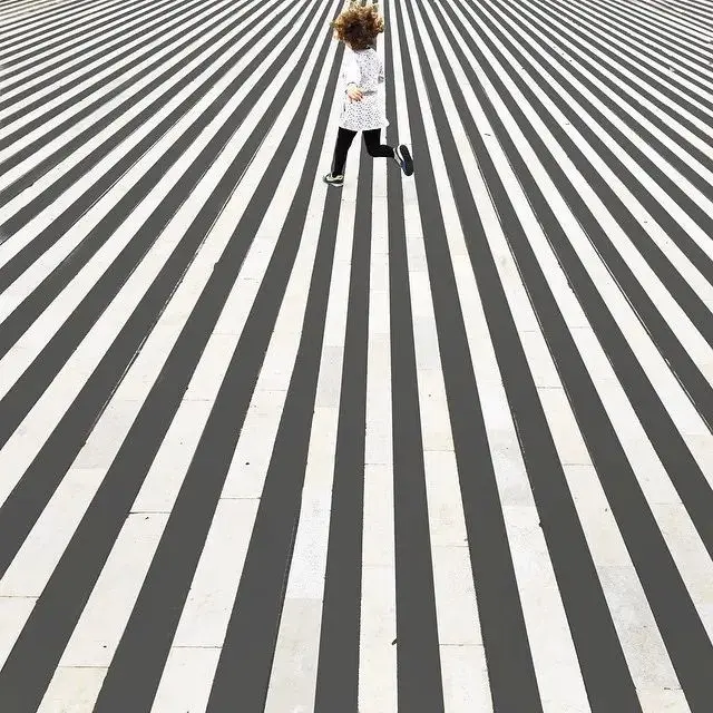
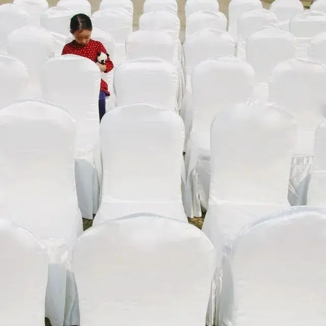
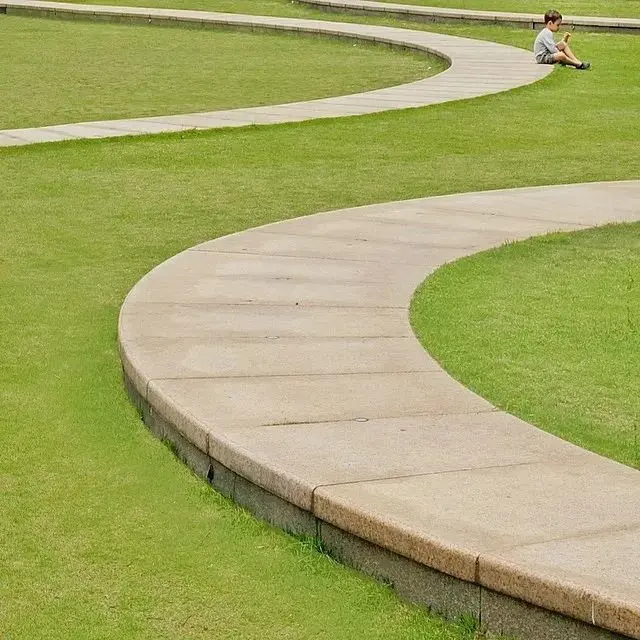
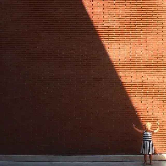
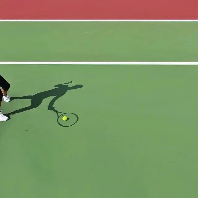
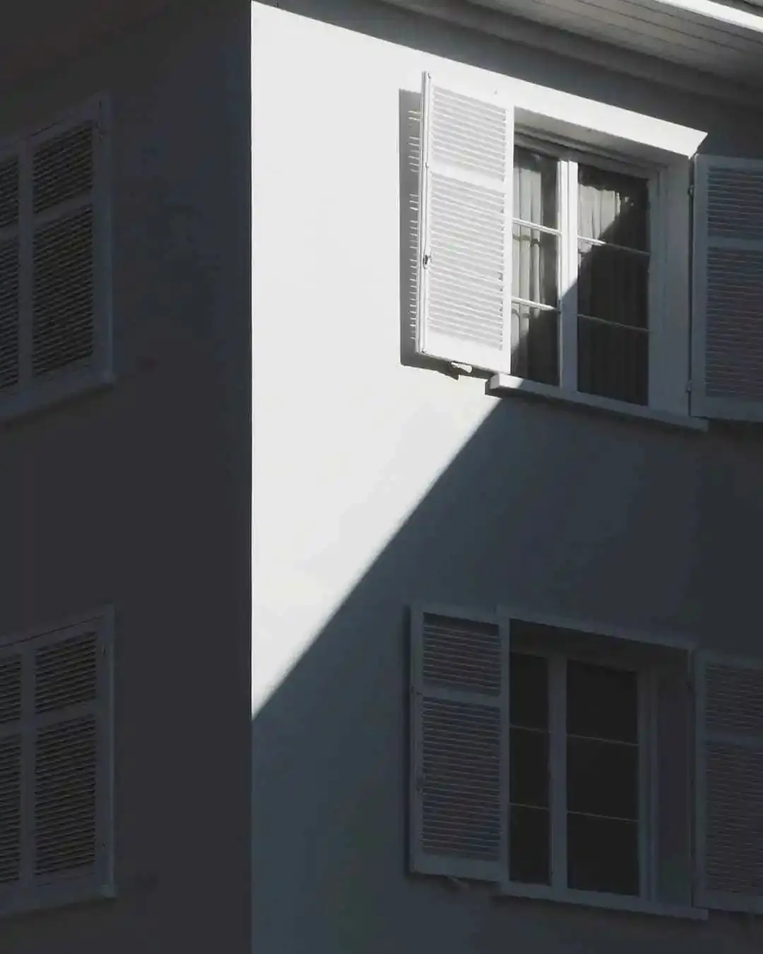
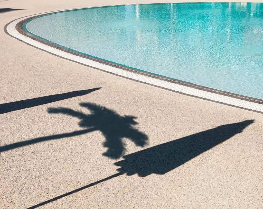
Do you like minimalist photos? Maybe the minimalist photos of ins in many people’s minds are like these images below
Most of them have gorgeous colours, delicate structures, and minimalist elements. They often bring people the ultimate visual enjoyment. Seeing more photos like this can cultivate beauty and inspire ideas. However, it may not help us much in our daily creations.
These photos are either empty scene, rich in colour or has undergone powerful post-production synthesis or even shot directly with a miniature model. These conditions are more difficult for ordinary people to meet. But don’t worry, minimalist photos are not as difficult as you might think.
Today, we will share some tips on how to take minimalist photos. Maybe only by trying it ourselves, we will truly appreciate its beauty~
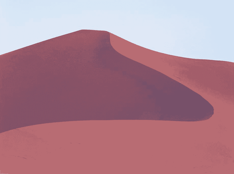
1. Choose the right frame
Minimalist photography, in simple terms, expresses the content clearly with as few elements as possible. The standard for minimalist photos are
- Every element that appears in the picture has its purpose and cannot be redundant
- Pictures that express different contents have their proper proportions and cannot be rigidly applied.
When we want to shoot a scene, we probably know what we want to shoot. At this time, we can choose a “frame” with a suitable proportion. Then, we arrange things within this frame
a. Square frame
In minimalist photography, 1:1 is the most common format. The four sides are of equal length, making the picture well-proportioned and compact. This allows the line of sight to be focused in almost any position.
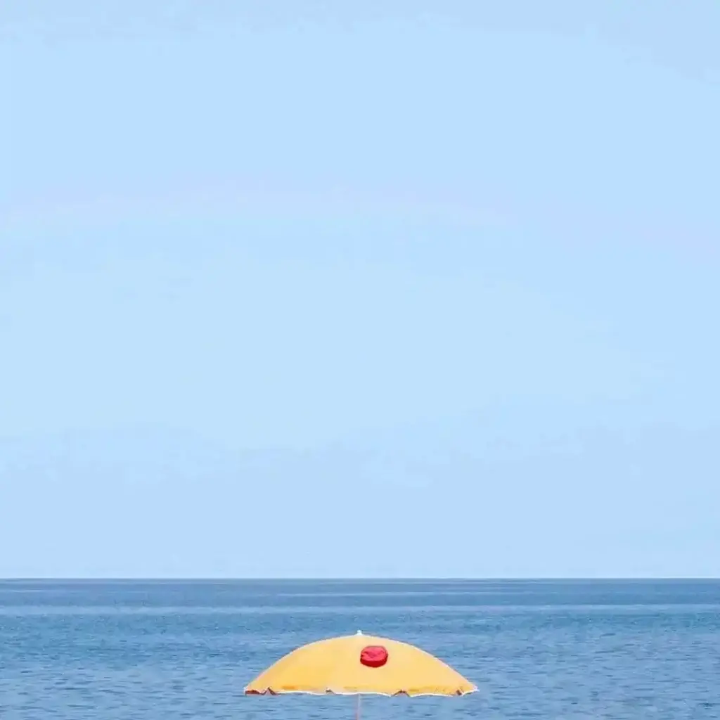
You can maximize the prominence of the subject without worrying about whether it is too space or too crowded. When you encounter an exciting scene, you can even close your eyes and shoot. So long as the frame has all the info you need, you are good to go.
b. Horizontal format
A horizontal format with a width > height can accommodate more horizontal content at the same time. This is more in line with our visual habits. Thus, it gives people a natural, comfortable and peaceful feeling.
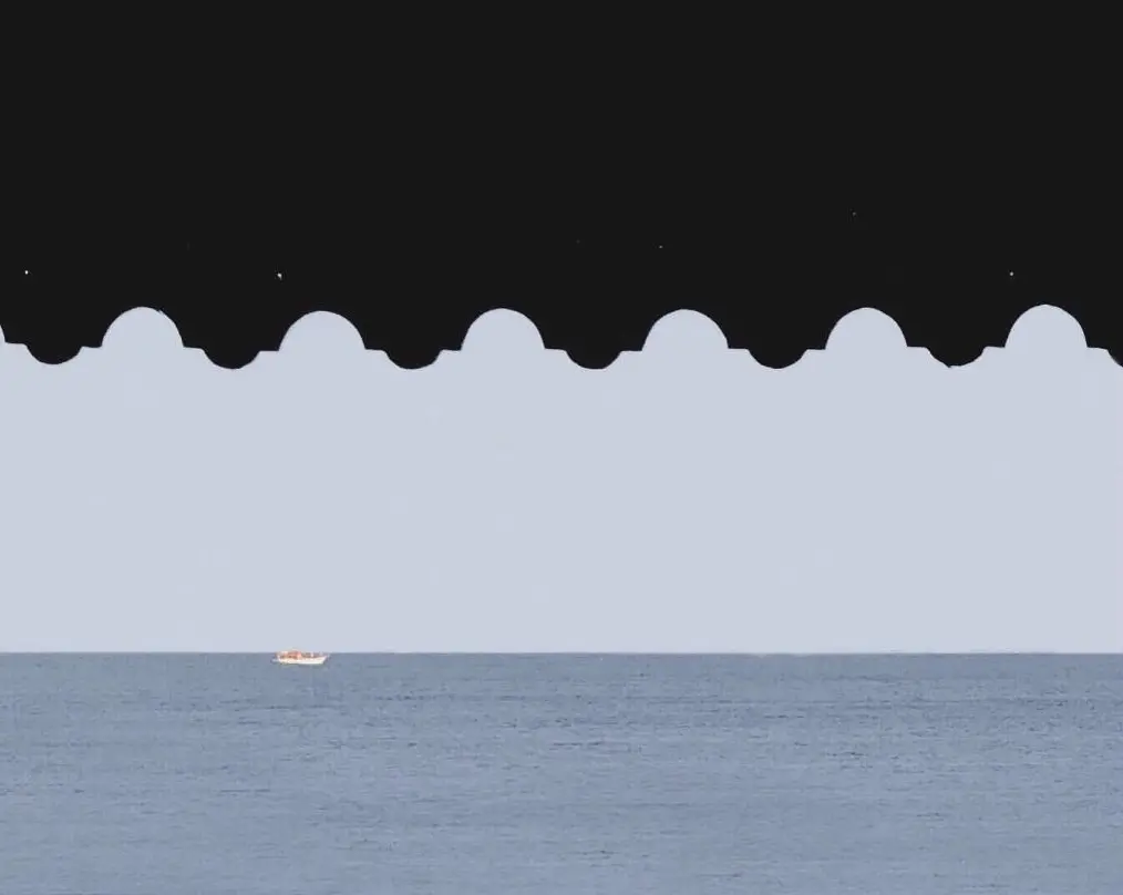
In minimalist photography, the common horizontal format is 3:2, and 4:3. They are suitable for expressing a wide scene, bringing more environment into it.
c. Vertical frame
A tall > wide vertical format will look a bit unusual compared to a horizontal format. Our eyes are drawn unconsciously by things that extend up and down. Common vertical formats are 2:3 and 3:4. They are suitable for expressing tall objects or a sense of depth in space.
2. Look for a clean background
After choosing the right frame, the next thing is to work on the elements in the frame. The elements in the picture generally belong to the “positive and negative space” of photography.
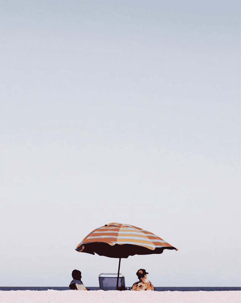
The positive space is the “main area” that attracts the audience’s attention. It can be an actual object or a detail (such as a shadow, etc.). Negative space is the “blank area” that occupies most of the screen, usually as the background. Moderate white space can not only highlight the subject but also create artistic conception and cause associations. This plays an important role in minimalist photography.
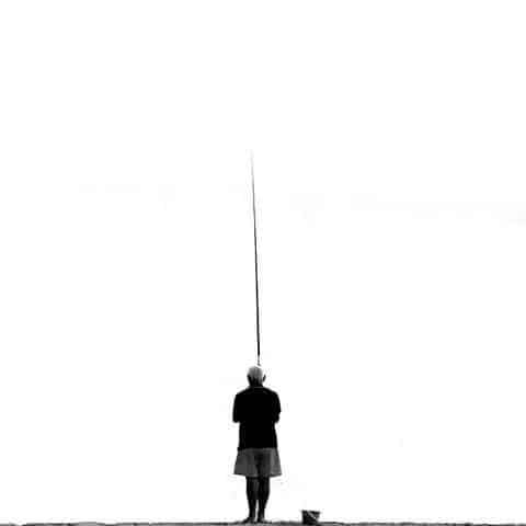
In our life, there are many things that can be photographed. However, it is not easy to find a clean background. So let’s solve this problem first. Here are tips on how to get a clean background
a. Change the perspective
When you walk along the road, you see a whole lot of things. This makes you wonder where you can find a large blank background for a minimalist photo. Well, thank goodness, there is an option.
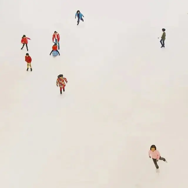
If the surrounding is full of objects, you can get a clean, pure picture of the empty sky as the background. You can also stand at a high place and take a bird’s -eye view, with a larger area of the ground as the background.
b. Narrow down
Without large blanks, we can also narrow the framing range and look for small blanks. For example, a wall, a corner of a swimming pool, a lawn, or even a cardboard box, etc.
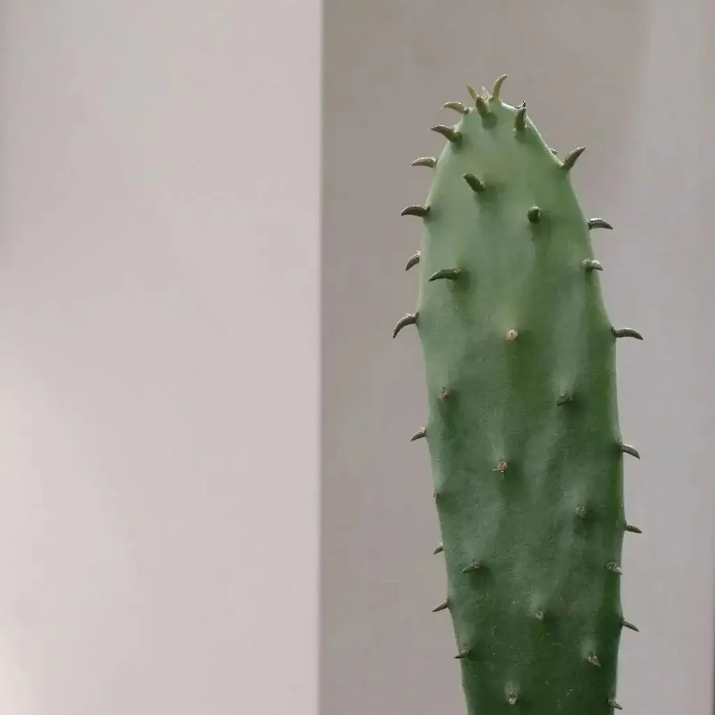
This simply means taking images of smaller areas that are empty. Even directly showing a part of the thing, leaving a blank from itself or its surroundings is good enough.
c. Post-processing
There is really no inspiration, and there is a creative way to play – change to a solid colour background in the later stage. The effect is a bit like clip art, however, it’s generally only suitable for well-defined subjects.
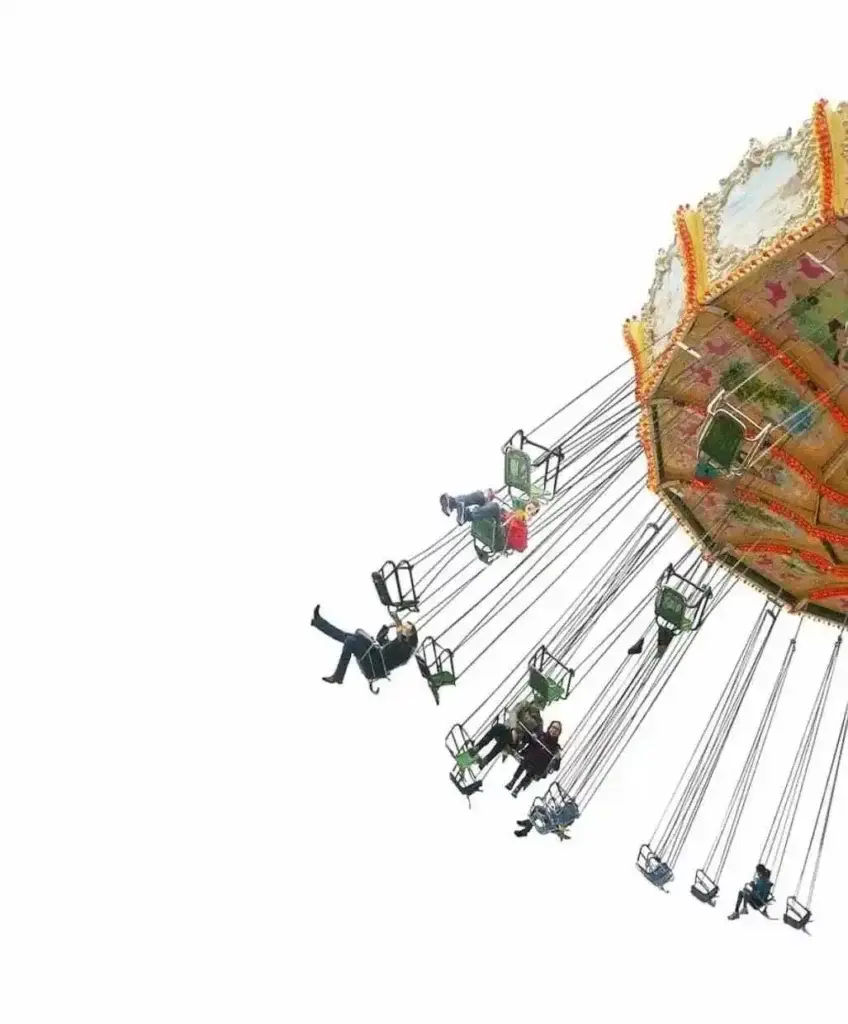
We can use “Awake” to make a solid colour background, the steps are as follows:
- Import pictures
- Portrait – Cutout – Smart Cutout / Quick Cutout
- Background — choose a solid colour background
3. Elements of the simplified screen
A clean background just removes unnecessary distractions from the picture. How to choose and arrange the elements in the image is the real test of the minimalist photo.
It requires positive and negative space, that is, the in-depth linkage between “subject” and “blank”. This linkage mainly occurs in the following aspects

a. Colour
Colour is the most attractive part of the picture. Between the main body and the blank, if it is the same colour and adjacent colour, it will bring a harmonious sense of hierarchy.
If it is a complementary colour or contrasting colour, it will bring visual impact. At this time, the main colour occupies a large area of the blank. This can not only set off the subject but also make the picture appear purer.

In the last adjustment, the low-saturation picture will be comfortable and durable. High saturation, which we often avoid, is full of design and fashion under the minimalist picture. This is also a direction to try.

b. Size
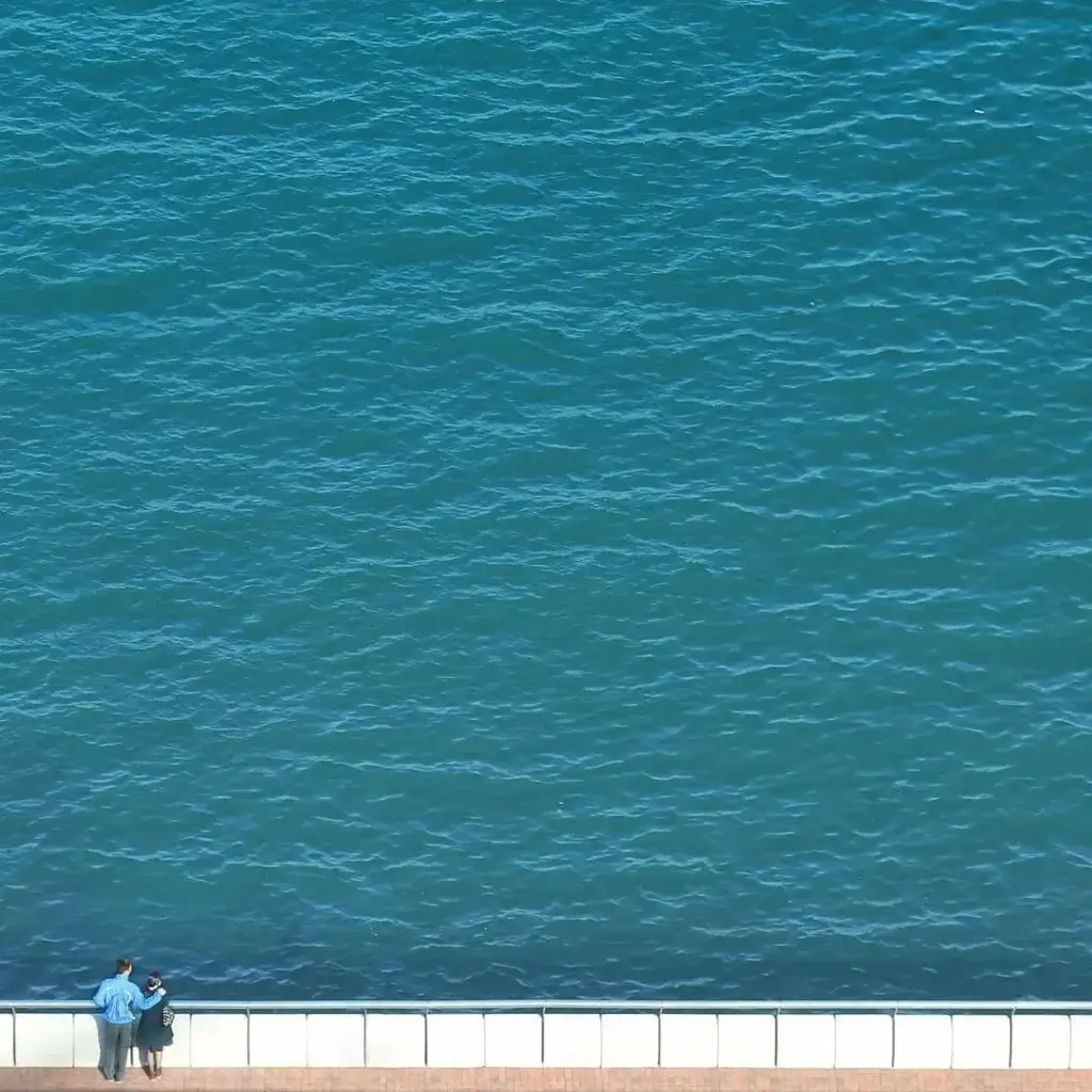
As we mentioned earlier: white space needs to be moderate. The size relationship between the main body and the blank also needs to be considered.
There is a lot of white space which can show the openness of the picture (as shown in the figure below). But if it is too much, it will appear spacey and the main body will not be obvious.
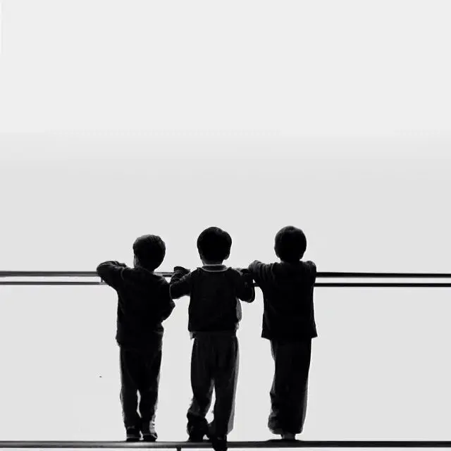
Less white space can enhance the status of the subject (as shown in the figure below). But if it is too much, it will appear dull and lack breath.
c. Geometry
Abstract geometric structures such as points, lines, and surfaces will always create a sense of space and make the picture more concise. Lines are often used in pictures to divide white space, add vitality, guide the eye, and accentuate the subject.
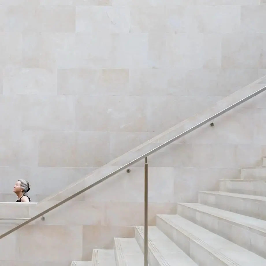
If the picture itself is composed of geometric figures, the boundaries between the blank and the subject begin to blur. Between positive and negative, the tension is full, and the simpler it is, the more intriguing it is.
In addition, there are many repeating textures in life, in the form of “full” instead of “empty”, they constitute another kind of void, which can also highlight the subject.
d. Light and shadow
Light and shadow are the most varied and contagious parts of the picture. It can be a blank to render the ambience if there are many shadows. ![]() If there is more light, shadows become the main body of life.
If there is more light, shadows become the main body of life.
And a little light and shadow in the simple picture, like the flavoring agent of life, adds interest and makes people feel more healed.
Conclusion
It is not difficult to take minimalist photos in daily life, because these scenes can be seen everywhere in life. As long as we pay more attention, we can capture wonderful pictures. But it’s not that easy, it requires us to have enough observation, aesthetics and composition ability. The most important thing is that minimalist photos are only minimalist in form, and what it pursues is to create unlimited content space with limited elements.

There are ideas, stories, or emotions in there, so we can immerse ourselves in them for a long time and keep thinking about them. It is definitely not to shoot a simple and beautiful picture, it is called minimalism.


