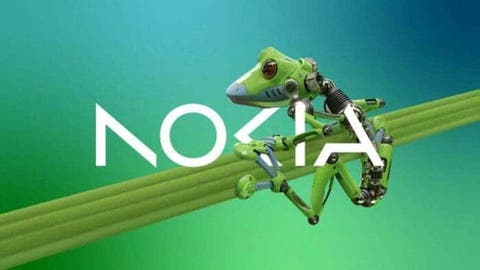
In order to align with the company’s objective of focusing on growth, Nokia stated today that it intends to alter its brand logo for the first time in nearly 60 years. The company will use a new design (as shown in the image below). As you can see from the image, the new Nokia logo is made up of five distinct forms. In addition, a variety of colours have taken the place of the original logo’s distinctive blue undertones.
“It (the old logo) was about mobile phones and today we are a business technology company,” Nokia Chief Executive Pekka Lundmark told Reuters in an interview.
Lundmark devised a plan with three stages after taking over as CEO of failing Nokia in 2020. These phases were reboot, accelerate, as well as extend. Lundmark also stated that the second phase is about to start after the restart phase was finished. Nokia’s primary emphasis is now on selling devices to other firms, though it still hopes to expand its service provider company.
Lundmark said: “Our enterprise business grew by 21% last year and currently accounts for about 8% of our sales, (or) about 2 billion euros, and we hope to sell it as soon as possible. Up to double digits. The signal is very clear, we only want to get into businesses where we can see global leadership.”
Nokia’s shift into factory automation and data centers will also put them in competition with big tech companies like Microsoft and Amazon. Lundmark said: “There will be many different types of cases, sometimes they will be our partners … sometimes they can be our customers … I believe there will be cases where they will be competitors.”
History of Nokia logo changes (minor changes)
The Nokia logo has gone through several changes over the years. Most of the changes are minor and reflect the company’s evolution and growth at the time. Here is a brief history of Nokia’s logo:
- 1865 – Nokia is founded as a paper mill in Tampere, Finland. At this time, there is no logo.
- 1965 – Nokia begins producing electronics, and a simple logo is introduced. It consists of the word “Nokia” written in blue letters, with a small blue rectangle above the “i.”
- 1971 – The logo is updated to include a new typeface and a small circle, which is meant to represent a radio wave.
- 1982 – The logo is simplified to just the word “Nokia” in bold blue letters.
- 1992 – A new, more modern logo is introduced, featuring the word “Nokia” in bold blue letters, with a curved line above the “i”. This logo becomes synonymous with Nokia’s rise to dominance in the mobile phone market in the 1990s.
- 2011 – As Nokia seeks to reinvent itself, it introduces a new logo featuring the word “Nokia” in lowercase letters, with a new typeface and a distinctive “slashed O” symbol. This logo is designed to reflect Nokia’s commitment to innovation and new technologies.
- 2015 – Nokia sells its mobile phone business to Microsoft, and the Nokia brand is no longer used on phones. The company introduces a new logo featuring the word “Nokia” in blue letters, with a simple, modern design.
Today, Nokia primarily focuses on providing telecom equipment and services, and its logo reflects this new direction.
About Nokia
Nokia is a Finnish multinational telecom company founded in 1865. Initially, the company produced paper products. Later, it shifted its focus to electronics and telecom equipment. Nokia played a huge role in the development of the GSM mobile phone standard. At some point, it was the world’s largest mobile phone brand. In recent years, Nokia has shifted its focus to providing telecom equipment and services, such as network infrastructure and software. The company has also been involved in the development of 5G tech. It has also partnered with other brands in the telecom industry to provide these services.
Nokia has had a solid impact on the telecom industry. It also has recognition for its innovation and contributions to the development of new techs. While the company has faced some challenges in recent years, it remains a major player in the telecom market.

